A pared-back room works when every object earns its place. The best versions of simplicity interior design are not empty or severe; they rely on clean lines, useful storage, and materials that feel calm rather than cold. In a UK home, that usually means balancing limited daylight, compact rooms, and older architecture without losing warmth or personality.
The calmest version of this style is edited, warm, and highly functional
- Keep the palette tight: two main neutrals and one or two accent tones are usually enough.
- Use hidden storage to protect open surfaces, especially in kitchens, hallways, and small living rooms.
- Choose natural materials such as wood, wool, linen, stone, and matte finishes to prevent a sterile feel.
- Layer lighting instead of relying on one bright ceiling fitting.
- Buy fewer but better pieces so the room feels intentional rather than sparse.
What this style really means now
When I talk about this look, I am not describing a showroom with nothing in it. Contemporary minimalism is closer to edited living: a room with breathing space, repeated materials, and objects that have a clear purpose. In 2026, the strongest version is warmer than the old all-white image most people still picture.
The easiest way to see the difference is to compare the three approaches most people confuse with one another:
| Approach | What it feels like | Best for | Risk |
|---|---|---|---|
| Classic minimalism | Very restrained, crisp, and architectural | Bright rooms with strong natural light | Can feel cold or unfinished if texture is missing |
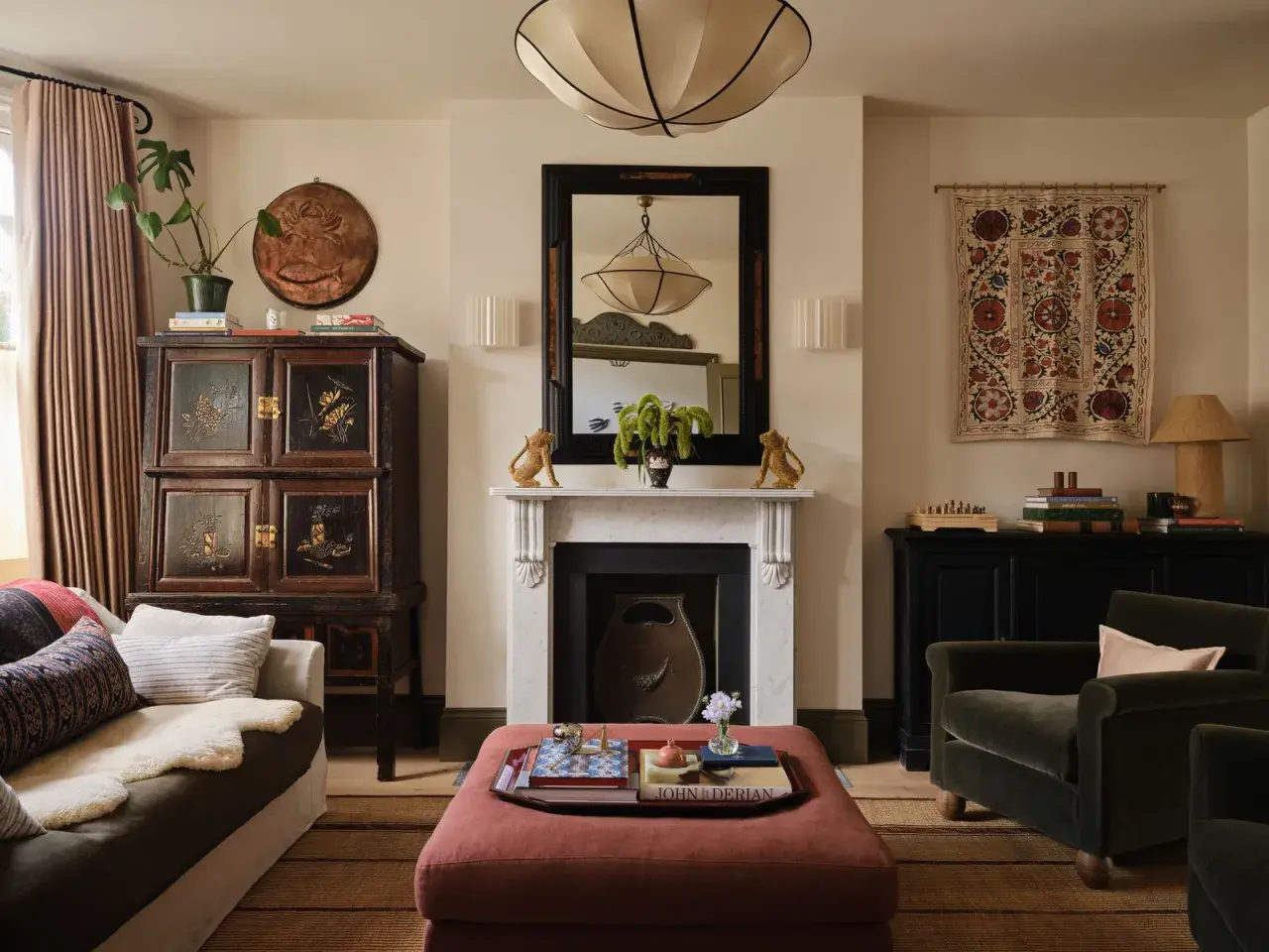
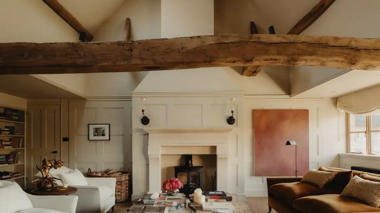
| Warm minimalism | Calm, tactile, and quietly layered | Most homes, especially UK rooms with limited daylight | Can drift into bland neutrality if the materials are weak |
| Cluttered neutral | Lots of beige or grey, but without discipline | Nowhere, really | Looks accidental rather than designed |
The practical point matters more than the label: good minimal interiors are not empty, they are edited. I find that distinction useful because it shifts the question from “What can I remove?” to “What deserves to stay?” Once that is clear, the next step is learning which rules keep the room calm day to day.
The rules that keep a room calm without making it feel empty
Minimal rooms fail when they chase emptiness instead of order. The goal is not to hide everything; it is to reduce visual noise so the eye can rest. Negative space, which is simply the open area around furniture and objects, matters because it gives the room rhythm rather than pressure.
These are the rules I use most often:
- Limit visible finishes. Two wood tones, one main metal, and one or two textile families are usually enough in a single room.
- Choose furniture with clear silhouettes. Straightforward shapes read as calmer than highly decorative profiles, especially when the room is small.
- Let pieces breathe. If circulation is tight, the room will feel crowded even with only a few items in it.
- Hide everyday clutter first. Mail, cables, chargers, shoes, and cleaning tools are the things that break the effect fastest.
- Repeat rather than multiply. One beautiful finish repeated three times looks more coherent than six finishes used once each.
I also like to use a simple editing test: if an item does not improve the room’s function, comfort, or proportion, it probably does not belong on display. That principle becomes even more important once colour, texture, and lighting enter the picture.
Colours, materials, and lighting that do the heavy lifting
This is where the style either comes alive or falls flat. A pale palette alone is not enough; the room needs tactile contrast. In practice, I usually start with a warm base, then add one grounded material, one soft material, and one finish that catches light gently rather than reflecting it hard.
For many UK homes, especially north-facing rooms, I would rather use warm white, oat, mushroom, clay, or muted olive than a sharp bright white. Cool whites can work, but they need strong daylight and careful styling. Without that, they often flatten the room and make it feel more clinical than calm.
| Material or finish | Why it works here | What to watch for |
|---|---|---|
| Oak, ash, or walnut | Adds grain and warmth without visual clutter | Too many wood tones can make the room feel busy |
| Linen and wool | Softens hard lines and makes a space feel lived in | Choose understated weaves, not loud patterns |
| Stone, terrazzo, or matte ceramic | Brings structure and durability | High-gloss surfaces can feel colder and more dated |
| Matte paint | Reduces glare and supports a quiet palette | Very dark matte walls need enough light to avoid heaviness |
| Brushed metal | Introduces a subtle accent without sparkle overload | Mix finishes sparingly so the room does not look unplanned |
Lighting deserves the same discipline. I usually prefer three layers: ambient light for the whole room, task light for reading or cooking, and accent light for shape and mood. In many homes, warm bulbs around 2700K to 3000K work well because they support texture instead of bleaching it out. Once the materials are right, the style becomes much easier to adapt room by room.
How to apply it room by room in a UK home
UK interiors often need a slightly different approach from glossy magazine spaces. Many homes have smaller footprints, awkward alcoves, period details, and windows that do not flood the room with daylight all day. I usually treat those features as design constraints worth working with, not problems to cover up.
| Room | Best move | Why it helps |
|---|---|---|
| Living room | Use one low-profile sofa, one strong table, and closed media storage | Prevents the room from feeling visually overloaded |
| Kitchen | Choose flat-front cabinetry, integrated handles, and a durable matte worktop | Keeps the busiest room in the house visually quiet and easy to clean |
| Bedroom | Keep bedside surfaces simple and rely on fitted wardrobes where possible | Makes the room feel restful and avoids morning clutter |
| Hallway | Use slim joinery, concealed hooks, and one bench or console | Stops the entrance from becoming a drop zone for everyday items |
| Small home office | Limit the desk to essentials and hide cables from view | Supports focus and reduces the sense of visual pressure |
In a Victorian terrace or a compact flat, fitted storage often does more for the overall look than any decoration ever will. A shallow unit in an alcove, a bench under a window, or joinery around a chimney breast can preserve floor area while making the room look deliberate. That practical layer is what stops minimalism from feeling like a style choice made in theory rather than in real life.
Common mistakes that make the style feel cold
Most disappointing minimalist rooms do not fail because they are too simple. They fail because the simplicity is careless. I see the same mistakes again and again: no texture, too many matching surfaces, weak lighting, and furniture that is either too large or too visually thin for the room.
- Using only white and grey. Without warmth or variation, the room can feel more like an office than a home.
- Mixing too many finishes. A room with four metals, three woods, and several paint sheens will never look calm.
- Buying oversized furniture. A deep sofa or heavy cabinet can overwhelm a small space, even if the rest of the room is spare.
- Leaving storage visible. The style depends on visual control, so open clutter breaks the effect immediately.
- Confusing emptiness with restraint. A room needs editing, not absence.
When a space feels flat, I usually add texture before I add objects. A wool rug, a linen blind, a timber tray, or a lightly patterned cushion can fix more than another decorative item. From there, the final question is not just how the room looks, but how responsibly it is furnished.
Sustainable choices that fit the style naturally
This is where the style and the website’s design values align neatly. A pared-back interior rewards fewer, longer-lasting pieces, which is usually the more sustainable route anyway. It also encourages you to think about repairability, not just appearance, which is a far better habit than chasing a perfect showroom finish.
When I choose pieces for a restrained interior, I look for these traits:
- Repairable construction. Solid joinery, replaceable legs, and removable covers matter more than trendy detailing.
- Natural or recycled materials. Reclaimed wood, recycled metal, bamboo, wool, linen, and low-VOC paint all suit this look well.
- Flexible proportions. Modular shelving, extendable tables, and adaptable storage are especially useful in changing households.
- Local or made-to-measure pieces. In the UK, a well-fitted item can reduce wasted space and often outlast cheaper, generic alternatives.
- Timeless shapes. A simple armchair or table that still makes sense in five years is usually a better buy than something obviously seasonal.
A practical starting sequence for one room this week
If you want to begin without overthinking it, work in this order. The sequence matters because it keeps you from decorating around a mess or buying new items before you know what the room actually needs.
- Clear every visible surface and return only the items you use regularly.
- Choose one main function for the room, then remove furniture that competes with it.
- Select a tight palette of two or three base colours and repeat them.
- Add storage before accessories, especially if the room is shared or small.
- Introduce one warm texture, one grounded material, and one softer layer.
- Finish with a single personal object or artwork that gives the room character.
That is the version of minimalism I trust most: not empty, but edited; not cold, but calm; and always shaped around how the room is actually used. If you start with storage, light, and a limited set of materials, the rest becomes much easier to decide.