The best mid century modern wood colors are rarely flat brown; they usually sit in a warm, believable range that includes walnut, teak, honey oak and pale ash, with the grain left visible and the sheen kept low. In practice, the style works because the timber does two jobs at once: it gives furniture visual weight and keeps the room feeling calm rather than overdecorated. This guide breaks down the typical palette, how to choose the right tone for a room, and how to keep the result authentic while making smarter sustainable choices.
The palette at a glance
- Walnut and teak are the classic anchor tones for the style.
- Oak and ash lighten the look and help in smaller or dimmer rooms.
- Finish matters as much as species; matte or satin usually reads best.
- Two wood tones are easier to balance than one perfect match.
- FSC-certified, reclaimed or well-made veneered pieces can fit the style and reduce waste.
- In UK homes, slightly lighter tones often work better because daylight is not always generous.
What gives the wood palette its mid-century character
Mid-century design does not rely on wood alone; it relies on the relationship between wood, line and restraint. The furniture tends to be slim, tapered and slightly sculptural, so the timber has to carry warmth without becoming rustic or heavy. That is why teak and walnut feel so at home in the style: they read as rich and grounded, but they still let the shape of the piece do the talking.
I usually think of the palette as warm, mid-value browns with a visible grain and a finish that stops short of gloss. Bright accent colours can sit on top of that base, but the wood is the anchor. Once you see that logic, the next step is choosing which species or tone plays the lead role in your room.
The main tones you will keep seeing
The classic range is smaller than people expect. In most interiors, four woods do most of the work, with a fifth used only as a statement accent.
| Wood tone | Colour character | Best use | Practical note |
|---|---|---|---|
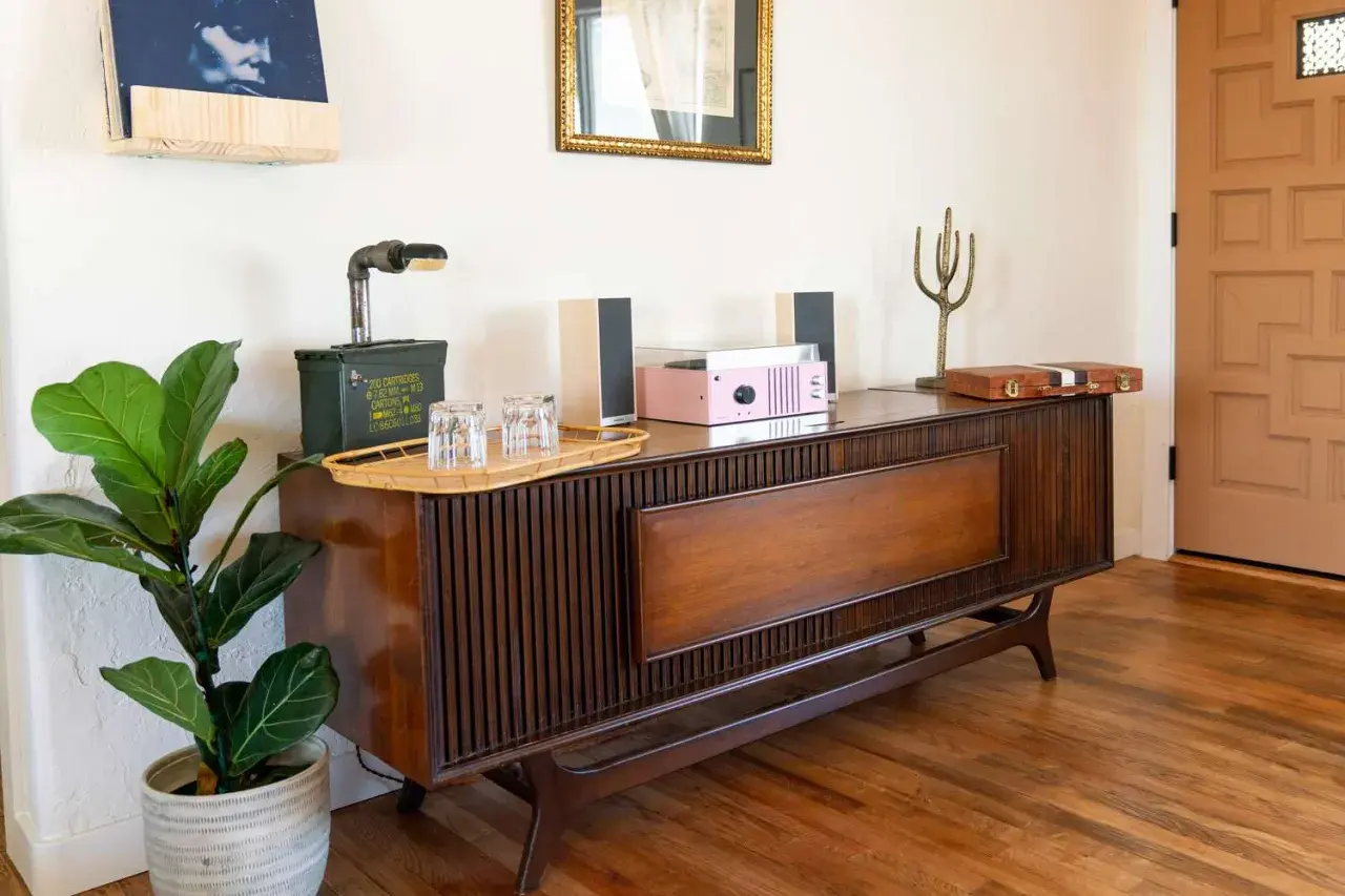
| Walnut | Deep brown with cocoa and a slight red undertone | Sideboards, dining tables, media units | The safest classic if you want richness without chasing a dark-stain look. |
| Teak | Golden to medium brown with an oiled glow | Chairs, cabinetry, sculptural pieces | The most recognisable signal of the style; avoid overly orange finishes. |
| Oak | Honey to medium brown, sometimes slightly golden | Floors, storage, larger built-ins | Good when you need warmth and a bit more light. |
| Ash | Pale blond with a softer grain | Chairs, shelving, trims | Keeps the room airy and suits smaller or brighter spaces. |
| Rosewood | Dark, dramatic, often figured or striped | Statement furniture only | Best used sparingly because it can dominate the room. |
Mahogany can work too, but I treat it as an accent rather than a foundation because it leans more formal than most mid-century schemes need. If you see an orange pine stain or a high-gloss reddish finish, that is usually a false friend: it may be wood, but it does not read as this style. From here, the more useful question is how those tones behave in the light of a real room.
How to match the tone to your room
Room light changes everything. In many UK homes, where daylight can be uneven and rooms are often narrower than the furniture brochures suggest, the same finish can feel either elegant or oppressive depending on where it sits. I normally move from the room’s light level to its wood tone, not the other way around.
| Room condition | Better tones | Why it works |
|---|---|---|
| North-facing or low-light room | Ash, pale oak, medium walnut | These keep the room open without flattening the palette. |
| Small room or narrow terrace | Ash, light oak, one walnut anchor | Lighter timber prevents the space from feeling boxed in. |
| Bright south-facing room | Teak, walnut, rosewood accent | Natural light balances richer wood and keeps it from feeling heavy. |
| Open-plan space | One dominant tone plus one lighter or darker support tone | Gives the room rhythm without visual clutter. |
For flooring, I try not to park every other timber in the same middle register. If the floor is already warm oak, let the furniture go a little darker or noticeably paler rather than hovering in the same orange-brown zone. That is usually what makes a room feel deliberate instead of accidental, which leads neatly into the next problem: mixing woods without losing the look.
Mixing woods without breaking the look
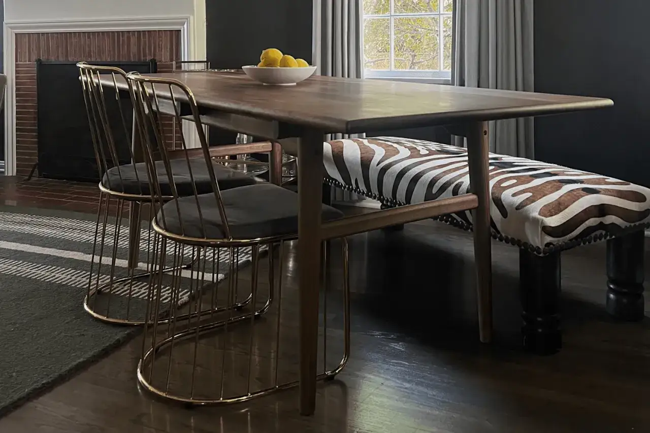
The safest approach is simple: one dominant wood, one supporting wood, and only a small third note if you truly need it. Mid-century rooms look collected, not matched, so I would rather see a walnut sideboard with ash chairs than six pieces fighting to be the same stain.
- Repeat the main tone at least twice so it feels intentional.
- Keep undertones aligned, such as golden with golden or red-brown with red-brown.
- Match sheen before exact colour; a satin finish beside a gloss finish usually looks wrong.
- Use black metal, leather, cream upholstery or stone as a bridge between different woods.
The usual mistakes are forcing a cheap timber into a fake walnut stain, mixing orange and grey undertones, or introducing glossy finishes that fight the grain. When a room feels slightly off, it is often the undertone, not the species, that is causing the problem. Once the palette is disciplined, the next question is how to source it responsibly.
Sustainable choices that still feel authentic
If sustainability matters, start with the source rather than the stain. FSC-certified timber is the clearest paper trail when you want to know the wood comes from responsibly managed forests, and it suits the style because mid-century design already values honest materials and long service life. Reclaimed pieces also make sense here, especially for sideboards, tables and shelving, where a little variation in grain adds character instead of looking messy.
- Choose FSC-certified or reclaimed timber first when you are buying new.
- Use solid wood where the piece takes the most wear, such as table tops and chair legs.
- Accept a quality veneer for large flat surfaces when it saves material and improves stability.
- Look for low-VOC or water-based finishes if you want a cleaner indoor environment.
The catch is that reclaimed stock rarely matches perfectly, so I would not use it if you need a uniform run of cabinetry. For a statement chair or table, though, the variation is part of the appeal. Those decisions matter most once you start placing the wood in specific rooms.
Where the palette works best in a modern UK home
The style is flexible, but some rooms reward it more than others. In a UK setting, I usually find that the living room and kitchen need the most planning, while bedrooms and hallways are easier places to let the timber breathe.
| Room | Best tones | Why it works |
|---|---|---|
| Living room | Walnut, teak, a little oak | Anchors seating and plays well with fabric, rugs and brass details. |
| Kitchen | Light oak, teak, walnut handles or lowers | Keeps cabinetry from feeling too heavy and works well with stone or matt paint. |
| Bedroom | Ash, oak, walnut headboard | Calm, softer and less visually busy, which helps the room feel restful. |
| Hallway or home office | Oak or ash with one walnut accent | Brightens circulation spaces and keeps the look purposeful. |
The kitchen is usually the hardest because cabinets dominate the room. If I want a mid-century feel without weight, I prefer lighter uppers, a medium walnut island or handle detail, and matt fronts rather than shiny ones. That is usually enough to create the right balance, which is why the final decision order matters so much.
The order I would use when choosing the wood
- Start with the room’s light and size.
- Choose one dominant tone for the biggest visual surface.
- Add one support tone only if you need contrast.
- Match the finish across pieces before chasing an exact colour match.
- Buy the best construction you can, especially for visible case goods.
That sequence keeps the room honest. When I choose timber for a mid-century scheme, I am really deciding how warm, how bright and how durable the room should feel for the next ten years, not just how it photographs on day one.