The essentials to keep in mind
- Use natural materials first: wood, linen, wool, stone and ceramic do most of the visual work.
- Keep the palette restrained: warm neutrals, softened greens, muted blues and clay tones usually feel more authentic than bright contrast.
- Mix old and new deliberately so the room feels collected, not staged.
- In UK homes, scale matters as much as style; one oversized rug or lamp often works better than several small pieces.
- Sustainability fits the look naturally when you choose durable, repairable and second-hand pieces.
- Too many themed objects, distressed finishes or matching sets can flatten the whole effect.
What countryside style really means in a British interior
What I mean by countryside style in a British interior is not a literal copy of a farmhouse. It is a calm, layered way of decorating that borrows from rural homes: painted wood, soft fabrics, pieces with patina, and furniture that looks as if it belongs to everyday life. The effect should feel warm, slightly imperfect and easy to live with.
The strongest rooms in this vein usually share three qualities: they are tactile, they are practical, and they avoid looking too arranged. I would rather see one worn oak table, one good linen curtain and one proper lamp than a room full of decorative references that never quite settle. If a room only works when it is styled perfectly, it has probably drifted away from the point.
That distinction matters, because the next step is recognising how this look differs from the related styles people often mix together.
How it differs from rustic, farmhouse and cottage interiors
These styles overlap, but the details change the mood quite a lot. When I am planning a room, I find it easier to separate them before I buy anything, because the wrong reference point can make a space feel muddled.
| Style | Main traits | Best for | Watch out for |
|---|---|---|---|
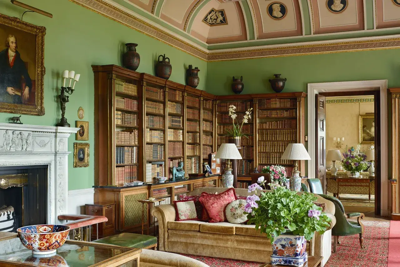
| Traditional country | Layered fabrics, antiques, softer patterns, deeper colour and a sense of heritage | Larger sitting rooms, period houses and homes with original features | Too much pattern can make the room feel heavy |
| Rustic | Rougher timber, stone, visible texture and a more natural, less polished finish | Open-plan spaces and homes that can handle a stronger, earthier look | It can become too raw if you ignore comfort and lighting |
| Farmhouse | Simple forms, practical storage, plain joinery and a cleaner overall line | Kitchens, family rooms and homes that need durability first | It can slide into blandness if every finish is too uniform |
| Cottage | Smaller-scale furniture, soft layering, charm, florals and a more intimate mood | Compact rooms and older homes with a cosy footprint | Too many tiny accessories can make it feel cluttered |
| Modern country | Simpler lines, fewer prints, calmer colours and a more edited mix of old and new | Flats, terraces and renovated homes that need the look without excess | It can lose personality if the room becomes too stripped back |
For most UK homes, modern country is the most forgiving version because it respects limited space, mixed furniture and everyday mess. Once you know which branch of the family you are working with, choosing the materials and colours becomes much easier.
The materials, colours and patterns that make it work
This is the part that does the heavy lifting. I usually keep a room to three core materials and two accent textures, because once the mix gets wider than that, the look starts to lose its calm. The aim is not richness for its own sake; it is a believable sense of texture.
- Wood gives the room its backbone. Oak, ash, pine and reclaimed timber all work, but the finish should feel honest rather than glossy.
- Linen softens the room without looking fussy. Curtains, loose cushion covers and tablecloths all benefit from its relaxed drape.
- Wool adds warmth and structure. It is especially useful in rugs, throws and upholstery because it wears well and looks grounded.
- Stone and ceramic stop the scheme from feeling too soft. A stone-top table, handmade tile or a ceramic lamp base gives the room weight.
- Limewash is worth considering for walls. It is a mineral finish that creates a gentle, chalky movement instead of a flat painted surface, which suits this aesthetic very well.
- Pattern should be present but controlled. Checks, stripes, faded florals and ticking can all work, but I would avoid using several bold patterns at full strength in one room.
Colour is where many rooms either come together or go slightly wrong. I tend to favour warm white, oatmeal, stone, moss green, dusty blue, clay and muted terracotta, with the odd darker note for depth. In practical terms, one base colour, one secondary colour and one accent colour is usually enough for a room that wants to feel calm rather than busy.
If you want a quick rule of thumb, think in terms of light, not brightness. A British room often benefits more from softened tones that work with natural daylight than from crisp white and high contrast. That approach leads neatly into the question of how the style actually plays out in real rooms.
How to adapt the look room by room
The easiest way to make this aesthetic feel believable is to let each room do its own job. A sitting room should feel layered and welcoming, a kitchen should feel robust, and a bedroom should feel quieter. If every room is styled the same way, the house starts to feel like a showroom.
Living room
Start with comfort and scale. A good sofa, one substantial rug and layered lighting usually matter more than decorative extras, especially in smaller British homes where floor space is limited. I like to add a timber coffee table, a lamp with a fabric shade and one or two well-chosen cushions rather than crowding the room with many small objects.
For windows, linen or cotton curtains soften light in a way that suits the look without feeling heavy. If the room has a fireplace, treat it as the natural anchor and keep the styling around it understated. That gives the space a sense of order without making it rigid.
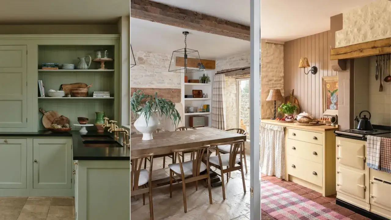
Kitchen and dining area
This is where practicality has to lead. Shaker-style cabinetry, painted timber, a solid dining table and durable flooring suit the mood because they feel useful first and decorative second. Open shelving can work, but only if you are willing to keep it edited; otherwise, closed storage is the more honest choice.
I would usually favour a simple pendant, a ceramic bowl, a butcher’s block or oak board and a couple of everyday textiles rather than a dense display of ornaments. In a British kitchen, especially one that doubles as a family room, the most successful version of the look is the one that can survive breakfast, homework and muddy boots.
Bedroom
Bedrooms should be the softest interpretation of the scheme. Use calmer colours, brushed cotton or linen bedding, a wool throw and bedside lamps that cast a low, warm light. One vintage chest, upholstered bench or painted bedside table is enough to suggest character.
What I would avoid here is over-layering. Too many cushions, too many prints and too much contrast can make the room feel busy rather than restful. A bedroom needs atmosphere, but it also needs to let you switch off.
Hallway and entrance
This is the room that reveals whether the style is real or only cosmetic. A bench, a peg rail, a runner and a mirror can make a hallway both useful and welcoming, which is exactly the point. If the space is narrow, keep the palette light and choose storage that hides the daily clutter of coats, shoes and bags.
A washable paint finish and a hard-wearing floor matter more here than in almost any other room. Once the layout is working, sustainability becomes the final filter rather than an afterthought.
Sustainable choices that suit the look instead of fighting it
This is one of the easiest styles to make more sustainable, because the visual language already favours longevity, repair and natural materials. In my view, the most credible rooms in this category are the ones that feel collected over time rather than bought in one shopping trip. If I were prioritising purchases, I would start with items that last and can be maintained: FSC-certified wood, which means timber sourced from responsibly managed forests; wool rugs; linen curtains; and ceramics instead of plastic-heavy decor. Low-VOC paints are also worth the extra attention because they release fewer volatile compounds into the air and are usually a better fit for a healthy home.- Buy second-hand first for tables, chairs and storage. Older pieces often have better proportions and better materials.
- Reupholster instead of replacing when the frame is sound. A good chair can gain another decade with the right fabric.
- Choose repairable finishes such as oil, wax or paint that can be refreshed without replacing the whole piece.
- Prefer local makers where possible so the room carries less transport cost and more character.
- Limit mixed-material decor when it cannot be repaired. It often looks tired before it looks charming.
The main compromise is time. Sustainable decorating usually asks for more patience because you are sourcing, restoring and editing rather than buying a full matched set. But the result is better in this style, because the room gains the kind of depth you cannot fake with shortcuts.
That also explains why some rooms miss the mark: they try to look rural, but they ignore the discipline that makes the look believable.
The mistakes that make the room feel staged
There are a few recurring problems I see again and again. None of them is dramatic on its own, but together they can strip a room of its ease.
- Too many themed objects such as signs, novelty prints or overly literal farm references. They age the room quickly.
- Over-distressed finishes on every surface. A little wear feels authentic; too much looks manufactured.
- Matching everything too closely. When the sofa, cushions, curtains and accessories all arrive from the same visual family, the room loses depth.
- Cool white and flat grey everywhere. These tones can work as support colours, but they rarely give the warmth this look needs.
- Ignoring proportion. Small accessories in a large room can look timid, while oversized rustic pieces in a small room can make the space feel cramped.
- Forgetting function. If the room is hard to clean, hard to sit in or hard to store things in, the style is only half working.
The best fix is usually restraint. If you remove one or two pieces, soften the palette and let the better materials breathe, the room often improves immediately. From there, the final edit becomes much easier.
The edit I would make before buying anything else
Before I add a single new object, I like to do a quick reset. It keeps the room from drifting into clutter and forces the eye back to the essentials.
- Take one decorative item off every surface and see whether the room feels calmer.
- Keep to two wood tones and one metal finish so the scheme stays coherent.
- Add one large natural textile, such as a rug or curtain, before buying more ornaments.
- Check that every piece earns its place through comfort, storage or durability, not just appearance.
If those four checks hold, the room usually lands in the right place: warm, practical and quietly characterful. That is the version of rural-inspired decorating I trust most, because it looks good now and still makes sense a few years from now.