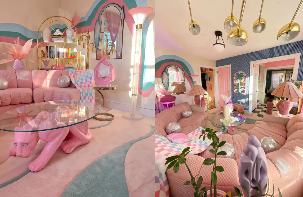
Soft colour can still feel layered, confident and grown-up when it is handled with discipline. Pastel maximalism works because it mixes gentle hues with bold objects, textured fabrics and a deliberately crowded sense of personality. In this article I look at what makes the style work, which combinations suit UK homes, how to use it room by room, and how to keep the result sustainable rather than disposable.
The style works when softness has something solid to lean on
- Use one or two dominant pastels and ground them with a darker or warmer anchor.
- Layer pattern, texture and vintage pieces so the room feels collected, not themed.
- North-facing or lower-light UK rooms usually need more contrast than sunny rooms.
- Second-hand furniture, repainting and reupholstery fit the look naturally and reduce waste.
- The easiest way to weaken the effect is to use too many pale tones without enough visual weight.
What gives this look its character
I read the style as controlled excess. Designers are still moving toward warmth and personality, and a 2026 1stDibs survey found that butter yellow, cornflower blue, powder pink and pistachio are all gaining ground, while vintage and eclectic pieces remain heavily in play. That matters because the room is not meant to feel sugary; it is meant to feel collected, expressive and slightly unexpected.
Benjamin Moore's maximalist guidance makes the same point from a paint perspective: colour is only the start, not the finish. What lifts the look is the tension between soft tones and sharper counterweights, such as walnut, aged brass, blackened metal or a dark-framed artwork.
In practice, the style succeeds when every object has a role. A scalloped lamp can sit beside a striped cushion, but both need a calmer surface to rest on. Once that balance is clear, the next step is making the palette behave in real light.
How to make pastel maximalism feel edited, not messy
When I design a room like this, I start with a simple rule: one dominant pastel, one or two supporting tones, and one stronger anchor. A loose 60/30/10 split works well, but I treat it as a guide, not a law.
| Element | Use this | Avoid this |
|---|---|---|
| Base colour | Repeat one pastel across large surfaces and one large piece, such as a wall, sofa or cabinet. | Five similar pale shades that all compete for attention. |
| Anchor | Add wood, black metal, charcoal, leather or another darker note for depth. | An all-white room with no visual weight. |
| Pattern | Combine one large pattern, one small pattern and some plain space. | Several busy prints at the same scale. |
| Finish | Mix matte paint, glazed ceramic, linen and velvet for dimension. | Only shiny surfaces or only flat surfaces. |
| Scale | Choose one or two oversized pieces that carry the room. | Too many tiny objects that break the composition apart. |
This is where the room stops reading as themed. A few strong decisions repeated in different materials are enough. If you can remove one object and the room still feels complete, you are usually close to the right amount of layering. With those rules in place, the palette becomes much easier to adapt to UK light.
Which pastel combinations work best in UK light
In British homes, the undertone matters as much as the colour name. A chalky pink that feels warm in the shop can turn flat in a north-facing room, while the same shade may look lively in a bright south-facing kitchen. I usually favour slightly dusty pastels over icy ones, because they sit more comfortably beside timber, stone and older architecture.
| Room condition | Colours that usually work | Best anchors | Why it helps |
|---|---|---|---|
| North-facing living room | Powder blue, dusty pink, muted mint | Oak, linen, antique brass | Warms up cooler daylight and keeps the room from feeling washed out. |
| Small terrace hallway | Butter yellow, blush, pale peach | Painted joinery, mirror, runner | Brightens a narrow space without making it feel overexposed. |
| Sunny kitchen | Peach, lilac, pale green | Chrome, stone, pale timber | Keeps strong daylight from flattening the scheme. |
| Bedroom | Chalk pink, pale blue, soft lilac | Walnut, boucle, linen | Feels restful while still having enough character to avoid blandness. |
The trend signal is also useful here. According to 1stDibs, soft pastels such as butter yellow, cornflower blue, powder pink and pistachio gained ground among designers heading into 2026, which tells me the softer side of maximalism is not fading. It is being pulled into a more grounded, layered direction. The right palette choice depends less on trend and more on the room's light and architecture, so the next step is translating that into real spaces.
Room by room ideas that keep the look practical
The trick is not to give every room the same level of energy. A hallway can be bolder than a bedroom, and a kitchen usually needs more durable surfaces than a sitting room. I think the best results come from assigning each room one clear job and letting the colour follow that job.
Living room
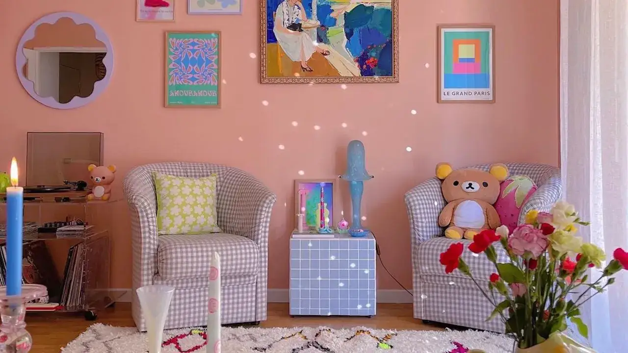
Use one soft base, then give it depth with a vintage rug, one patterned cushion and a lamp or side table in a more assertive shape. A pastel sofa works best when the walls are calm enough to let it breathe, and when the room includes at least one object with stronger contrast, such as a dark timber coffee table or a black picture frame.
Bedroom
Here I prefer texture over noise. Washed linen, a painted headboard, a ceramic lamp and one print above the bed usually feel richer than a flood of small accessories. The room should be soft enough to relax in, but not so delicate that it looks temporary.
Kitchen
Cabinet fronts, a painted island or glazed tiles carry the look better than random decor. In a UK kitchen, I would rather see one well-chosen pastel with timber or stone than three different cabinet shades fighting for attention. Practical surfaces matter here, so the finish has to be wipeable and durable.
Read Also: Modern Mountain Homes - Design for Comfort & Style
Hallway
This is where the style can make a strong first impression. A runner, mirror and one painted piece of joinery can do a lot in a narrow terrace or flat corridor, and the space usually benefits from slightly more contrast than a bedroom would.
Once the room-by-room structure is right, the choice of furniture and texture becomes much easier to edit.
Furniture, pattern and texture choices that carry the room
The best rooms in this style feel layered because the materials are doing the work, not because the surface is packed with accessories. I usually look for one hero upholstered piece, one vintage timber piece, and two or three finishes that interrupt all the softness.
- Velvet or mohair gives one seat or cushion a richer, light-catching surface.
- Linen keeps curtains and bedding relaxed, which stops the palette from becoming sugary.
- Wood with visible grain grounds the room and makes the pastels feel less synthetic.
- Ceramic and glass break up too much fabric and add a bit of shine without turning glossy.
- One metal finish repeated twice is usually enough; brass, chrome or blackened steel all work if you stay consistent.
Pattern needs the same discipline. One large floral, one stripe or check, and one mostly plain surface is often enough for a living room. If every print is loud at the same scale, the room loses rhythm and starts to feel accidental. When the materials are doing their job, the palette can stay soft without going flat.
Why the style can be surprisingly sustainable
This is one of the few decorative directions that can align naturally with better consumption habits. A room built from reupholstered chairs, painted storage, inherited ceramics and second-hand art often feels more convincing than a room filled with brand-new pastel accessories.
- Buy vintage or repairable pieces first, then paint or reupholster them.
- Choose FSC-certified timber and low-VOC paint where you can.
- Use removable covers, washable fabrics and modular storage so the room can evolve.
- Prioritise one or two durable anchors instead of many small seasonal objects.
- Keep a shortlist of pieces you can swap later, such as cushions, lampshades and art prints.
That approach is not just greener; it also produces better rooms because the pieces have history and variation. In a British context, charity shops, local antique centres, salvage yards and estate sales can be more useful than fast-decor browsing, especially if you are willing to repaint or repair. Once the base materials are working, sustainability stops being an add-on and becomes part of the design logic.
The mistakes that make the look childish or cluttered
| Mistake | What to do instead |
|---|---|
| Using only pale shades | Add at least one dark or warm anchor. |
| Buying matching sets | Mix eras and finishes so the room feels collected. |
| Relying on tiny decor pieces | Choose a few larger objects with presence. |
| Using every pastel at once | Repeat one core colour across the room. |
| Ignoring the light source | Test samples in morning and evening light before committing. |
The biggest trap is mistaking sweetness for balance. A room can be full of colour and still feel disciplined, but it needs contrast, scale and some visual quiet. If you lose those elements, the result slips from expressive into messy very quickly.
What I would keep if I wanted this look to last
If I were designing this style for the long term, I would keep the base architecture calm and let only a few pieces carry the playfulness. That means one or two repeat colours, one reliable wood tone, and a small number of objects that can be replaced later without redoing the room.
The rooms that age best are the ones that feel slightly collected, not completely finished. They have enough softness to be inviting, enough contrast to stay adult, and enough reuse in them to make the design feel responsible as well as attractive. When I am unsure, I subtract one accessory rather than add another, because that simple habit usually keeps the palette crisp and the room easy to live with over time.