The current curtain trends are less about decoration for its own sake and more about proportion, texture, and how a room behaves through the day. In this article, I focus on the fabrics, colours, hanging styles, and room-by-room choices that feel current in UK homes, especially where light, privacy, and insulation all matter. I also flag the trade-offs, because the best-looking treatment is not always the best one for a draughty sash window or a compact flat.
What matters most if you are updating your windows
- Natural-looking fabrics such as linen, linen blends, cotton, and woven textures are leading the way.
- Layering sheers with a second curtain or shade gives the most flexible mix of daylight, privacy, and warmth.
- Warm neutrals, muted greens, clay, oatmeal, and soft browns are easier to live with than icy, high-contrast schemes.
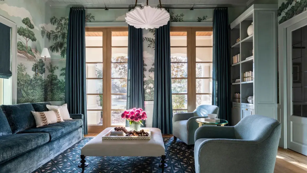
- Full-length curtains usually look more current than short panels, especially in period homes and rooms with decent ceiling height.
- Made-to-measure proportions, lining choice, and hardware finish matter as much as fabric.
- For a more sustainable result, choose durable cloth, repairable headings, and a style you can keep for years.
Why the look has shifted toward softness and restraint
I'm seeing a clear move away from heavy ornament and toward curtains that feel integrated with the room. That means fewer fussy swags, fewer overworked trims, and more fabric that does a practical job while still adding texture, softness, and architectural height. In UK homes, that shift makes sense: winter light is limited, many properties need extra warmth at the window, and a good curtain has to work with radiators, sashes, bay windows, and not against them.
The best schemes now usually do three things at once: they soften daylight, they improve comfort, and they make the window look intentionally dressed rather than simply covered. That balance is what keeps the style current, and it is why the next step is usually a fabric decision rather than a colour decision.
The fabrics I would shortlist first
When I specify curtains, I start with the cloth because it controls the whole mood. Linen still leads for its relaxed drape, but it is no longer the only answer; cotton, velvet, sheers, and lined blends all have a place depending on the room and the amount of daylight you need.
| Fabric or finish | What it gives you | Best use | Watch-outs |
|---|---|---|---|
| Linen or linen blend | Relaxed texture, soft movement, an easy modern feel | Living rooms, bedrooms, period homes | Can crease and may need lining for better body |
| Cotton | Crisp drape, versatility, a cleaner silhouette | Casual schemes, layered rooms, kitchens | Can look plain if the colour and heading are too flat |
| Sheer voile or semi-sheer | Soft daylight, lighter privacy, an airy atmosphere | Living spaces, front rooms, layered schemes | Does not give full privacy at night on its own |
| Velvet | Depth, warmth, sound absorption, a richer finish | Colder rooms, larger windows, period interiors | Can feel heavy in small or low-light spaces |
| Thermal or blackout-lined drapery | Practical light control, extra warmth, better sleep support | Bedrooms, street-facing rooms, draughty windows | Needs careful measuring to avoid looking bulky |
| Woven texture | Organic detail and visual depth without a loud pattern | Minimal rooms, calm schemes, mixed-material interiors | May need a second layer for full privacy |
If sustainability matters, I would rather buy a well-made natural or recycled fabric that lasts than a cheaper synthetic panel that looks tired after one season. The Energy Saving Trust still treats heavy thermal curtains as a sensible low-cost upgrade, and that is a useful reminder that good design and lower energy use do not have to compete. Once the fabric is doing the right job, layering becomes much easier.
Layering is the easiest way to make windows feel designed
Layered window dressing is one of the most useful directions right now because it solves a real problem: most homes need different levels of light and privacy at different times of day. A sheer or light-filtering base keeps daylight soft, while an outer curtain adds depth, colour, and insulation when evening comes.
The cleanest version is simple. In a living room, I like a sheer plus a floor-length drape; in a bedroom, I prefer a blackout-lined curtain with a softer secondary layer only if the room still feels exposed; in a kitchen or breakfast area, a cafe curtain or Roman shade often looks more intentional than a full panel. The point is not to pile on fabric for the sake of it, but to make each layer do one job well.
Layering does have limits. In a very small room, too many heavy fabrics can make the window feel boxed in, and if the room already lacks daylight, a dense double layer can work against the atmosphere. In those spaces, I would keep one layer light and let the second layer stay simple.
Colours and patterns that feel current without ageing quickly
The strongest palette is warmer and quieter than the one that dominated a few years ago. I still see plenty of oatmeal, mushroom, clay, olive, softened rust, biscuit, and muted blue-grey, but the difference now is that they are usually paired with texture rather than flatness. In a north-facing British room, that warmth matters more than style theory, because a cool white curtain can make the whole space feel flatter than it looks in the sample image.
| Colour or pattern direction | What it does | Where it works best |
|---|---|---|
| Warm neutrals | Softens the window and keeps the room calm | Living rooms, open-plan spaces, hallways |
| Earth tones | Adds depth and makes pale walls feel grounded | Bedrooms, period homes, rooms with timber |
| Muted stripes | Brings structure without shouting | Kitchens, French doors, casual sitting rooms |
| Small-scale botanicals | Adds character while staying restrained | Guest rooms, dressing rooms, cottage-style interiors |
| Two-tone or blocked colour | Makes the curtain read more like a design feature | Statement rooms, home offices, taller windows |
My rule here is simple: if the curtain is already doing a lot visually, keep the pattern modest and the palette controlled. It is much easier to live with a restrained print at window height than a loud one that competes with every other surface in the room.
What works best in each room of a UK home
There is no single correct answer, and this is where many people overspend or overstyle. A curtain that feels right in a high-ceilinged Victorian living room can look wrong in a compact new-build bedroom, so I prefer to match the treatment to the room's actual conditions rather than to a magazine image.
| Room | Best approach | Why it works |
|---|---|---|
| Living room | Full-length linen or linen-blend curtains, often layered with a sheer | Looks relaxed but tailored, softens daylight, and adds height |
| Bedroom | Blackout-lined drapes or thermal-lined curtains in a calm neutral | Supports sleep, blocks early light, and keeps the room warm |
| Kitchen | Cafe curtains, a Roman shade, or a simple light-filtering panel | Keeps privacy without losing too much daylight or workspace clarity |
| Bay or sash window | Made-to-measure curtains with a neat heading and generous drop | Respects the architecture and avoids awkward gaps or bunching |
| Compact flat | One quiet fabric, slim hardware, and floor-length if proportions allow | Prevents the window from looking busy or chopped up |
| Patio or French doors | Wide, easy-gliding curtains on a discreet track | Lets the fabric move cleanly and keeps the opening practical |
If a radiator sits directly below the window, I would check clearance carefully before committing to a long, heavy curtain. That is one of the few cases where the room's function should override the trend, especially in older homes where heating efficiency still matters.
The details that make the whole scheme look expensive
The quickest way to make a window treatment look dated is to hang it too low, too narrow, or too short. I usually mount the pole or track higher than the frame to stretch the window visually, and I extend it beyond the opening so the curtains can stack back without blocking light.
A practical rule of thumb is to position the pole about 10 to 20 cm above the frame and let it project roughly 15 to 30 cm beyond each side, depending on the wall space. For fullness, 2 to 2.5 times the finished window width usually gives a better result than a skimpy pair of panels, and the hem should either kiss the floor or break by a small amount rather than hovering awkwardly above it.Heading style matters too. Wave headings feel cleaner and more modern, pinch pleats feel tailored and work especially well in classic rooms, and pencil pleats are still useful where flexibility is needed. I would be cautious with shiny eyelets unless the rest of the scheme is very casual, because they can make even good fabric read as less refined.
Interlining is worth considering on better-quality curtains: it is the extra layer between face fabric and lining that gives the curtain more body, improves drape, and can help with warmth. It is not always necessary, but on a prominent window it usually makes the finish look more deliberate.
The choices I would make first in a real room
If I were updating one room this year, I would start with the job the window has to do, then choose the fabric, and only then settle the colour. That order sounds basic, but it stops most expensive mistakes: you do not end up with a beautiful curtain that leaks light, clashes with the room's temperature, or feels overfitted for the space.
For a future-proof result, I would reach for a natural or natural-looking cloth, a calm colour, a clean heading, and a length that respects the architecture. That combination will outlast whatever the loudest look of the season happens to be, and it fits the sustainable, practical side of home decorating far better than a fast, decorative fix.
When the window treatment is right, the room feels quieter, warmer, and more finished without drawing attention to itself. That is the standard I would use every time.