A gallery wall can make a room feel finished, but only when the spacing, scale, and frame choices are edited with care. I usually think of it as a small composition problem, not a decorating afterthought. In this article I’ll show how to plan the layout, choose materials with a lighter footprint, hang everything safely in a UK home, and avoid the mistakes that make the result feel cluttered instead of collected.
What matters most before the first nail goes in
- Pick one visual anchor and build the rest of the arrangement around it.
- Keep spacing steady, usually around 5-8 cm between frames.
- Centre the composition around 145 cm from the floor in living areas; lift it slightly in hallways and stairwells.
- Choose frames you can reuse or update, rather than replacing the whole display each time your taste changes.
- Plan the wall on the floor or with paper templates before you drill.
How to plan a gallery wall that actually looks edited
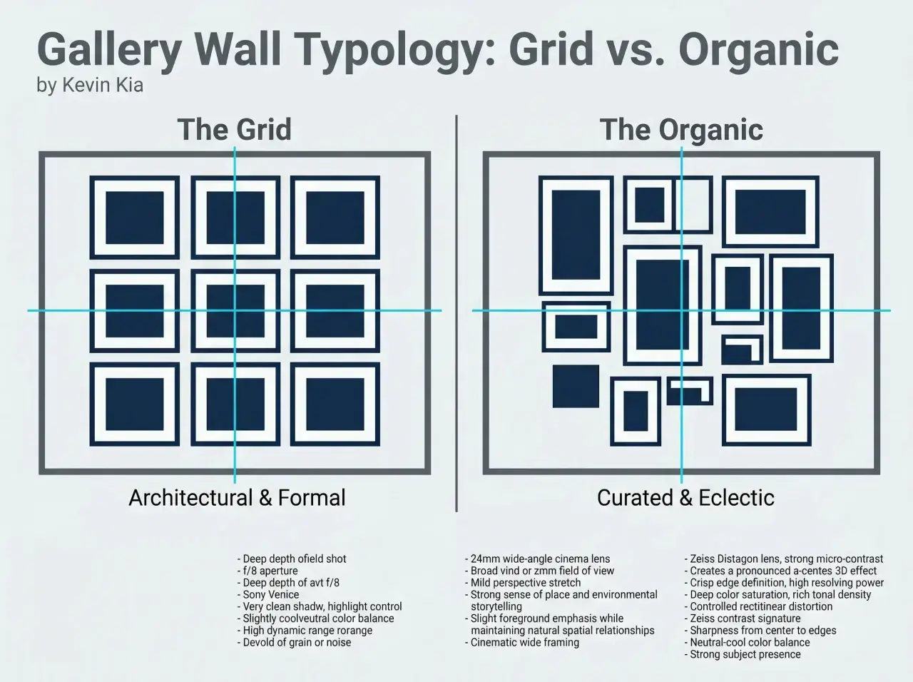
The easiest mistake is to start with too many pieces and no hierarchy. I get better results when I choose one anchor piece first, usually the largest print, the strongest colour, or the most meaningful work, then let everything else support it. From there, decide whether you want the display to feel structured or relaxed: a clean grid reads calm and modern, while a looser salon arrangement feels more collected and lived in.
| Layout type | Best for | What it gives you | When it falls short |
|---|---|---|---|
| Grid | Matching frames, simple rooms, narrow walls | Order, symmetry, and an easy path for future additions | Can feel stiff if every image is too similar |
| Salon-style | Mixed sizes, eclectic rooms, staircases | Personality, movement, and a more curated feel | Looks messy fast if spacing is inconsistent |
| Linear row | Above sofas, consoles, and long corridors | Calm rhythm and a clean visual line | Can feel underpowered on a very large blank wall |
Then I mock it up on the floor or with paper cut-outs. I trace each frame, label it, and move it around until the negative space feels even; the gaps matter as much as the art. A useful rule is to keep frames about 5-8 cm apart, with slightly wider gaps only when you want the arrangement to breathe more. That planning step is what separates a wall that feels intentional from one that just fills space, and once the layout is settled, the next question is what should go inside those frames.
What to frame when you want the wall to feel personal
I prefer a mix that tells a story without becoming noisy: prints, family photos, sketches, tickets, postcards, or one textile piece can all work together if the palette is controlled. In 2026, the strongest displays feel less like perfect symmetry and more like a collected set of objects that reflect real life, which is a welcome shift away from the generic, over-matched look.
- Use one dominant finish - for example, oak or black metal - and repeat it enough to create unity.
- Mix formats, not chaos - photos, art prints, and one or two tactile pieces are enough.
- Spend where it matters - an inexpensive print can look excellent in a well-sized frame and mount.
- Reuse what you already have - a good frame can survive many swaps, which is better for both budget and waste.
A mount, the paper border around the artwork, gives a small print more presence without forcing you to buy a larger piece. That is one of the simplest ways to make the whole composition feel more expensive and more deliberate. For UK budgets, off-the-shelf frames often start around £8-£25 each, sturdier reclaimed-wood or better-finished frames are commonly £20-£60, and custom framing usually starts above £80 once you add a mount and glazing. I would only pay for custom work when the piece is awkwardly sized, fragile, or genuinely irreplaceable.
The material choice matters too, especially if you want the display to align with a lower-waste way of decorating. Reclaimed timber, recycled plastic, second-hand finds, and solid metal frames all have a place, but they behave differently over time. Once you know what you want to frame, the next step is making sure the wall itself can actually hold it.
How to hang it safely in a UK home
UK walls are not all the same, and that matters more than most decorating advice admits. Plasterboard, brick, masonry, and older lath-and-plaster walls all ask for different fixings, so I always check the wall type before I decide on hooks or screws. For heavier frames and mirrors, use the fixing rated for the load rather than guessing; for rented homes, lightweight pieces and removable strips can work, but only within the weight limit printed on the pack.| Fixing | Best for | Typical use | Notes |
|---|---|---|---|
| Picture hooks | Light to medium frames on plaster walls | Prints, small frames, frequent rearranging | Low damage and useful in rentals, but not for heavy art |
| Screws and wall plugs | Brick, block, and heavier pieces | Large frames, mirrors, and long-term installs | Strongest option; use the correct drill bit and plug size |
| Adhesive strips | Very light pieces and temporary layouts | Small framed prints in rentals | Good for simple installs, but avoid damp rooms and overloaded strips |
For height, I work from the visual centre rather than the top edge. In living rooms, around 145 cm from the floor is a reliable starting point; in hallways or other standing spaces, a slightly higher centre can feel more natural. Above a sofa, keep the bottom edge roughly 15-20 cm above the back of the seat, and aim for the full arrangement to span about two-thirds of the furniture width.
If the wall is narrow or awkwardly interrupted by a radiator, mirror, or doorway, I would rather scale down the composition than force a bigger one. That restraint usually looks more expensive, and it saves unnecessary holes, which leads neatly into how to adapt the display room by room.
How to scale the display for each room
The same arrangement rarely works everywhere. A hallway wants movement, a living room wants balance, and a bedroom usually benefits from something calmer and lower contrast. When I’m choosing scale, I think less about filling the wall and more about how the wall is viewed - standing, sitting, moving past it, or looking at it from bed.
- Living room - centre the display over a sofa or console and let it feel anchored to the furniture below it. A wider, lower composition usually works better than a tall one.
- Hallway or entry - use a vertical sequence or staggered row so the eye travels naturally. Keep the spacing consistent or the movement feels accidental.
- Staircase - follow the angle of the stairs, but keep the gaps even. The arrangement should rise with the architecture rather than fight it.
- Bedroom - keep the palette softer and the contrast lower, especially above the headboard. A pair or trio often feels calmer than a dense cluster.
- Dining room - hang slightly lower than you would in a living room so the display feels connected to seated viewing rather than floating above it.
For larger rooms, a series of related pieces can be stronger than one giant cluster, especially if you want the space to feel airy. For smaller spaces, repetition helps: three similar frames with different images can be enough, and they will read as deliberate rather than crowded. That leads straight to the errors I see most often, because they are easy to avoid once you know what to look for.
The mistakes that make a wall feel busy instead of designed
The most common issue is not the art itself but the lack of editing. Too many styles, sizes, and finishes pull the eye in different directions, which makes the arrangement feel accidental. I also see walls hung too high far too often; once the centre of the composition drifts above eye level, the whole room starts to feel shorter and less grounded.
- Uneven spacing makes even good pieces look improvised.
- Every frame a different finish can read as clutter unless the palette is very controlled.
- Too many tiny prints on a large wall make the room feel underdressed.
- No focal point means the eye never settles.
- Ignoring surrounding furniture makes the wall float instead of belonging to the room.
- Hanging before testing usually means extra holes and more frustration later.
If I want the display to look calmer, I reduce the number of frame colours, repeat one size at least twice, and leave more breathing room near the edges. The wall does not need to be packed to feel complete; often it just needs a clearer rhythm. Once those basics are under control, the final step is keeping the whole thing flexible so it can evolve without waste.
A display that can change with you
The most sustainable version is the one you can update without starting over. I like systems that let me swap prints, rotate family photos, or move a few pieces around when the room changes, because that keeps the frame set in use for years rather than months. It also makes the wall feel alive instead of frozen, which suits the more personal direction interiors are taking now.
- Buy frame sizes that repeat, so new pieces can slot in later.
- Use mounts to refresh small prints instead of replacing entire frames.
- Keep a small box of spare hooks, labels, and paper templates for future changes.
- Choose reclaimed, second-hand, or recycled materials where the finish still suits the room.
- Save meaningful scraps, postcards, or artwork from travel and turn them into part of the display.
If I had to reduce the whole process to one idea, it would be this: edit first, hang second, and only buy new pieces when the existing composition genuinely needs them. That approach looks better, costs less in the long run, and fits naturally with a smarter, lower-waste way of decorating.