Console tables work best when they solve a spatial problem and still look intentional. In a hallway, they soften a blank wall and give you somewhere to drop keys; in a living room, they can anchor lighting, art, and a few well-chosen objects without taking up much floor space. I’m focusing here on the decisions that actually matter: scale, proportion, room placement, and the materials that keep the result calm rather than cluttered.
What matters most before you decorate the table
- Keep depth to about 25-35 cm in narrow hallways and 35-45 cm in larger rooms.
- Use one tall anchor, one medium piece, and one low functional object for balance.
- A mirror or artwork usually looks best at roughly two-thirds of the table’s width.
- Choose reclaimed wood, FSC-certified timber, ceramic, glass, and natural fibres when you want a longer-lasting, lower-impact look.
- Leave at least 75-90 cm of clear walking space in a hallway so the setup stays practical.
- In the UK, a usable console often starts around £80-£150 new, with stronger solid-wood pieces usually higher.
Start with the table itself, because scale does most of the work
I always begin with the console, not the accessories. If the piece is too deep, it turns into a trip hazard; if it is too shallow, it can look like a shelf that never quite belonged there. For most UK homes, a depth of 25-35 cm suits a narrow hallway, while 35-45 cm usually feels comfortable in a wider living room or behind a sofa.
| Placement | What usually works best | Why it works | What I would avoid |
|---|---|---|---|
| Narrow hallway | Slim profile, open legs, one drawer at most | Keeps the passage visually light and physically easy to use | Bulky bases, deep cabinets, heavy ornamentation |
| Living room wall | Longer console with a shelf or drawers | Holds a lamp, books, and a few layered objects without looking busy | A piece so tiny that the wall overwhelms it |
| Behind a sofa | Table close to sofa-back height or slightly lower | Connects the seating area and gives the room a finished edge | A table that sits too low and feels disconnected |
| Under art or a mirror | Width that feels roughly two-thirds of the wall feature | Creates a balanced vertical composition | Artwork that is too narrow or too wide for the table |
Height matters too. I usually look for something around 75-85 cm high, because that gives enough presence for a lamp or a tray without forcing the top of the arrangement too high up the wall. If the hallway is tight, I also want at least 75-90 cm of clear circulation space in front of it. Once the dimensions are right, the styling choices become much easier.
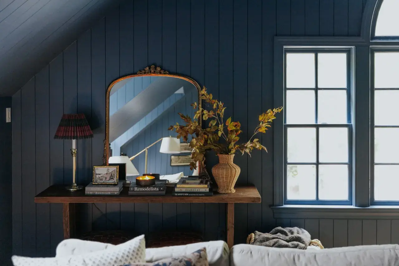
A styling formula that keeps the surface balanced
When I style a console, I think in layers. The easiest version is simple: one tall anchor, one medium-height piece, and one low object that has a practical job. A vignette is just a small, intentional grouping of objects, and this is where the whole table starts to feel designed rather than decorated by accident.
- Anchor the back with a mirror or artwork so the wall feels finished.
- Add height with a lamp, tall vase, or branch arrangement.
- Ground the front with a tray, bowl, or a short stack of books.
- Use one organic element such as foliage, ceramic, stone, or wood to stop the display feeling stiff.
- Leave breathing room so negative space can do its job.
Negative space is simply the empty room around the objects, and it is what keeps the composition from looking crowded. On a narrow table, three well-chosen pieces are often enough; on a wider one, five is usually my limit before the surface starts to feel overworked. The next step is deciding how that formula should change from room to room.
Room-specific arrangements that feel natural in a real home
In a hallway
In a hallway, I keep the setup practical and calm. A round mirror, a small tray for keys, and one lamp with a linen shade usually do more good than a dozen decorative items, especially in a narrow space where people are constantly passing through. If the hall is dark, I prefer warm light and reflective surfaces, but not so many shiny finishes that the area starts to feel cold.
In a living room
In a living room, the table can behave more like a display ledge. I like a stack of books, a sculptural object, and either a lamp or a framed print, depending on how the wall is laid out. If the console sits behind a sofa, I keep the height visually linked to the sofa back so the two pieces feel like part of the same composition rather than two unrelated objects forced into the room.
Read Also: Rug Guide - Choose the Perfect Rug for Your UK Home
In a narrow landing or corridor
For a landing or corridor, restraint usually wins. One strong object, such as a mirror or a tall vase, is often enough, and I would use the lower shelf for a woven basket rather than for more decorative clutter. In these tighter areas, the table should solve storage and soften the wall at the same time, not add another obstacle.
The real difference between these setups is not style alone; it is function. Once the room’s job is clear, the materials and colours become much easier to choose, which is where the look starts to feel current rather than generic.
Materials and colours that feel current without dating quickly
If I want a console display to feel right in 2026, I lean towards warmer, more tactile materials. Reclaimed wood and FSC-certified timber are strong choices because they bring texture and usually age better than glossy, overly processed finishes. I also like ceramic, recycled glass, stone, brushed brass, and linen shades, partly for the look and partly because they give the arrangement a quieter, lower-impact feel.
- Warm wood and cream for a soft hallway that feels inviting rather than stark.
- Walnut and brass for a richer look that still feels timeless.
- Painted timber in green or clay for a more characterful, less expected finish.
- Oak, stone, and black metal for a cleaner scheme that still has depth.
I also think lighting deserves more attention than it gets. A warm bulb in the 2700K-3000K range usually flatters wood and stone far better than a harsh cool-white bulb, especially in a UK hallway where daylight can be limited for much of the day. If the lamp shade is natural linen or paper, the whole arrangement tends to feel softer immediately. The remaining problem is usually not taste, but a handful of avoidable styling mistakes.
The mistakes that make console styling feel accidental
- Choosing decor that is too small for the width of the table, which makes the whole setup look timid.
- Using objects of the same height, which removes the vertical rhythm that makes a display feel finished.
- Filling every inch of the surface instead of letting a little space stay empty.
- Hanging the mirror or art too high, which breaks the connection between the wall and the table.
- Mixing too many finishes, so the console feels like a sample board rather than a home.
- Ignoring traffic flow, especially in a hallway where the piece still has to be lived with every day.
When a table feels off, I nearly always check scale first. If the console is only 90 cm wide, two medium-sized pieces will usually look better than six tiny ones, because the eye reads confidence more easily than accumulation. Once those mistakes are out of the way, it becomes much easier to create a setup that feels deliberate from the start.
A practical arrangement I would use first in a typical British hallway
If I were starting from scratch, I would choose a slim oak or walnut console, ideally second-hand or made from responsibly sourced timber, because that gives the room warmth without excess. Above it, I would hang a round mirror that is roughly two-thirds the width of the table, then place a small lamp with a linen shade on one side and a ceramic bowl or tray on the other. A single book stack or a recycled-glass vase with one stem is usually enough to finish the surface.
If the console has a lower shelf, I would keep it almost empty and use one woven basket for gloves, scarves, or spare charging cables. That approach keeps the piece useful without making it look like storage is being hidden in plain sight. When I keep the palette to three materials at most, the whole arrangement feels calmer, more refined, and easier to maintain over time.
That is usually the sweet spot for a hallway or living room console: enough structure to look thoughtful, enough restraint to stay practical. If the table feels balanced, the wall behind it will look finished, and the space around it will still be easy to live in.