The current wave of popular kitchen cabinet colors is less about stark contrast and more about warmth, texture, and longevity. My read of the strongest schemes in 2026 is that soft neutrals, earthy greens, richer blues, and timber-led finishes are taking over from the flat grey-and-white look. In this piece, I’ll break down what is trending in the UK, how to choose the right shade for your room, and how to update cabinets in a way that feels smarter and more sustainable.
What matters most when choosing a cabinet colour right now
- Warm neutrals, sage and olive, deep blues, walnut tones, and muted earthy shades are the most useful directions in 2026.
- Grey and white are not gone, but they work best when softened with texture, warmer undertones, or a two-tone scheme.
- In UK kitchens, daylight, floor colour, and worktop material matter as much as the paint sample.
- Two-tone layouts and low-sheen finishes help a colour feel current without making the kitchen look trendy for the wrong reasons.
- Repainting or refacing cabinets is often the most sustainable update when the existing carcasses are still sound.
The colours shaping UK kitchens in 2026
The current direction is clear: cabinets are being asked to do more than look clean. They need to feel warmer, work with natural materials, and sit comfortably in real daylight, which is why the market is moving toward tones that borrow from stone, clay, wood, and weathered paint.
Houzz UK trend data still puts grey ahead, but the gap is narrowing as green cabinetry and medium wood gain ground. That tells me the shift is not toward louder kitchens, but toward rooms that feel calmer, more tactile, and less borrowed from a showroom.
| Colour family | Why it works now | Best used in | Watch out for |
|---|---|---|---|
| Warm white and cream | Softens daylight and keeps compact kitchens open without feeling clinical | Smaller rooms, north-facing spaces, Shaker schemes | Too much yellow in the undertone can look tired or buttery |
| Mushroom and taupe | Sits neatly between beige and grey, so it feels current but not fragile | Quiet, pared-back kitchens with stone or timber finishes | Can go pink or muddy if the floor has a strong undertone |
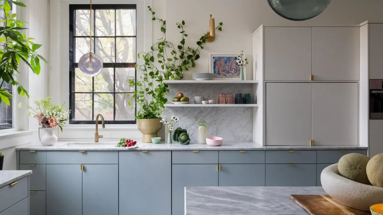
| Sage and olive | Brings in the natural, modern-organic mood without shouting | Family kitchens, islands, doors paired with oak | Very blue-green sages can feel cold in low light |
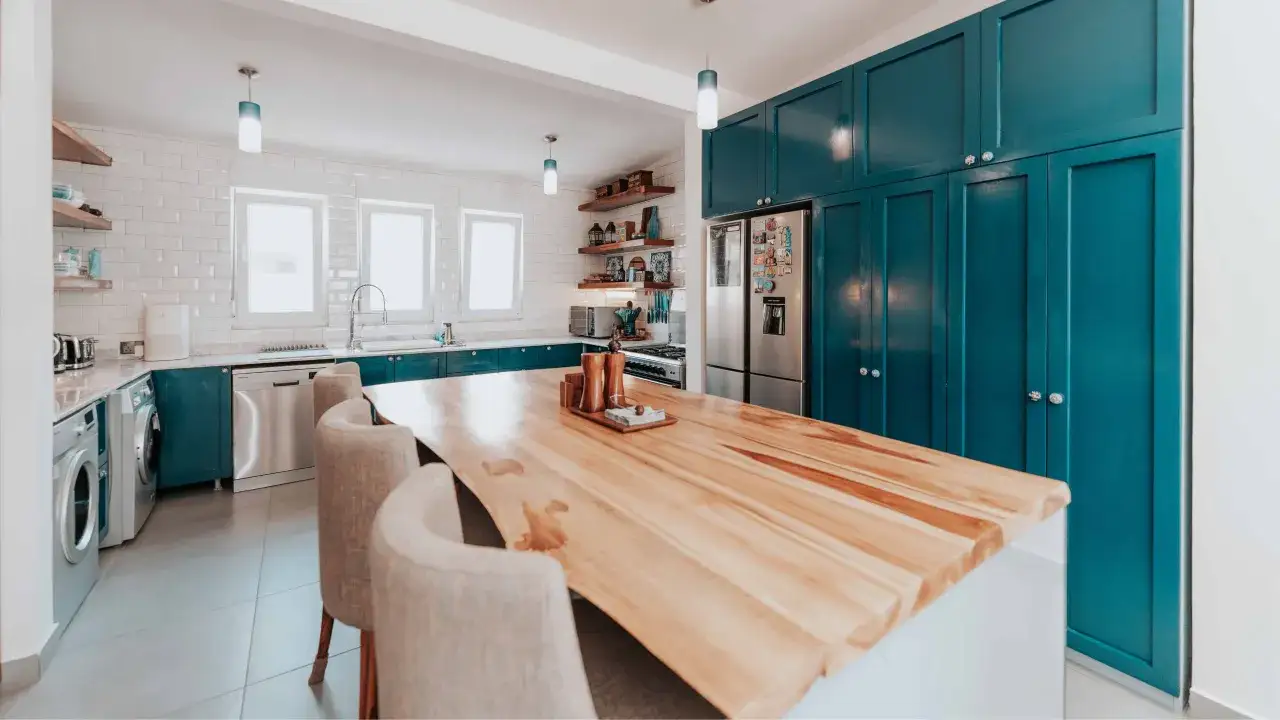
| Deep navy and inky blue | Adds depth and makes joinery feel more tailored | Base units, islands, larger kitchens with good daylight | Can overwhelm narrow layouts if used everywhere |
| Walnut and medium wood | Feels grounded, textured, and quietly luxurious | Tall runs, open-plan spaces, kitchens that need warmth | Too many different grains in one room can look busy |
| Charcoal and soft black | Looks architectural and crisp when the layout is clean | Modern schemes, statement islands, well-lit kitchens | Absorbs light and shows dust more readily than mid-tones |
| Dusty blue and muted teal | Gives colour without the commitment of a saturated shade | Pantries, lower units, heritage-influenced kitchens | Brighter blues date faster than softened, greyed versions |
| Clay and muted terracotta | Brings warmth and character, especially in rooms with natural textures | Islands, lower cabinets, schemes with warm stone or wood | Needs enough light to avoid feeling heavy |
If I had to reduce the trend to one principle, it would be this: choose a colour that looks as if it belongs to the room’s materials, not one that is fighting them. That rule becomes much easier to apply once you look at light, layout, and the finishes you already have.
How to choose a colour that suits the room, not just the trend
I never pick a cabinet colour from a swatch sheet alone. The same shade can look elegant in a bright showroom and strangely heavy in a narrow UK kitchen, so I always check the room’s light, floor, worktop, and paint sheen before I decide.
Start with the light the room actually gets
North-facing kitchens usually suit warm whites, mushroom, sage, and soft clay because they stop the room feeling cold. South-facing spaces can carry deeper navy, charcoal, or walnut more easily because the natural light gives the colour enough lift.
If you are unsure, compare the sample at breakfast, at dusk, and after the kitchen lights are on. A colour that still feels calm at all three moments is usually the right one.
Let the fixed finishes do some of the work
Cabinet colour should respond to the floor, worktop, splashback, and even the metal on the tap. A busy quartz pattern wants quieter doors; a plain oak floor can handle more depth. I like to think of the cabinets as the connector that makes the materials read as one scheme.
Read Also: Galley Kitchen Design - Maximize Space & Efficiency
Choose the sheen as carefully as the shade
On kitchen doors, a low-sheen satin or eggshell finish usually gives the best balance of wipeability and softness. Ultra-matte can be beautiful, but in a cooking space it needs more care, while high gloss can feel sharper than many UK homes actually want.
A good sample board should be large enough to read like a door, not like a postage stamp. Once that piece of the puzzle is right, the next question is how to combine colours without making the room feel busy.
Two-tone schemes that look current without trying too hard
Two-tone cabinetry is one of the easiest ways to use colour without overcommitting. I use it when a kitchen needs depth, but I still want the overall scheme to stay liveable and easy to update later.
| Pairing | Why it works | Best for |
|---|---|---|
| Warm white uppers with sage lowers | Keeps the eye line light while giving the room colour at the base | Smaller kitchens and period homes |
| Mushroom cabinets with a walnut island | Feels layered, calm, and quietly high-end | Open-plan kitchens that need warmth |
| Cream perimeter units with a navy island | Creates contrast without making the whole room dark | Medium to large kitchens with good daylight |
| Taupe base units with a soft-black pantry wall | Adds structure and a sharper architectural edge | Contemporary kitchens with simple lines |
A useful rule of thumb is to let the stronger colour cover no more than about a quarter to a third of the cabinetry unless the room is unusually bright and simple. That keeps the contrast intentional rather than shouty, and it also gives you more flexibility if you change the worktop or flooring later.
Brass, bronze, and blackened steel all work here, but I prefer the hardware to echo the cabinet tone rather than compete with it. Once the colour pairing feels balanced, sustainability becomes the next practical decision.
A more sustainable refresh is often the smarter move
If the cabinet boxes are solid, I would think hard before replacing the entire kitchen. Repainting, refacing, or replacing just the doors usually saves material, reduces disruption, and gives you more control over the final finish.
- Repaint if the carcass and door fronts are structurally sound and you mainly want a visual reset.
- Reface if the layout works but the door profile looks dated or too damaged for paint alone.
- Replace only the doors and plinths if the kitchen is functional but the style no longer matches the room.
- Keep visible timber if the grain is attractive, because a well-finished wood surface can age better than a trend-driven colour.
- Choose water-based, low-VOC paint, which means a coating with lower levels of volatile organic compounds and usually less odour and fewer solvent emissions.
The most sustainable cabinet update is usually the one that reuses the most structure and changes only what the room truly needs. That leads naturally to the shades I would be careful with if the goal is to keep the kitchen looking good for years.
Colours I would treat carefully if you want longevity
Not every popular shade deserves equal confidence. Some colours look great in photos or short bursts of trend coverage, but they demand the right light, the right hardware, and the right amount of restraint.
| Shade | Why it can age poorly | How to make it work better |
|---|---|---|
| Cool grey | Can feel flat or chilly in lower-light kitchens | Warm it with oak, stone, and softer metal finishes |
| Pure white | Shows marks easily and can read sterile under bright lighting | Choose a broken white or cream instead |
| Jet black | Absorbs light and makes fingerprints more visible | Use it on an island or tall run rather than every cabinet |
| Very bright yellow or green | Strong personality is harder to live with over time | Keep it to a smaller area or a more muted version of the tone |
I am not saying these colours should be avoided outright. I am saying they need better editing: warmer metal, more texture, or a smaller footprint on islands and tall units rather than across every door in the room.
That is why, when clients ask me for a colour that will still feel sensible after the novelty wears off, I usually steer them back to a palette that does not rely on shock value. The safest options are not boring; they are simply easier to live with.
What I would choose for a kitchen that still feels right in five years
If I were designing for a typical UK home today, I would start with one of three directions. A warm white or mushroom kitchen works beautifully in smaller rooms, sage or olive feels balanced in family kitchens, and walnut or deep navy gives larger spaces the weight they need.
- For a compact kitchen, choose warm white doors with oak or stone accents.
- For a medium kitchen, pair mushroom perimeter units with a sage island.
- For an open-plan room, use walnut or navy on the island and keep the rest lighter.
The best cabinet colour is the one that supports the room rather than performs for it. When the shade, light, and materials all agree, the kitchen looks calmer on day one and still makes sense long after the trend cycle moves on.