Getting the height right above a console table is mostly a matter of proportion. The frame should feel connected to the furniture, not float above it, and the spacing matters even more in UK homes where hallways and living areas are often compact. In the sections below, I’ll show the starting measurement I use, how I adjust it for table height and artwork size, and the styling choices that keep the whole arrangement calm and balanced.
A 15 to 20 cm gap is the most reliable starting point
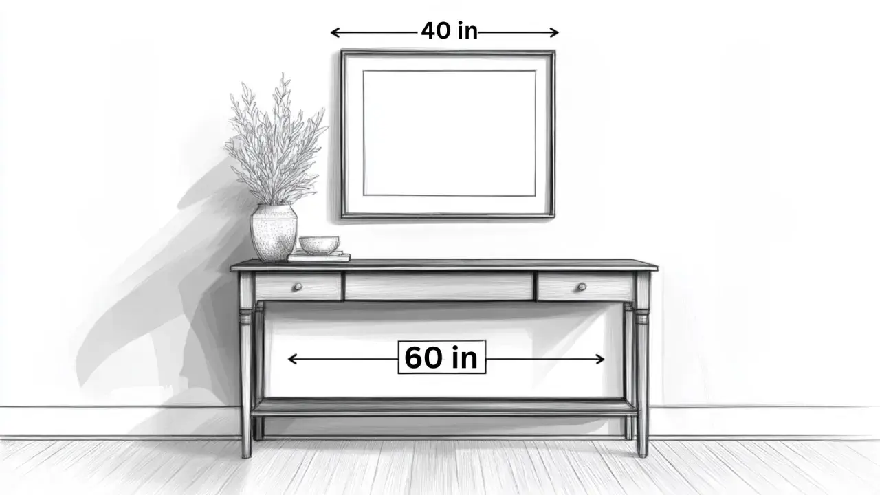
- 15 to 20 cm between the top of the console and the bottom of the artwork suits most rooms.
- If the console is styled with a lamp, vase, or stacked books, measure from the tallest object instead of the tabletop.
- Large artwork can sit a little closer to the furniture; small artwork usually needs better scaling, not more empty wall.
- Many console tables sit around 71 to 81 cm high, so a gap that looks fine on paper can feel too high in real life if the table is already tall.
- Think in terms of visual connection first, then use eye level as a check rather than the only rule.
Start with the gap that works in most homes
I usually begin with 15 to 20 cm (about 6 to 8 in) between the top of the console and the bottom edge of the artwork. That range gives the wall enough breathing room without making the art feel separate from the table below it. If the piece is especially large or visually heavy, I often stay closer to 15 cm; if the room feels a touch dense, I let it rise nearer 20 cm.
The one exception is a console that already carries tall decor. In that case, the real starting point is the highest object on the surface, not the tabletop itself. A vase with branches, a table lamp, or even a stacked display of books can change the measurement enough that the art needs to sit a little higher to avoid collision. Once you accept that, the rest becomes much easier to judge by eye.
For a blank wall with no furniture below it, the centre of the artwork often sits around 145 to 152 cm from the floor. Over a console, I treat that as a useful check, but not the main rule, because the furniture relationship is what keeps the composition grounded. That shift in priority is what prevents the wall from looking like it belongs to a different room.
Once that first gap feels sensible, the next question is whether the console itself is asking for a slightly different measurement.
Let the console height and the art size do the rest
Console tables vary more than people expect. In practice, many sit around 71 to 81 cm high, but some are lower, especially in slim entryways, and some are deliberately taller for a more architectural look. The taller the table, the more careful you need to be: if the art is hung too high above an already tall console, the whole setup starts to feel fractured.
| Situation | Good starting point | Why it works |
|---|---|---|
| Standard console with medium artwork | 15 to 20 cm above the console top | Keeps the wall and furniture visually joined without crowding the frame. |
| Taller console, around 76 to 81 cm | 10 to 15 cm, then step back and check the balance | Prevents the artwork from drifting too far up the wall. |
| Small artwork above a wide console | Keep the gap tight, but improve the scale of the art or add a second piece | The problem is usually scale, not spacing. |
| Console styled with a lamp or tall vase | Measure from the tallest object, often 20 to 30 cm above it | The decor becomes part of the composition instead of a visual interruption. |
| Oversized frame or mirror | 10 to 15 cm can be enough | Large pieces have enough weight to sit closer and still feel deliberate. |
If I want a quick calculation, I do it in three moves. First, I note the height of the console. Second, I add the bottom-edge gap I want, usually 15 to 20 cm. Third, I check whether the centre of the piece still feels comfortable from a normal standing position. That last step matters, because the eye does not care whether the maths looks neat if the result feels awkward in the room.
Width matters too. A useful rule of thumb is to make the artwork, or the full grouping, feel roughly two-thirds as wide as the console. That proportion stops the art from looking undersized on a long surface. If the console is especially narrow, I would rather choose one stronger piece than force a large gap around a tiny frame.
With the basic numbers in place, the next layer is the composition itself, because single pieces, pairs, and layered arrangements all behave differently.
Different layouts need different spacing
The same height rule does not suit every arrangement. A single artwork can sit slightly closer to the furniture because its shape is easy for the eye to read, while a pair or triptych needs the pieces to function as one block. When the composition becomes fragmented, the wall starts to feel busier than it should.
One oversized piece
A large canvas, print, or mirror often looks best with a tighter gap of around 10 to 15 cm. Its scale gives the wall enough structure, so it does not need to hover higher just to look important. In fact, oversized art usually looks better a little lower than people expect because the furniture below it suddenly feels intentional rather than dwarfed.
A pair or triptych
For two or three pieces, I treat the whole grouping as one unit. The lowest edge of the arrangement should still relate to the console, but the internal spacing between frames matters too. I usually aim for a consistent gap of about 5 to 8 cm between pieces, then make sure the whole set sits low enough to stay connected to the table. This is where a laser level earns its keep, because small misalignments become obvious once the frames are on the wall.
Read Also: Console Table Styling - Get It Right Every Time!
A relaxed leaned arrangement
Leaning art against the wall creates a softer, less formal look, and it can be very effective above a console. The setup can sit a touch lower because the leaning posture already signals ease. I like this approach in rooms that lean natural or sustainable in tone, where a few well-made pieces, rather than a polished display of many objects, create a calmer result. It also has a practical advantage: fewer holes, fewer mistakes, and less repainting later.
Once the structure is right, the final polish comes from how the console is styled underneath it.
Style the console so the wall and table read as one
The most convincing console arrangements usually follow a simple visual triangle: one taller object, one medium object, and one lower object. That might be a lamp, a ceramic bowl, and a stack of books; or a mirror, a tray, and a vase. The idea is not to fill the table, but to create a gentle upward movement that leads into the art above it.
- Use one taller element to anchor the side of the console, then keep the opposite side lower so the display does not feel top-heavy.
- Repeat one material or colour once or twice, such as oak, linen, ceramic, or recycled glass, so the arrangement feels deliberate.
- Leave some negative space on the surface. A calm, edited console almost always looks better than one that has been layered to exhaustion.
- If you are buying new pieces, choose durable, honest materials that age well instead of decor you will replace in six months.
That last point matters more than it sounds. A well-chosen frame in FSC wood, reclaimed timber, or recycled metal can quietly support the whole scheme without adding visual noise. For a site that cares about smart design and sustainable furnishing, this is the sweet spot: fewer objects, better materials, and a wall arrangement that feels composed rather than temporary.
When the styling is right, the height usually becomes easier to judge, because the eye reads the whole vignette as a single composition. The next step is avoiding the mistakes that break that connection.
The mistakes that make a console wall feel off
The most common error is hanging the art too high because the person installing it is thinking about the wall instead of the furniture. That leaves a strip of dead space between the console and the frame, and the room immediately feels less settled. In most cases, lowering the art by just a few centimetres fixes the problem better than changing anything else.
- Using only eye level as the rule - Eye level is useful, but above furniture it can be misleading if it ignores the table height and the decor on top.
- Leaving more than 25 to 30 cm - Once the gap grows too large, the art starts to float instead of relating to the console.
- Choosing art that is too narrow - A small piece over a wide table often looks accidental, not minimal.
- Forgetting the items on the console - A tall lamp or vase changes the visual starting point, so measure the composition, not just the furniture.
- Hanging everything at the same height - A little variation in object height is what gives the arrangement depth and keeps it from looking flat.
If I had to name the most stubborn mistake, it would be trying to make a small frame work simply by hanging it higher. That rarely solves the problem. A better fix is usually a larger piece, a second frame, or a more edited tabletop display that gives the art room to breathe.
Once those traps are out of the way, you can do one last check before drilling any holes.
The quickest check before you make the holes
Before I commit to the wall, I step back and ask a few simple questions. Does the bottom of the frame sit about 15 to 20 cm above the console, or above the tallest decor on it? Does the width of the artwork feel proportionate to the table, rather than undersized or overbearing? And does the whole setup still look connected when I view it from the doorway or from across the room?
- Console top to frame bottom: aim for 15 to 20 cm in most cases.
- Tall decor on the console: measure from the highest object, not the wood top.
- Frame width: try for about two-thirds of the console width, or a grouping with similar visual weight.
- Room view: step back several metres and check whether the art and furniture read as one composition.
- If the result feels floaty, lower it by a few centimetres; if it feels cramped, simplify the table before moving the art higher.
That is usually enough to get the placement right on the first try. In a UK home, especially where hallways are narrow and surfaces work hard, I would rather see art that sits slightly lower and feels joined to the console than a piece that hangs high with a strip of empty wall beneath it.