
The essentials at a glance
- New Orleans interiors blend French, Spanish, Caribbean and Victorian influences, so the look is layered rather than rigid.
- The strongest signals are tall proportions, ironwork, plaster detail, French doors, antique wood and dramatic lighting.
- In a UK home, the style works best when you borrow the mood, not every architectural feature.
- Sustainable choices fit naturally: reclaimed wood, vintage furniture, repaired lighting and low-VOC finishes.
- The main risk is turning the room into a themed set, so I favour restraint, repetition and good scale.
What the New Orleans interior design style is really made of
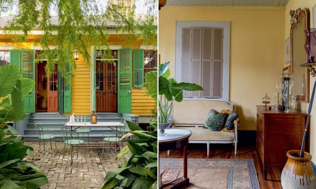
I read this style as a meeting point between architecture, climate and cultural layering. The City of New Orleans describes Creole architecture as a blend of French, Spanish and Caribbean influences shaped by local conditions, and that is still the clearest way to understand the interiors today. Nothing about the look is accidental: rooms are meant to feel gracious, ventilated, collected and slightly formal, but never stiff.
That matters because the style is often flattened into a few decorative clichés. In reality, the strongest New Orleans rooms are not built from novelty pieces; they are built from proportion, texture and repetition. If you get those right, the room reads as authentic even when the architecture itself is modest.
Historic layers matter more than a single theme
One room may borrow from Creole, another from Victorian grandeur, another from the easier elegance of a shotgun house. That mix is part of the appeal. I would never force everything into one strict period, because the city’s interiors have always been more conversational than that.
The climate shaped the look
The hot, humid environment encouraged tall openings, shutters, cross-ventilation and shaded transitions between inside and outside. Even in a modern home, that lesson still applies: light, airflow and visual breathing room make the style feel believable.
Once you understand that the style is functional as well as decorative, the architectural details start to make sense.
The architectural details I would prioritise first
If I could only borrow a few elements, I would start with the bones of the room. Tall windows, French doors, transoms, deep mouldings, plaster medallions and iron detailing do more for the atmosphere than a room full of themed accessories ever will. New Orleans.com’s architectural guide is useful here because it shows how Creole cottages, shotgun houses and double-gallery homes rely on strong proportions and practical openings, not just decoration.
| Feature | What it does | UK-friendly version | Common mistake |
|---|---|---|---|
| Tall openings | Make the room feel airy and generous | Full-height curtains, vertical art, slim mirrors | Using short curtains that cut the wall in half |
| Ironwork | Adds graphic contrast and a sense of history | Blackened steel, wrought-iron mirrors, side tables or stair details | Overusing ornate iron on every surface |
| Plaster and mouldings | Gives the room depth and a finished feel | Ceiling roses, cornicing, picture rails, layered trim | Going too wide or too fussy in a small room |
| French doors and glazed panels | Bring in light and soften the boundary between rooms | Glazed internal doors or sympathetic door inserts | Replacing everything with heavy solid doors |
| Antique wood | Introduces warmth and patina | Reclaimed oak, old pine, restored sideboards | Mixing too many wood tones without a plan |
My rule is simple: choose two or three strong architectural signals and let them carry the room. If you add every possible flourish, the effect stops feeling elegant and starts feeling crowded. Once those bones are in place, colour and furniture do the rest.
Colours, finishes and furniture that feel right
The palette should feel sun-faded, not sugary. I reach for warm whites, stone, tobacco, moss, deep navy, bottle green, oxblood, black iron and the kind of brass that has softened over time. Bright, glossy colours can work, but only if they are balanced by quieter surfaces and a little visual rest.
What I would use on the walls
Matte or softly chalky finishes usually work better than high gloss because they absorb light instead of bouncing it around. If you want a more traditional New Orleans feel, a subtle plaster effect or limewashed wall can add depth without becoming theatrical. Pattern is fine too, but I would keep it controlled: one wallpapered wall, not every vertical surface.
The furniture should look collected, not matched
I prefer carved wood, cane, marble-topped tables, tufted seating, linen upholstery and one or two pieces with a stronger silhouette. The point is not to fill the room with antiques; the point is to make the room feel as if it has been assembled over time. A single gilded mirror or crystal chandelier can carry a lot of visual weight if the rest of the room is quieter.
Read Also: Traditional Rustic Interior Design - Get the Look Right
Lighting does more work than people expect
A good chandelier is useful here, but scale matters. In a dining room, one statement fitting can be enough; in a sitting room, I would layer it with lamps and wall lights so the room feels warm after dark. If a chandelier is too large or too ornate for the ceiling height, it dominates the room instead of anchoring it.
When the colour palette, furniture and lighting are working together, the look becomes much easier to adapt to a British house.
How to adapt it in a British home without losing the mood
Most homes in the UK do not have the scale of a Garden District townhouse, so the aim is translation, not imitation. I would not try to recreate a New Orleans façade indoors. Instead, I would borrow the sense of height, contrast and lived-in formality that makes the style feel so distinctive in the first place.
That approach matters even more in terraces, flats and listed properties, where structural changes may be limited. In those cases, reversible updates usually do the best job: good curtains, layered lighting, restored doors, better trim and a few carefully chosen vintage pieces can shift the mood without crossing the line into pastiche.
| New Orleans cue | What it contributes | British adaptation | Best used when |
|---|---|---|---|
| High ceilings | Drama and openness | Hang curtains high and keep furniture visually light | The room feels cramped or boxy |
| French doors | Elegance and light flow | Use glazed internal doors or tall glass panels | You want more daylight between rooms |
| Cast-iron balconies | Graphic detail and contrast | Choose blackened steel accents, mirrors or shelving | You need a darker line to balance pale walls |
| Plaster ornament | Softens the architecture | Add a ceiling rose, narrow cornice or picture rail | The room feels flat or unfinished |
| Patinated antiques | Age and character | Use reclaimed or second-hand furniture with visible grain | The room needs warmth and texture |
There is also a practical British twist to consider: our light is often cooler and more uneven, so warmer neutrals and layered lamps help the style feel less stark. That is where sustainability stops being an add-on and becomes part of the design logic.
Sustainable choices that suit the look
This is one of the easiest historical styles to make more sustainable, because patina is already part of its appeal. I would rather see a repaired antique than a factory-made replica with fake distressing. The style rewards age, repair and material honesty, which means second-hand sourcing fits naturally instead of feeling forced.
- Buy second-hand first and look for solid wood, brass, iron and stone that can be cleaned or refinished.
- Reupholster instead of replacing when the frame is good; linen, wool and cotton blends work particularly well.
- Choose low-VOC paints and finishes if you are refreshing mouldings, walls or cabinetry.
- Repair metalwork and lighting rather than discarding it, especially when the shape is already right.
- Use fewer, better pieces so the room feels intentional instead of over-furnished.
Once you build with reuse in mind, the next problem is not what to add, but what to leave out.
Where this style goes wrong
The most common mistake is over-illustrating the idea. A fleur-de-lis on every cushion, a chandelier in every room and a heavy antique in every corner can make the house feel like a set rather than a home. I’m much more convinced by one or two strong gestures than by a pile of decorative references.
- Avoid theme overload. One iron accent and one antique mirror are often enough.
- Do not ignore scale. Large decorative pieces need breathing room, especially in smaller UK rooms.
- Do not mix too many historic voices. If the room already has ornate mouldings, keep the furniture calmer.
- Do not make everything dark. The style needs contrast, not a blackout effect.
- Do not fake age badly. Better a simple, well-made piece than a worn-looking imitation.
When the room goes wrong, it is usually because the decoration is doing the job that architecture and proportion should have done. Once you strip away the noise, the style becomes much easier to control.
What I would specify today for a believable version
If I were building this look from scratch, I would keep it disciplined. I would choose one statement light, one or two antique woods, one iron detail, one patterned element and a generous amount of visual quiet around them. That is enough to create atmosphere without pushing the room into costume territory.
- Keep the layered feel, the warmth and the sense of history.
- Change the scale so it suits a British room, not a New Orleans mansion.
- Skip anything too literal, too shiny or too themed.
A room in this style should feel collected over time, a little formal at first glance, and comfortable once you sit down. If you let the architecture, materiality and lighting do most of the work, the result feels believable, sustainable and far more interesting than a pasted-on “look.”