The room should feel settled, not themed
- Start with a traditional base: balanced furniture, simple symmetry, and classic silhouettes.
- Add rustic character through texture, not through too many decorative motifs.
- Use warm, muted colours that work in British light, especially in smaller or north-facing rooms.
- Choose reclaimed, vintage, or repairable pieces where possible to keep the room authentic and lower-waste.
- Limit the number of finishes in each room so the space feels calm rather than busy.
What gives the style its balance
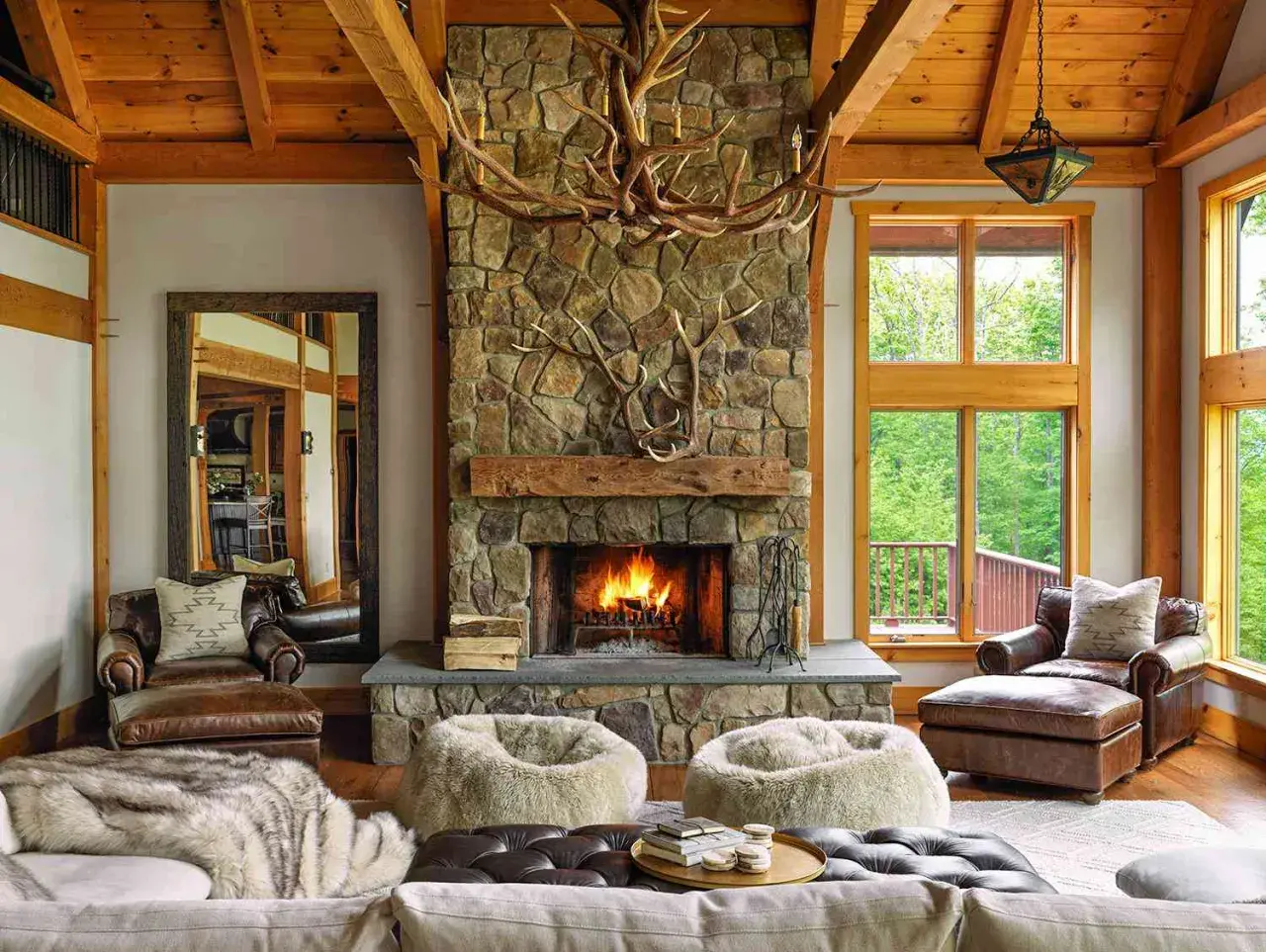
I think this style succeeds when it behaves like a good conversation between two different moods. The traditional side brings structure: symmetry, familiar furniture shapes, panel moulding, and a sense that the room has been thought through. The rustic side relaxes that discipline with grain, patina, rougher textures, and pieces that look touched by time rather than manufactured for perfection.
That balance matters because too much tradition can feel formal and stiff, while too much rustic detail can slip into theme-park country decor. The sweet spot is somewhere in the middle, where the room feels comfortable but still composed. I often describe it as a space with good manners and a little roughness at the edges.
| Design layer | Traditional leaning | Rustic leaning | Best blended choice |
|---|---|---|---|
| Furniture | Upholstered, tailored, classic proportions | Solid, sturdy, visibly worked by hand | Clean-lined pieces in oak, ash, or walnut with a softened finish |
| Colour | Muted neutrals, heritage blues, warm creams | Earth tones, clay, moss, weathered timber | Warm white walls with one or two grounded accents |
| Surface | Painted, polished, or detailed | Textured, matte, aged, imperfect | Mostly calm finishes, plus one or two tactile focal points |
| Layout | Orderly, balanced, often symmetrical | Looser, collected over time | Structured layout with relaxed layering |
| Accessories | Classic lamps, framed art, tailored cushions | Pottery, woven baskets, hand-thrown ceramics | A restrained mix that feels personal, not curated for show |
Once that balance is clear, choosing materials becomes much easier, because the room starts to tell you what it needs and what it should leave out.
The materials and colours that do the heavy lifting
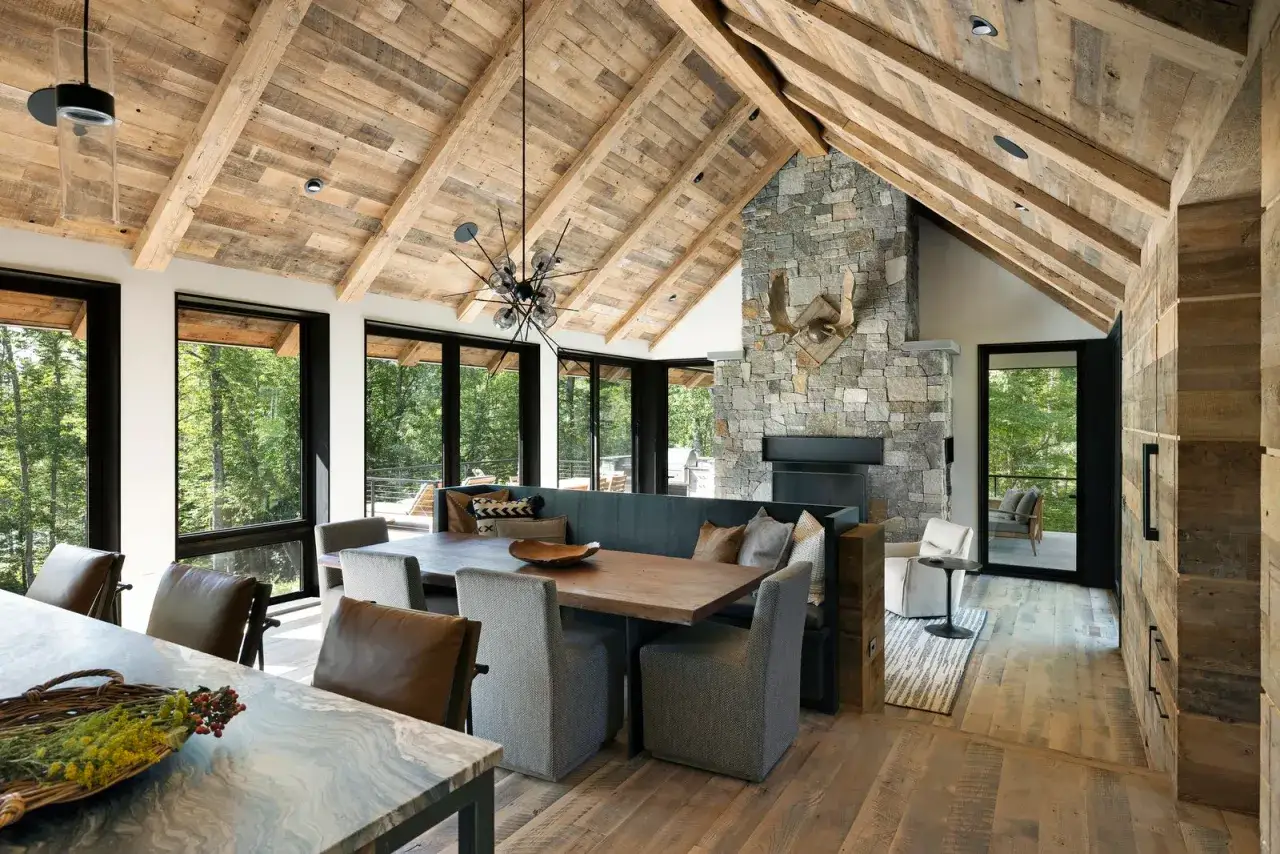
The material palette is where the whole scheme either feels believable or falls apart. In practice, I rely on wood, stone, wool, linen, clay, and aged metal before I think about decorative accessories. Those surfaces do the emotional work of the room: they make it feel grounded, lived in, and visually warmer without forcing the issue.
Wood should not look over-processed. Reclaimed timber, brushed oak, and oiled finishes usually work better than high-gloss varnish because they hold light softly and allow the grain to show. Stone, whether it appears in flooring, a fireplace surround, or a kitchen worktop, adds weight and permanence. If you want a softer version of stone, limewash can help. It is a mineral wall finish that leaves a chalky, subtly varied surface, and it pairs well with older houses and newer rooms that need texture.
For colour, I would stay near warm white, putty, mushroom, taupe, clay, olive, muted navy, and smoke grey. Those shades respect natural light rather than fighting it. In many UK homes, especially terraces and semi-detached houses, that matters more than people realise. A north-facing room usually needs a warmer white to stop it feeling cold, while a south-facing room can take deeper tones without losing lift.
Finish also matters. I would generally choose matt or eggshell paint, brushed metal, woven fabric, and lightly textured ceramics over polished chrome and glossy lacquer. Strong contrast can work, but too many reflective surfaces make rustic rooms feel confused. With this style, restraint usually looks more expensive than excess.
With the core palette set, the next question is how to distribute it across real rooms without making every space look identical.
How I would layer it room by room
The easiest way to lose this style is to apply the same formula everywhere. A living room, kitchen, and bedroom all need a different ratio of structure to softness. If I were planning a whole home, I would treat each space as a variation on the same language rather than a copy of the same sentence.
| Room | What to anchor first | What adds warmth | What to avoid |
|---|---|---|---|
| Living room | A well-proportioned sofa, timber coffee table, and a classic rug shape | Wool throws, linen cushions, a lamp with a ceramic or aged metal base | Too many small rustic objects fighting for attention |
| Kitchen | Simple cabinetry, ideally with shaker lines or another restrained profile | Oak shelving, stone or wood worktops, handmade-looking ceramics | Overly distressed finishes that make the kitchen feel tired instead of timeless |
| Bedroom | An upholstered or timber bed with calm proportions | Linen bedding, a vintage chest, soft curtains, a woven shade | Heavy ornament and too many dark surfaces |
| Hallway | A narrow console or bench, plus one clear focal mirror | Runner rugs, baskets, hooks, and framed art with breathing room | Cramped styling that blocks circulation |
| Dining room | A solid table with enough visual weight to hold the space | Mixed chairs, a pendant in natural material, and one antique piece | A full matching set that feels too coordinated |
I especially like this approach in smaller UK homes, because it stops the style from becoming heavy. You do not need beams, flagstone, and a fireplace in every room. In many cases, one strong rustic anchor per space is enough. That might be a reclaimed table in the kitchen, an oak chest in the bedroom, or a stone mantle in the sitting room. The room reads as rustic without shouting about it.
The final layer is the one many people miss: choosing pieces that are not just visually suitable, but also durable and responsible.
Sustainable choices that fit the look naturally
This is where the style aligns beautifully with sustainable furnishing. I would much rather see one repaired oak table, a reupholstered chair, or a vintage sideboard than a room full of disposable lookalikes pretending to be old. The rustic side of the aesthetic already values age, wear, and repair, so sustainability is not an add-on here. It belongs inside the style.
Good starting points include reclaimed timber, FSC-certified wood, vintage furniture, natural fibres, and finishes with lower chemical load. FSC-certified timber means the wood comes from responsibly managed forests, which makes it a more considered choice when you are buying new. For textiles, wool, linen, cotton, jute, and sisal usually suit the look better than synthetic fabrics because they soften the room without looking synthetic. Low-VOC paint is also worth considering; it releases fewer volatile organic compounds, which is a practical benefit as well as a design one.
There is one caveat: reclaimed does not automatically mean suitable. I always check the condition, treatment, and structural stability of salvaged pieces before I build them into a room. A beautiful old board with movement, damage, or unresolved staining can become expensive trouble. The same is true for antique furniture that looks charming but is too fragile for daily use. Sustainability works best when it is honest about what can actually perform.
When the material choices are right, the main threat is not poor taste but over-decoration, and that is the next problem to solve.
Mistakes that make the room feel heavy or fake
What usually ruins this look is not a single bad object but a pattern of overdoing the same idea. The style has enough character on its own; it does not need reinforcement at every turn.
- Too much distressing makes everything look pre-aged in an artificial way. One or two worn pieces are enough.
- Matching rustic sets flatten the room. A dining table, chairs, and sideboard that all look bought together can drain the personality from the space.
- Overused farmhouse symbols such as over-the-top signage, fake enamelware, or decorative barn motifs can make the scheme feel dated fast.
- Poor scale is a common problem in UK homes. Oversized rustic furniture can overwhelm a terrace or compact sitting room.
- Dark finishes without enough light can create a gloomy result. If the room is naturally dim, I would lean lighter on walls and heavier only in accents.
- Too many textures at once turns warmth into noise. The room needs contrast, not competition.
There is also a subtle mistake that people overlook: ignoring negative space. Negative space is simply the open area around objects, and it is what lets the eye rest. If every surface is full, even excellent furniture starts to look chaotic. That is why I prefer to leave some wall space, clear tabletop edges, and a few quiet corners.
Once you know what not to do, the best next step is to spend energy on the few decisions that shape the room for years rather than weeks.
What I would prioritise first if I were designing this kind of room
If I were building a room from scratch, I would start with the things that hold visual weight: flooring, walls, one major furniture anchor, and the main source of light. Those elements set the tone before the softer pieces ever arrive. A strong base does more for this style than a pile of decorative objects ever will.
After that, I would choose one dominant timber tone, one textile family, and one metal finish, then keep repeating them with small variations. That kind of discipline makes a room feel intentional. It also makes shopping easier, because every new object has to earn its place against a clear brief rather than against vague taste.
For most homes, especially in the UK, the safest and most rewarding path is not to copy a rustic image exactly. It is to borrow the feeling: calm proportions, real materials, a few pieces with history, and enough restraint for the room to breathe. That is what lets the style age well instead of dating itself.
When the mix is handled with that level of care, the result feels both classic and liveable, which is exactly why this approach keeps working in real homes rather than just in mood boards.