
The quickest way to narrow the right cabinet colour
- Warm whites, mushroom tones, sage, deep blue, charcoal and natural oak are the most reliable contemporary directions.
- Finish matters almost as much as hue: matt and soft-satin surfaces usually look more current than highly reflective ones.
- North-facing or low-light UK kitchens usually need warmer, softer colours to avoid a cold cast.
- Two-tone schemes work best when one colour stays light and the other brings depth.
- Cabinet colour should always be judged beside the worktop, floor and hardware, not in isolation.
- Repainting or refacing sound cabinets is often the most sustainable way to get a new look.
What makes a cabinet colour feel modern now
I usually start by asking what the room needs to do at 8am and again at 8pm. A cabinet colour feels modern when it looks calm in weak daylight, still has depth under artificial light, and does not fight the worktop or floor. That is why the strongest contemporary schemes are less about novelty and more about restraint, warmth and a clear contrast story.
In practice, that means avoiding anything too stark, too icy or too heavily saturated unless the rest of the kitchen is deliberately quiet. A simple door profile, a matt or soft-satin finish, and one clear undertone usually read more current than a flashy colour with nowhere to land. Once you know that, the palette becomes much easier to narrow, and the next step is choosing the right family of colours to sample.
The colour families I would shortlist first
If I had to build a shortlist for a contemporary kitchen today, I would start with shades that can flex with different worktops, floors and hardware. These colours are popular for a reason: they are easy to live with, but they still have enough personality to stop a kitchen from feeling bland.
| Colour family | Why it works | Best for | Watch-outs |
|---|---|---|---|
| Warm white and ivory | Bright without looking clinical, especially beside timber or stone | Smaller kitchens, period homes, schemes that need more light | Cool undertones can turn flat in north-facing rooms |
| Mushroom, greige and putty | Soft, quiet and adaptable, with more depth than plain white | Open-plan kitchens, minimalist layouts, family homes | Needs the right balance of warmth or it can feel muddy |
| Sage and olive | Brings colour without shouting, and sits naturally with wood | Modern rustic kitchens, calm family spaces, dining-led layouts | Very pale sages can look washed out if the light is poor |
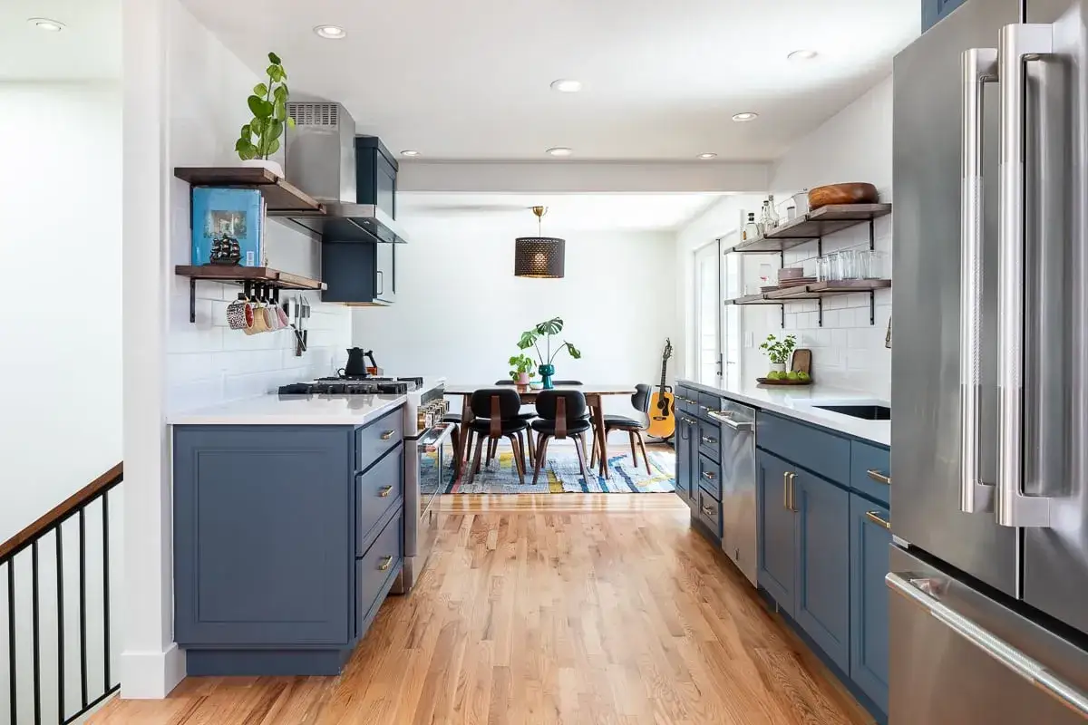
| Deep blue and inky tones | Creates structure and contrast without feeling harsh | Larger kitchens, island units, schemes with pale worktops | Needs enough light so it does not feel heavy |
| Charcoal and soft black | Feels architectural and disciplined, especially in a simple layout | Handleless kitchens, urban spaces, strong contemporary designs | Shows dust and fingerprints more clearly on glossy finishes |
| Natural oak and soft wood tones | Warm, tactile and quietly modern when the grain is clean | Scandi-inspired kitchens, sustainable updates, open-plan rooms | Very orange woods can date quickly if the tone is wrong |
| Muted clay and terracotta | Adds warmth and personality without becoming overly decorative | Kitchens that need a softer, lived-in feel | Best in controlled doses if the room already has strong colour |
For me, the real trick is not just picking a beautiful colour, but picking one that still makes sense next to the rest of the room when the light changes. That is where the space itself begins to matter just as much as the shade, so I look at layout and daylight before I commit.
How to choose the right shade for your light and layout
Two kitchens can look completely different in the same colour because the light is different. In a UK home, that matters more than people expect, especially in north-facing rooms, narrow galley kitchens and open-plan spaces that pick up reflections from living areas or gardens.
| Your room | What I would choose | Why | What I would avoid |
|---|---|---|---|
| North-facing or low-light kitchen | Warm white, mushroom, pale greige, soft sage, light oak | These tones keep the room from turning bluish or flat | Cool white, icy grey and blue-based neutrals |
| Small galley kitchen | Light warm neutrals or a low-contrast two-tone scheme | They keep the space feeling open without making it sterile | Very dark all-over colours unless the lighting is excellent |
| Large open-plan kitchen-diner | Olive, navy, charcoal, clay or a grounded two-tone mix | The room can handle more depth and more visual presence | Too many competing shades in the same sightline |
| Busy family kitchen | Mid-tone greens, greiges, oak and soft black accents | These usually hide everyday wear better than pure white | Ultra-gloss finishes if fingerprints will annoy you |
| Period house with a modern update | Muted heritage colours with a simple door profile | They sit more comfortably beside original features | Harsh, cold palettes that ignore the character of the house |
I usually narrow the choice to three samples at most, then move them around the room for a full day. I want to see them beside the actual worktop, under the pendant lights and in the evening, not just in perfect daylight. That habit removes a lot of guesswork and makes the next decision far easier: how the cabinets should relate to the rest of the kitchen.
Pairing cabinets with worktops, splashbacks, floors and metal finishes
Cabinet colour rarely fails on its own; it fails when the undertones clash. A creamy white beside a cool blue-veined quartz can look slightly off, while the same white with oak and brushed brass feels easy and intentional. I always compare the cabinet sample next to the actual worktop, floor sample and handle finish before I call a scheme finished.
| Cabinet colour | Best partners | Overall effect |
|---|---|---|
| Warm white | Oak, pale stone, brushed brass, soft linen tones | Calm, bright and quietly elegant |
| Sage or olive | White quartz, timber, aged brass, matte black accents | Natural and contemporary without feeling forced |
| Deep blue | Marble-look quartz, nickel, pale oak, satin chrome | Crisper and more architectural |
| Charcoal or soft black | Warm oak, pale stone, stainless steel, bronze details | Strong but still balanced |
| Muted clay or terracotta | Cream stone, smoked oak, blackened metal, sand tones | Warmer, softer and more tactile |
The most reliable rule is simple: if the cabinet colour is calm, let the worktop add texture; if the cabinet colour is strong, keep the other surfaces quieter. That balance keeps a kitchen from feeling busy, and it also opens the door to better material choices and a more sustainable approach.
Finishes and materials that keep the look contemporary and sustainable
If the carcasses are sound, I would rather update the doors and colour than throw away a whole kitchen. A repaint, a refacing project or a new door set can deliver the same visual shift with less waste, and it usually leaves more budget for the details people actually notice: hinges, handles and lighting. In that sense, sustainable design is not just about ethics; it often produces calmer, better-made rooms.
- Choose low-VOC paints or coatings. Low-VOC means the finish releases fewer volatile organic compounds, which is better for indoor air.
- Repaint or reface sound cabinets instead of replacing the entire structure when the box is still solid.
- Look for FSC-certified timber or responsible veneer where wood is involved.
- Pick a finish you can clean with mild detergent and a soft cloth, not harsh chemicals.
- Use matt or soft-satin surfaces if you want a contemporary look; reserve high gloss for very deliberate, ultra-minimal schemes.
Finish matters because it changes how light lands on the colour. A soft satin can make a muted green feel richer, while a dead-flat matt can make a dark colour feel expensive but slightly more absorbent of light. That trade-off is worth understanding before you buy, and it is easy to miss if you only look at a tiny sample. Once that is clear, the last thing to watch is the set of mistakes that can undo a good palette.
Mistakes that make a modern scheme feel dated too quickly
The most common mistake I see is choosing a colour as if it exists in isolation. In reality, the cabinet front sits between flooring, splashback, worktop, handles and daylight, so even a good shade can look wrong if those elements pull in different directions. The fix is usually not a bolder colour; it is a cleaner relationship between the parts.
- Using cool grey in a north-facing kitchen and wondering why it feels flat.
- Matching every surface too closely, which removes depth and makes the kitchen look one-dimensional.
- Ignoring undertones in quartz, stone or wood.
- Testing a sample only under showroom lighting.
- Choosing a trendy strong colour without checking how it behaves at night.
- Picking hardware last and discovering the metal finish fights the cabinetry.
My practical workaround is simple: view samples in morning light, afternoon light and with the kitchen lights on, then reduce the options until the room feels quiet rather than crowded. Once those mistakes are out of the way, the shortlist becomes much easier to read and much easier to trust.
The palette I would sample first in a typical UK kitchen
If I were starting from scratch in a typical UK kitchen, I would sample a warm white, a mushroom greige, a muted sage, a deep blue and a natural oak tone. That set covers the widest range of room conditions without drifting into anything too safe or too theatrical, and it gives you a real sense of where your own taste sits.
- Warm white for smaller rooms or kitchens with limited daylight.
- Mushroom or greige for a soft, long-lasting backdrop that works with most worktops.
- Muted sage for colour that still feels calm and linked to natural materials.
- Deep blue or charcoal for open-plan spaces that can handle more contrast.
- Natural oak for a warmer, lower-waste look with a modern edge.
My rule is to choose the shade that still feels right when the room is busy, imperfect and lit by ceiling lights rather than perfect daylight. If the cabinet colour can survive that moment, it is probably the right one for the kitchen, the dining area and the way you actually live in them.