A well-planned combined kitchen and dining space changes how a home feels day to day. It needs to handle cooking mess, family traffic, conversation, and storage without looking overworked. This guide focuses on the layout decisions, zoning tricks, light, acoustics, and material choices that make kitchen and dining room design practical rather than decorative.
The best kitchen-diner plans feel calm, flexible, and easy to live with
- Start with the room shape and the way you actually use it, not with the island first.
- Keep main walkways generous; 900 mm is a useful minimum, while 1,000 to 1,200 mm feels better in daily use.
- Use zoning through lighting, flooring, and furniture so the room still reads as one space.
- Closed storage, integrated appliances, and one or two strong finishes usually beat a busy mix of open shelves and decorative extras.
- Choose durable, repairable, and low-toxicity materials if you want the room to age well.
Start with the layout that fits the room and the household
When I plan a shared cooking-and-eating space, I begin with the floorplan rather than the mood board. In most UK homes, the best choice depends on three things: the shape of the room, how many people cook at once, and whether the dining table is a daily fixture or an occasional one.
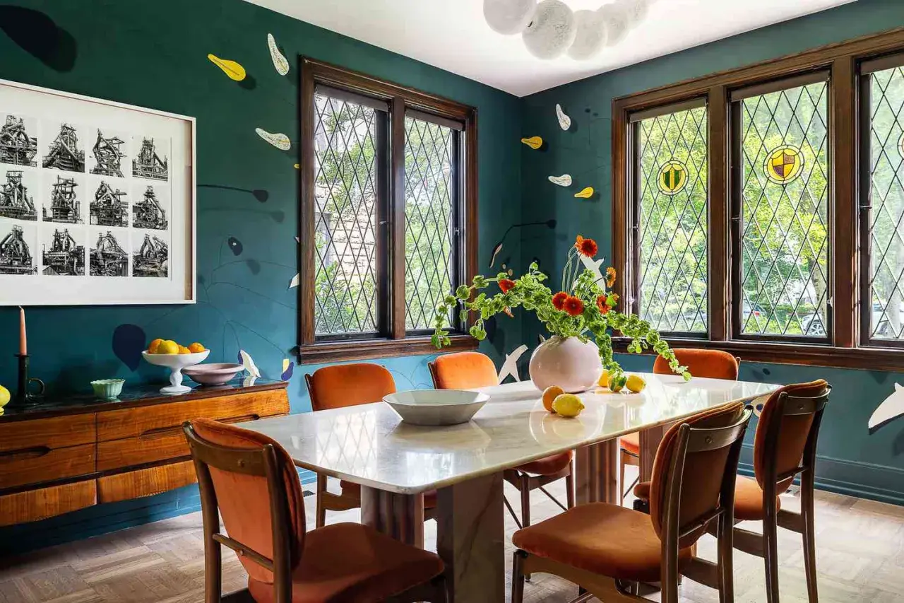
A full island is attractive, but it is not automatically the right answer. In a narrower terrace or a modest semi, a peninsula, banquette, or simple table-led layout often works better because it protects circulation and leaves the room feeling lighter. A bigger room can support a more assertive arrangement, but only if the dining zone still has enough breathing space around it.
| Layout | Best for | Why it works | What to watch |
|---|---|---|---|
| L-shape with a dining table | Small to medium rooms | Keeps the cooking area efficient and leaves the table as a natural social anchor | Can feel cramped if the table is oversized or pushed too close to the run of units |
| Peninsula layout | UK homes with limited width | Creates a useful prep surface and a gentle boundary without needing island clearance on all sides | Needs careful positioning or it becomes a bottleneck |
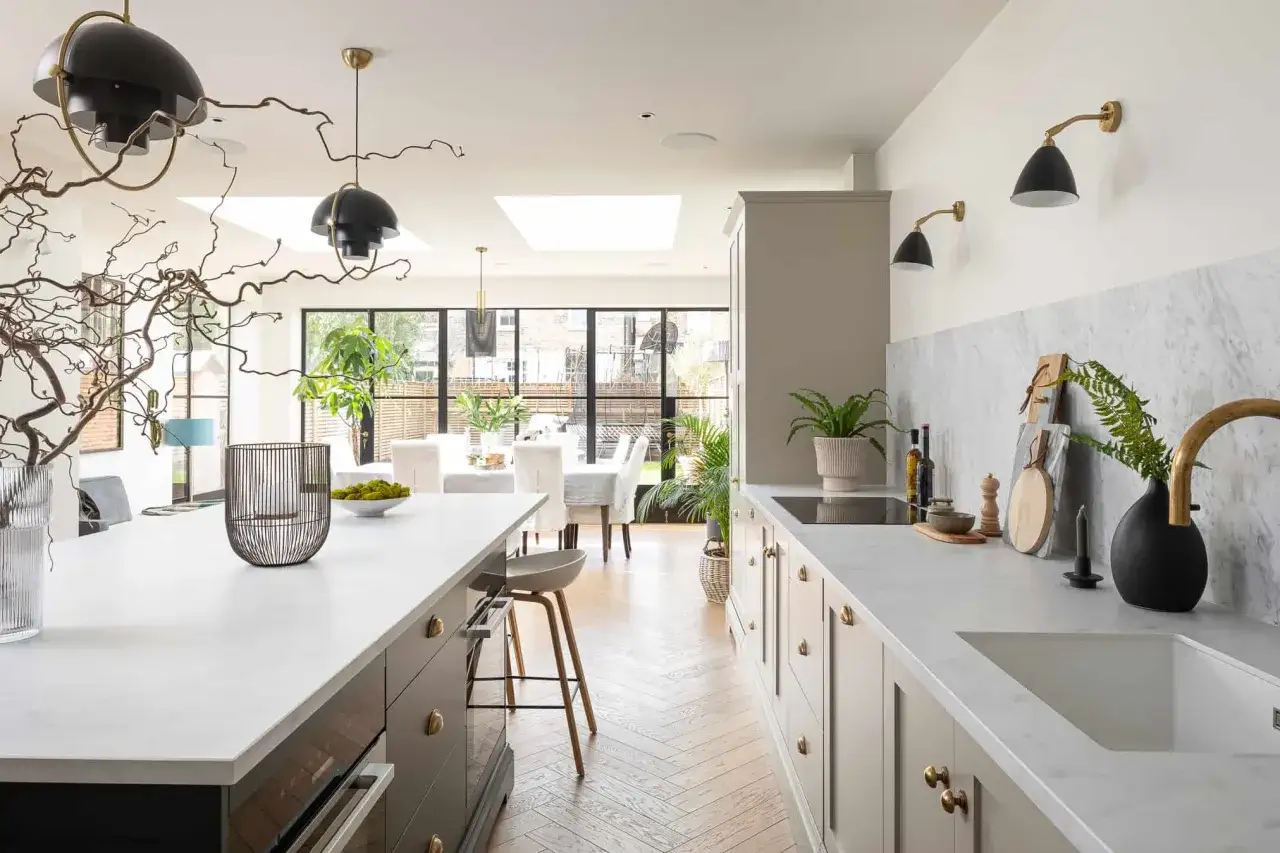
| Island plus dining table | Larger, open rooms | Separates cooking and eating clearly while keeping the room sociable | Only works if there is enough circulation on every side |
| Broken-plan with a low divider or glazed screen | Homes that want openness with more control | Softens noise, smells, and visual clutter while preserving light and connection | Costs more than a simple open arrangement |
If the room is awkwardly long, I usually try to avoid forcing symmetry. A strong cooking run at one end and a more relaxed dining zone at the other often feels more believable than trying to make both halves behave the same way. Once the footprint is right, the next step is making the zones feel intentional rather than improvised.
Use zoning to separate cooking, eating, and everyday clutter
Zoning is what keeps a shared room from feeling like a showroom with a stove in it. The aim is not to divide the space into neat boxes; it is to give each function a visual cue so the eye understands what belongs where. That makes the room easier to use and calmer to look at.
Use more than one type of boundary
I prefer a mix of subtle cues rather than a single dramatic divider. A change in flooring direction, a pendant above the table, or a sideboard behind the dining chairs can do more than a wall ever would in a compact room. The strongest schemes usually repeat one material or colour across both zones, then shift the scale or texture to signal a change in use.
- Flooring can define the kitchen edge with a practical surface while keeping the dining side warmer underfoot.
- Lighting can create a visual “ceiling” over the table without closing the room.
- Furniture such as a banquette, sideboard, or peninsula can mark a transition without blocking light.
- Colour depth can separate zones gently, especially if the kitchen is slightly deeper or moodier than the dining area.
Keep the dining side honest
The dining area often becomes the catch-all for post, laptops, school bags, and everything else that has no home. If you want the room to stay elegant, build in a place for that clutter before it appears. A shallow console, drawer unit, or concealed bench storage is more useful than another decorative object.
Once the room has clear boundaries, the real test begins: can people move through it without having to sidestep chairs, bins, or appliance doors? That is where circulation matters most.
Make circulation generous enough for real life
Good flow is one of the least glamorous parts of the job, and one of the most important. A room can look beautiful on paper and still fail if the fridge door clashes with a chair, or if two people cannot pass each other while dinner is being made. I aim for the room to feel easy before I think about styling it.
| Area | Practical target | Why it matters |
|---|---|---|
| Main walkway | 900 mm minimum, 1,000 to 1,200 mm preferred | Lets one or two people pass comfortably without turning the room into an obstacle course |
| Space behind dining chairs | 900 mm if the route is occasional, more if it is used daily | Allows someone to sit or stand without bumping into the wall or another piece of furniture |
| Island clearance | 1,000 mm on the tight side, 1,200 mm or more on the working side | Gives enough room for drawers, appliances, and moving around the prep area |
| Door and appliance swings | Check every opening in the plan, not just the walkways | Prevents the common mistake of designing a route that looks fine until the dishwasher opens |
In smaller homes, I would rather see a slightly smaller table or a banquette than a too-large island that steals the circulation route. The same applies to dining chairs: if the room needs flexibility, a bench on one side often works harder than four loose chairs. After the movement through the room feels right, the next question is where everything lives when it is not being used.
Choose storage and surfaces that keep the room visually calm
Open shelves can be attractive, but in a combined kitchen-diner they are easy to overdo. The dining side is constantly in view, so visual clutter spreads fast. That is why I usually prioritise closed storage, deep drawers, and one or two well-placed display areas instead of filling every wall with objects.
What deserves to disappear? Small appliances, bins, pet items, charging cables, spare candles, medication, homework bits, and everything else that tends to breed on a counter. What deserves to stay visible? A handful of pieces with real character: a ceramic bowl, a strong lamp, perhaps a small stack of books or a vase.
- Deep drawers are better than shallow cupboards for plates, pans, and everyday serving pieces.
- Appliance garages keep coffee machines and toasters from taking over the main worktop.
- Banquette seating with storage is especially useful in smaller UK homes where every centimetre counts.
- Freestanding furniture can soften a fitted kitchen and make the room feel more collected, but only if it is still purposeful.
- Integrated bins and recycling matter more than most people expect because they reduce the daily mess that ruins a good view from the table.
For surfaces, I prefer finishes that look good even when the room is being used, not only after it has been tidied for guests. Satin or matt cabinet fronts hide fingerprints better than high gloss, and durable worktops usually age more gracefully than fragile statement materials. Once the visual noise is under control, light and sound become the next things you notice.
Get lighting and acoustics right before you worry about accessories
A kitchen-diner can look polished and still feel wrong if the lighting is harsh or the acoustics are chaotic. This is the point where many schemes fail: the room has all the right furniture, but it still feels cold at night or echoey during a meal. I treat light and sound as part of the architecture, not the decoration.
Layer the light
Task lighting should make chopping, washing, and cooking easy. Ambient lighting should stop the room from becoming cave-like after dark. Accent lighting should create atmosphere, especially around the dining table and any shelving or artwork. For most homes, warm-white LEDs in the 2,700K to 3,000K range feel more forgiving than a stark cool light, and dimmers are worth the small extra spend.
If you are hanging pendants above a dining table, I usually work around 700 to 800 mm above the tabletop, adjusting for ceiling height and sightlines. Too high and the lights lose intimacy; too low and they get in the way. That balance matters more than choosing the most fashionable fitting.
Read Also: Kitchen Styling Guide - Create a Calm, Functional Space
Soften the sound
Hard surfaces bounce sound around the room, which is why open schemes can feel noisier than they look. Upholstered dining chairs, curtains, a rug under the table, timber furniture, or even acoustic wall panels can make a real difference. If the room also hosts homework or laptop use, the reduction in echo is not a luxury; it is what makes the space bearable for long stretches.
Extraction matters here too. In a combined room, I would rather spend more on better extraction than on another decorative feature, because cooking smells and lingering steam are what quickly make an open space feel tired. With light and acoustics handled, you can choose materials that support the room long term instead of dating it quickly.
Choose sustainable materials that age well rather than just looking green
Sustainability is most convincing when it changes the way a room is built, bought, and maintained. The greenest-looking option is not always the best one. I care more about durability, repairability, and responsible sourcing than about a label that only sounds good in a brochure.
| Choice | Why it helps | Trade-off |
|---|---|---|
| FSC- or PEFC-certified timber | Supports more responsible forest management and usually gives a warmer, more natural finish | Can cost more than basic mass-market alternatives |
| Reclaimed wood or stone | Reduces demand for new extraction and adds character that does not feel mass-produced | Needs careful grading, sealing, and matching |
| Low-VOC paints and finishes | Helps improve indoor air quality and reduces harsh odours during and after decorating | The colour range may be slightly narrower in some product lines |
| Linoleum, cork, or other repairable flooring | Comfortable underfoot and often easier to maintain over time than brittle surfaces | Needs correct installation and sensible care |
| Modular joinery with replaceable fronts | Makes future repairs and refreshes simpler, which extends the useful life of the kitchen | Can feel less bespoke unless it is thoughtfully detailed |
| LED lighting and efficient appliances | Lowers running costs and reduces unnecessary heat in the room | The up-front price can be higher |
The important idea here is embodied carbon, which is the impact created before a product even reaches your home. A piece that lasts longer, can be repaired, and does not need replacing every few years is usually the smarter environmental choice. In practice, that means choosing fewer, better finishes and resisting the temptation to overcomplicate the scheme. Once you see that, the most common design mistakes become much easier to avoid.
Avoid the mistakes that make the room feel smaller than it is
The most expensive mistake is usually not the wrong cabinet colour; it is a layout that keeps fighting the household. I see the same problems repeat in combined spaces, and most of them are avoidable if the plan is checked honestly before anything is ordered.
- An oversized island that swallows circulation and turns the room into a squeeze point.
- Too many finishes competing with each other, which makes the room feel restless and smaller.
- Not enough closed storage, so the dining area becomes a dumping ground for daily life.
- Ignoring appliance doors, especially dishwashers, fridges, and ovens that swing into the main route.
- Forgetting smell and noise control, which makes an open room far less pleasant than it looked on the plan.
- Designing for photographs instead of weekday use, which is usually how beautiful rooms become annoying rooms.
My rule is simple: if a design only works when the table is styled and the counters are clear, it is not finished yet. The plan should already feel usable with a mug on the counter, a backpack by the door, and someone cooking at the same time. That test is what separates a good room from a fragile one.
The decisions I would lock in first on a real project
If I were starting from scratch, I would make the decisions in this order: layout, circulation, storage, lighting, then finishes. That sequence prevents the common trap of choosing pretty details before the room has a workable backbone. It also keeps the budget under control, because structural and joinery choices usually shape the biggest costs.
For a light refresh in the UK, I would expect roughly £5,000 to £15,000. A mid-range rework with new cabinetry, flooring, lighting, and some electrical changes often lands around £15,000 to £35,000. Once walls move, services shift, or a room becomes part of an extension, the figure can rise beyond £35,000 very quickly.
Before committing, I would tape the island or table outline on the floor, walk the routes at different times of day, and stand in the dining position to check what the room looks like from eye level. If that quick test feels comfortable, the design is probably close. If it feels tight, noisy, or overly busy, the plan still needs work.