Kitchen styling works best when it does more than make a room look attractive. I use it as a way to shape how the kitchen feels day to day: calmer, easier to use, and more in tune with the home itself. In this guide, I focus on the practical decisions that matter most in a British kitchen, from visual direction and materials to lighting, storage, and the small details that stop the space from feeling unfinished.
The key decisions that shape a better kitchen
- Start with the room’s structure. Style only works when layout, circulation, and sightlines are already doing their job.
- Pick one clear visual direction. Warm minimalism, modern organic finishes, classic shaker details, or a stronger colour-led scheme all work if you do not mix too many at once.
- Use no more than three main materials. That keeps the room grounded and avoids a cluttered, over-designed look.
- Layer the lighting. A good kitchen needs ambient, task, and accent light, not one ceiling fitting doing all the work.
- Make storage part of the design. Open shelves, trays, rails, and pantry organisation should look deliberate, not improvised.
- Edit the room hard. The most polished kitchens usually have fewer visible objects, not more.
What kitchen styling changes before you buy anything
I usually start with the room itself, because the best-looking kitchen is rarely the one with the most accessories. It is the one where the layout feels logical, the surfaces are not fighting each other, and the eye knows where to rest. That matters even more in British homes, where a kitchen may have to balance period character, family life, and cooking space in one room.
Good styling changes three things at once. First, it gives the room a visual hierarchy, so the eye moves from the main features to the smaller details in a natural order. Second, it reduces visual noise by limiting competing colours, finishes, and objects. Third, it makes the kitchen feel lived in rather than staged, which is the difference between a room that photographs well and a room that actually works.
I think of it as a sequence: structure, surfaces, then accents. If you reverse that order, you end up decorating around problems instead of solving them. Once that is clear, the choice of style becomes much easier.
Choose a visual direction that suits the way you use the room
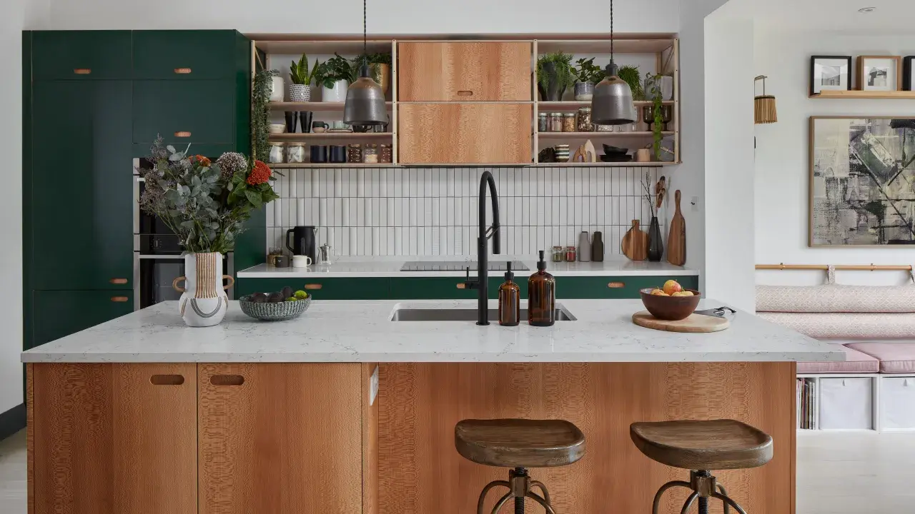
In 2026, the strongest kitchens feel warmer and more tactile than the stark white schemes that dominated for years. I would not chase a trend blindly, but I would pay attention to the direction behind it. The point is to choose a look that supports the way you cook, store, and gather, not just one that looks good in a mood board.
| Style direction | What it gives you | Best for | Watch out for |
|---|---|---|---|
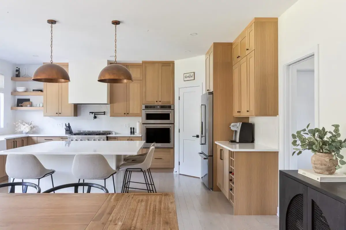
| Warm minimalism | Soft neutrals, pale oak, slim fronts, and a calm, uncluttered feel | Smaller kitchens and open-plan spaces that need visual breathing room | It can feel flat if you do not add texture through wood, stone, or lighting |
| Modern organic | Natural surfaces, curved forms, and a more tactile, grounded atmosphere | Homes that need warmth without losing a contemporary edge | Too many textures can make the room feel busy instead of relaxed |
| Classic shaker | Timeless lines, painted timber, and a look that feels familiar without being dull | Period properties and family kitchens that need longevity | It can look old-fashioned if the lighting, hardware, and worktop are not updated |
| Colour-led contemporary | Terracotta, navy, walnut, or deeper accents with a stronger personality | Larger rooms or kitchens that need one clear focal point | You need restraint elsewhere, or the scheme loses balance fast |
I usually tell people to commit to one dominant direction and one supporting one, not four at once. A kitchen that mixes too many moods often feels unresolved. If you want a practical rule, keep the main cabinets and worktops on the same visual side of the argument, then let the splashback, lighting, or hardware carry the accent.
That approach also makes the room easier to update later, which is useful if you want the space to age well rather than feel locked into one season of taste.
Build the scheme from materials and finishes that age well
The most convincing kitchens usually have a material palette that feels limited on purpose. I would keep the main scheme to three core materials at most: one for cabinetry, one for worktops or splashback, and one for the metal or timber accents. Once you go beyond that, the room often starts to look assembled rather than styled.
For a more sustainable approach, I favour materials that can age gracefully rather than ones that need replacing quickly. That means timber from responsible sources, veneer where it makes sense, recycled-content surfaces, and finishes that can handle daily wear without looking tired after two years.
- Timber and veneer add warmth and are especially effective in kitchens that need softness.
- Natural stone or stone-look surfaces create depth and work well when the room needs a more grounded focal point.
- Recycled glass, terrazzo, or high-recycled-content boards can bring texture while supporting a lower-waste approach.
- Painted cabinetry is one of the easiest ways to introduce a warmer tone without changing the whole room.
- Brushed metal hardware reads cleaner than overly decorative handles and is easier to live with long term.
I also like finishes that show some life. A kitchen that is too polished can feel cold, especially in natural daylight. Slight texture in the cabinetry, a matt or honed worktop, and a warm wood grain can do a lot of heavy lifting without any extra decoration.
If the room needs a refresh, this is usually where I would spend before I spend on ornamental pieces. The base layers matter more than the styling props that sit on top of them.
Let the lighting do some of the styling work
A lot of kitchens look flat because the lighting has been treated as an afterthought. That is a mistake I see constantly. Good lighting is not only about brightness; it also controls shadow, depth, and how materials actually read at different times of day.
I prefer to think in three layers. Ambient lighting gives the room its general level of light. Task lighting removes shadow from the worktop, hob, and sink. Accent lighting adds atmosphere and helps the room feel finished once the cooking stops. If one layer is missing, the whole scheme feels weaker.
- Ambient: ceiling or recessed lighting that makes the room usable.
- Task: under-cabinet strips or spots that light the working surface directly.
- Accent: pendants, shelf lights, or cabinet lighting that adds shape and mood.
For colour temperature, I usually stay around 2700K to 3000K if the kitchen needs to feel warm and inviting, then move slightly cooler only when the space is heavily task-led. Dimmable fittings are worth it in any kitchen that also functions as a dining or entertaining space, because one setting rarely suits every moment.
One practical detail people overlook is glare. A beautiful worktop can look harsh under the wrong light, and glossy finishes can become awkward at night. If the room feels visually noisy after dark, it is often the lighting, not the cabinetry, that needs fixing.
Make storage part of the decor instead of hiding it all away
Storage is one of the most underrated parts of kitchen styling, because it decides how much visual calm the room can sustain. The cleaner the storage system, the easier it is to style the room without creating clutter. That is why curated pantries and considered open shelving are still so effective: they make order visible.
I like a simple split between closed storage and display. Closed storage should handle the bulk of everyday items, cleaning products, and the things you do not want on show. Display areas should carry a small amount of character, not everything you own. The space between those two jobs is where the room starts to look intentional.
Open shelving works best when it is edited hard. I would group objects by material or colour, keep the stack heights varied, and leave some empty space so the shelf can breathe. The same applies to countertops. A tray with a few daily essentials looks considered; six loose bottles and three mismatched utensils do not.
- Keep everyday oils, salt, and chopping boards together on one tray.
- Store dry ingredients in matching jars if they are visible.
- Use baskets for awkward items that do not deserve display.
- Repeat one or two materials, such as wood and ceramic, to create cohesion.
- Limit decorative objects to pieces that also feel useful.
If the kitchen includes a dining nook, I would repeat one finish from the main kitchen in that area, even if it is only a chair leg, pendant, or linen runner. That link helps the room feel designed as one environment, not as two spaces awkwardly sharing a wall.
The mistakes that make a kitchen feel crowded rather than considered
Most kitchen mistakes are not dramatic. They are small decisions made too often. Too many finishes, too many objects on the worktop, and too little editing will make even a good kitchen feel restless. The room does not need more decoration; it needs clearer judgement.| Common mistake | Why it fails | What to do instead |
|---|---|---|
| Mixing too many metals | The eye keeps catching on different reflections and the room loses unity | Pick one primary metal and one secondary at most |
| Styling every surface | Counters start to look busy, even if the objects are beautiful | Leave larger clear zones so the room can breathe |
| Using accessories that are too small | Small pieces disappear and create visual clutter without adding impact | Choose fewer, slightly larger objects with more presence |
| Ignoring scale | Oversized pendants or tiny stools can throw the room off balance | Match accessory scale to the size of the room and island |
| Decorating only at eye level | The lower and upper parts of the room feel neglected | Balance worktops, shelves, window treatments, and lighting together |
My strongest rule is this: if a room already has a strong cabinet colour or a very textured worktop, the accessories should become quieter, not louder. Let one feature lead. The rest should support it.
That restraint is especially important in compact kitchens, where every extra finish reads more quickly than you expect. In a larger room, excess can look expensive for a while; in a smaller one, it just looks crowded.
A simple weekend refresh plan if you want quick results
If you want to improve the room without starting a renovation, I would work in a strict order. This keeps the changes practical and makes it easier to stop before you overdo it.
- Empty the worktops completely and return only the items you use daily.
- Decide on one dominant palette, then remove anything that interrupts it.
- Add one natural material, such as wood, linen, or ceramic, to soften the room.
- Upgrade the lighting where it matters most, especially over the worktop and sink.
- Group small objects on trays so they read as one arrangement rather than five loose items.
- Replace weak hardware, old tea towels, or tired storage containers if they are pulling the room down.
As a rough planning guide, I usually think about three spending tiers for a refresh. Under £250 can cover paint, textiles, containers, and a few small accessories. Around £250 to £1,000 is where lighting, taps, shelving, and a better splashback start to make sense. Above £1,000, you can begin changing the actual feel of the room with worktops, flooring, or cabinetry updates. The exact cost depends on brand, size, and whether you are hiring trades, but those bands are useful for deciding how ambitious the project should be.
If the budget is tight, I would rather see one strong change done properly than several half-measures. A single good pendant, a cleaner worktop, or a better paint colour often moves the room further than lots of low-impact purchases.
The details I keep for the final pass
The final stage is the one most people skip, yet it is where the room starts to feel complete. I look at the kitchen from the doorway, from the table, and from the sink, because each view shows a different kind of imbalance. If something feels off, it is usually because one area is too busy or one material is repeating too often.
My last pass is simple. I keep one or two decorative objects with presence, one practical tray near the cooking zone, and one natural element such as fresh herbs, a bowl of fruit, or a small branch in a vase. Then I remove anything that does not earn its place. That usually includes duplicate bottles, oversized packaging, and accessories that only look good in isolation.
If you want the kitchen to feel warm rather than curated to the point of stiffness, let it show a little real life. The best version of the room is not perfect symmetry or maximum decoration. It is a space that feels calm, usable, and quietly resolved every time you walk into it.