The fastest way to make a console table look finished is to balance function, height and restraint
- Begin with the table’s job: a hallway landing spot, a display surface, or both.
- Choose one anchor piece, usually a mirror or artwork, sized to roughly two-thirds of the table’s width.
- Mix tall, medium and low objects so the arrangement has movement without feeling crowded.
- Use natural, durable materials such as wood, ceramic, linen, glass, rattan and vintage metal.
- In narrow British hallways, keep at least 30 to 40 percent of the top clear for keys, bags or post.
Start with the table’s job
The easiest styling mistakes happen when people decorate the surface before deciding what the space needs. A console in a hallway is usually doing a different job from one behind a sofa or in a bedroom, so I always begin there. In a UK home, especially in a narrow hallway or a compact landing, a console table often has to carry keys, letters, a lamp and a mirror without blocking circulation.
If the table is purely decorative, you can lean into display pieces. If it is a landing zone, every object needs to earn its place. I usually keep the balance at about 60 percent style and 40 percent utility for a hallway console, and I go even more practical if the space is tight. That simple decision makes every later choice easier, from the size of the lamp to whether you need baskets underneath.
- For a hallway: prioritise a drop zone, mirror and one lighting source.
- For a living room: prioritise display, books and a stronger decorative focal point.
- For a bedroom: prioritise softness, personal objects and calmer layers.
Once the job is clear, the rest becomes a matter of scale and editing, which is where the anchor piece comes in.
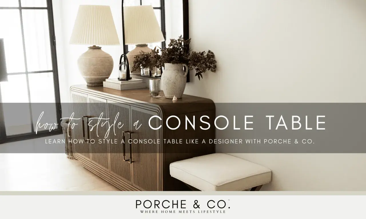
Choose one anchor and get the scale right
Almost every good console table arrangement starts with a strong anchor behind or above it. In practice, that usually means a mirror or a framed piece of art. A mirror is the safer choice when you want the room to feel brighter and larger; artwork is better when the wall needs more character and less reflection. In both cases, I like the anchor to feel visually contained by the table rather than floating too far above it.
A useful rule is to keep the mirror or artwork at about two-thirds of the console’s width. For a round mirror, I still look for that same overall visual weight. Leave roughly 15 to 20 cm between the tabletop and the bottom edge of the mirror so the arrangement feels connected, not crowded. If the wall is tall, a vertical mirror or taller artwork can work well, but the console still needs something on the surface to ground it.
| Anchor option | Best for | What it does | My view |
|---|---|---|---|
| Mirror | Narrow hallways, darker rooms, spaces that need light | Reflects daylight and makes the table feel part of the architecture | The most versatile choice if you want one arrangement to work hard |
| Artwork | Rooms that already have enough light or visual shine | Adds colour, mood and personality without extra reflection | Best when the rest of the room is calm and the wall needs a focal point |
| Pair of lamps | Long tables or spaces that need symmetry | Creates balance and useful task lighting | Very effective, but only if the table is wide enough to avoid a bulky look |
That anchor sets the scale for everything else. If the mirror is too small, the table looks unfinished; if it is too large, the surface starts to feel like an afterthought. Get this part right and the rest of the styling becomes much easier to edit.
Build a layered arrangement that looks edited, not crowded
Once the anchor is in place, I build the surface in layers. My preferred formula is simple: one tall piece, one medium piece, one low piece and one practical container. That gives the eye enough movement without turning the table into a display shelf. I aim for three to five objects on top in most homes, because the table itself needs breathing room to look intentional.
Height is what keeps the arrangement from looking flat. A tall ceramic vase with dried stems, a medium lamp, and a low bowl or stack of books is usually enough. If everything sits at the same level, the display loses tension and starts to resemble clutter rather than styling. I also like to vary texture within the same palette: smooth ceramic next to woven fibre, matte stone beside glass, or brushed metal against wood.
A reliable five-piece formula
- One anchor above the table, such as a mirror or artwork.
- One tall object, usually a vase, lamp or branch arrangement.
- One medium object, such as a stack of books or a framed photo.
- One low object, like a bowl, tray or candle.
- One functional item, such as a key tray or basket if the table is in a hallway.
What I would leave out
- Too many tiny ornaments that create visual noise.
- Matching sets that look bought all at once.
- Decor that is all the same height or all the same finish.
- Anything so large it blocks the use of the surface.
If the table still feels busy after that, remove one item. Almost every good console vignette improves when I edit it down by a single piece.
Match the styling to the room
The room changes the rules more than most people expect. A hallway console needs clarity and storage; a living room console can lean more decorative; a bedroom console can be softer and more personal. In UK homes, that distinction matters because so many hallways are narrow and many living spaces do double duty.
| Room | Best styling approach | Good pieces to use | What to avoid |
|---|---|---|---|
| Hallway | Practical, airy and easy to maintain | Mirror, lamp, tray, basket, one vase | Deep decor, oversized clusters and fragile clutter |
| Living room | More layered and expressive | Artwork, books, sculptural objects, candleholders | Pieces that compete with the sofa, rug or fireplace |
| Bedroom | Calmer and more intimate | Soft lamp, framed print, ceramic bowl, flowers or greenery | Overly bright metallics or too many strong contrasts |
| Landing or stair wall | Simple, vertical and light-enhancing | Round mirror, slim lamp, a pair of books, one natural accent | Heavy furniture that interrupts movement |
My own rule is straightforward: the more traffic the space gets, the fewer objects I use. That is why a hallway console often looks best with one mirror, one light and one storage piece. The room stays usable, and the styling still reads as deliberate.
Use materials that will still feel good next season
For 2026, I think the most convincing console table styling is less polished and more tactile. Warm wood, aged brass, ceramic, linen, recycled glass and woven baskets all feel more current than glossy, highly coordinated decor sets. That shift matters for sustainability too, because pieces made from natural or repairable materials tend to age better and stay in use longer.
If you want the arrangement to feel more responsible as well as more stylish, buy fewer items and choose them with more care. A reclaimed wood console, a vintage mirror, a second-hand ceramic lamp base and a woven storage basket will usually outlast a fully matched decorative set. I also prefer objects that can move with you from room to room, because versatility is one of the best forms of sustainable design.
- Good long-term materials: solid wood, stone, ceramic, rattan, linen, glass and brass with a softer finish.
- Better than disposable decor: vintage trays, framed art, inherited objects and handmade vessels.
- Worth avoiding if longevity matters: very glossy finishes, flimsy resin pieces and overly themed matching sets.
That approach also gives the table more character. The room stops looking staged and starts looking collected, which is usually the goal.
The 10-minute reset I use when the arrangement feels off
When a console table looks wrong and I cannot immediately see why, I strip it back and rebuild it in ten minutes. It is a fast way to fix proportion problems without buying anything new. Most of the time, the issue is not a lack of decor; it is too much decor, or too many objects competing at the same height.
- Remove everything from the table.
- Put back the anchor first.
- Add one tall item and one low item.
- Bring in one practical object if the table is in a hallway.
- Step back and check the view from the doorway, not just straight on.
- Leave some empty surface visible so the table can still breathe.
If I want the look to feel more relaxed, I usually make one side slightly fuller than the other and keep the materials varied but related. That small asymmetry tends to feel more natural than perfect matching, and it is often the difference between a console table that looks decorated and one that looks genuinely considered.