I find that bold artwork changes a room faster than almost any other decorative choice. Maximalist art works best when the rest of the room gives it enough structure to breathe, and that is what this article focuses on: colour, scale, framing, placement, and the sustainable decisions that make the look feel thoughtful rather than temporary.
The essentials to get right before you hang anything
- Choose one dominant visual idea first: colour, pattern, or subject.
- Let the artwork lead the room, then echo 2 to 3 colours elsewhere.
- In smaller UK rooms, one strong piece usually works better than many tiny ones.
- Use second-hand frames, FSC wood, and archival paper if sustainability matters.
- Hang art so the centre sits around eye level, roughly 145 cm from the floor.
- When in doubt, edit the surrounding decor before you add more art.
What makes this style feel rich instead of noisy
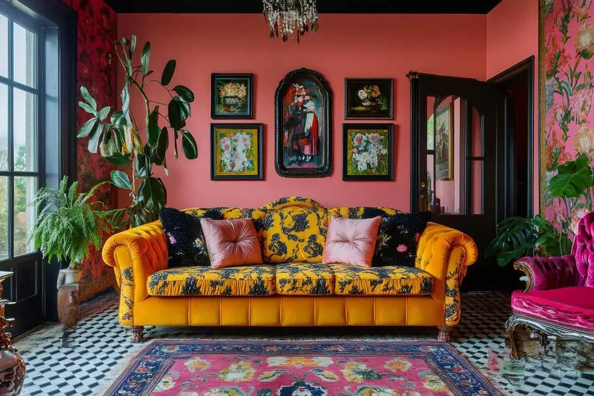
The difference between a room that feels collected and one that feels overloaded usually comes down to editing. A strong scheme still needs a clear lead element, a repeatable palette, and enough visual rest so the eye knows where to land.
I like to think of it in three layers: the artwork itself, the room’s supporting colours and materials, and the quiet space around them. If the art is full of movement, keep nearby furniture shapes simpler. If the art is graphic and sharp, let fabrics soften the composition.
Let one idea lead
Maybe the lead is colour, maybe it is pattern, or maybe it is subject matter. A room feels stronger when one of those threads dominates and the others support it. In a London flat with limited wall space, that single-thread approach usually works better than trying to make every wall compete.
Respect the room’s existing detail
UK homes often already have skirting boards, coving, fireplaces, or awkward alcoves. I treat those features as part of the composition, not as a problem to hide. The art should engage with the architecture, not ignore it.
Once the overall rhythm is clear, the next step is deciding which colours deserve the loudest voice.
How to build a palette that feels bold and liveable
For me, the most reliable formula is not “more colour”; it is “better colour relationships.” I usually start with two dominant colours and one accent, then repeat them across cushions, lampshades, books, or a rug so the room feels intentional.
Some combinations that work particularly well in home decor are deep teal with rust and cream, plum with moss and brass, or cobalt with ochre and warm white. These pairings are strong enough to support vivid artwork, but they still leave the eye somewhere calm to rest.
- Use one warm metal, such as brass or aged gold, if the art already contains a lot of cool tones.
- Let wall colour either echo one shade in the artwork or deliberately contrast with it.
- Keep large furniture pieces quieter when the artwork carries several patterns.
- Repeat the accent colour at least twice in the room so it feels chosen, not accidental.
If you want the look to feel current in 2026, I would avoid relying on neon alone. The richer result usually comes from saturated colour with depth, not just brightness. Once the palette is settled, scale becomes the decision that makes or breaks the room.
Scale, framing, and materials that work in real homes
In many UK homes, especially terraces and compact flats, scale matters more than sheer quantity. A single large piece often has more presence than several small prints because it reduces visual fragmentation, which is exactly what a busy room does not need.
As a rule of thumb, I aim for artwork that takes up about 60 to 75 per cent of the width of the furniture it sits above. If I am hanging above a sofa, I usually leave 15 to 25 cm between the top of the sofa and the bottom of the frame. The centre point around 145 cm from the floor is still a reliable starting point for eye-level hanging.
| Format | Best for | Why it works | Watch out for |
|---|---|---|---|
| Large canvas | Living rooms and wide walls | Creates one clear focal point | Can overpower a narrow wall if the proportions are off |
| Gallery wall | Staircases, hallways, and longer runs of wall | Lets you layer colour and subject matter gradually | Feels messy if spacing and framing are inconsistent |
| Framed print | Renters and smaller budgets | Easy to swap, easy to scale up over time | Thin frames can make the room feel flatter |
| Textile or mixed-media piece | Rooms that need warmth and texture | Adds softness and depth without more pattern on the walls | May need more care with light and dust |
If I am spending money strategically, I would rather invest in better framing than chase another print. In budget terms, I would expect a decent framed print to land around £50 to £150, custom framing around £80 to £300, and original works much higher. A good frame can make an affordable piece look deliberate, while a poor frame can cheapen even a strong image. That is also where sustainable choices fit naturally, because reclaimed frames and responsibly sourced materials often improve the look as well as the footprint.
Once the size and format are sorted, the question becomes where each piece should actually live in the room.
Where to place statement pieces room by room
The most effective placement depends on how the room is used, how much light it gets, and how much movement happens through it. I think about wall art as part of the daily route through a home, not just as something viewed head-on once the room is finished.
Living room
Above a sofa or fireplace is the obvious location, but it only works if the art can hold the room. In a formal sitting room, I often prefer one oversized piece or a two-part composition because it feels calmer than a crowded cluster.
Bedroom
Bedrooms usually benefit from slightly softer contrasts. The artwork can still be vivid, but I would avoid a piece that feels visually aggressive right above the bed. A calmer subject, a warmer palette, or a textile finish usually gives better results.
Hallway or staircase
These spaces are ideal for layered displays because they naturally encourage movement and a sequence of views. Repeating frame colour or mat width helps the arrangement feel curated rather than random, which matters even more in narrow British hallways where every distraction is magnified. If you are building a gallery wall, leaving 5 to 8 cm between frames usually keeps the rhythm tight without making the wall feel cramped.Dining area
Dining rooms can handle bolder scale because people are seated for part of the time. Here, I like a single dramatic work or a pair of pieces that echo the room’s lighting and table shape. The goal is atmosphere, not competition with conversation.
When placement feels right, the remaining challenge is balancing all that visual energy with the furniture and textiles around it.
How to mix pattern, texture, and sustainable materials without overloading the room
This is the part where many rooms slip. People add a vivid print, then a patterned cushion, then a textured rug, and suddenly every surface is asking for attention. I get better results when I treat pattern like seasoning: enough to sharpen the room, not so much that it overwhelms the meal.
If the artwork is intricate, I usually quiet the immediate surroundings with plain linen, wool, timber, or boucle. If the art is mostly solid colour, that is when I am more willing to introduce a patterned chair or a woven throw. The room needs contrast, but it does not need every item to speak at full volume.
- Choose recycled paper or archival stock for prints if you want the piece to last.
- Use second-hand or reconditioned frames where possible; they often suit a layered interior better than brand-new gloss.
- Look for FSC-certified timber, water-based inks, and low-VOC finishes when you are buying new.
- Mix one tactile element, such as wool or rattan, with one smoother surface so the wall art does not do all the work.
- Buy fewer pieces, then give them more room. Curation usually reads as more luxurious than accumulation.
That kind of restraint may sound counterintuitive, but it is what keeps the style from becoming disposable. From there, the final step is avoiding the common mistakes that undermine the whole effect.
Common mistakes that flatten the look
There are a few errors I see repeatedly, and they are easy to fix once you know what to look for.
- Too many small pieces - They can make the wall feel busy before the room has even been furnished properly.
- No clear hierarchy - If every piece is fighting for attention, none of them feels special.
- Hanging art too high - This leaves the room feeling detached and awkward instead of grounded.
- Ignoring the frame - A weak frame can make a strong image look temporary.
- Forgetting lighting - Glare from a window or the wrong bulb temperature can flatten colour and kill texture.
My practical test is simple: if I step back and the room looks loud but not purposeful, I remove one thing before I add anything else. Usually that one edit is enough to restore the hierarchy. The room does not need less personality; it needs a clearer order.
The one rule I would keep if the room already feels full
Start with the piece that matters most, then build the room around it. If a room is already rich in colour, texture, or period detail, the artwork should sharpen the story rather than compete with it. If the room is plain, the art can carry more of the drama, but it still needs support from framing, spacing, and a few repeated tones.
That is the version of this style I trust: bold enough to be memorable, controlled enough to live with, and considered enough to last beyond a single season. If you are building it slowly, I would begin with one anchor piece, one good frame, and one repeated colour elsewhere in the room, then stop and see what the space is asking for next.