Natural timber is never just one colour. In furniture, the shade you see is shaped by species, grain, age, finish, and light, which is why the same table can read as honeyed in one room and almost silvered in another. In this article, I break down wood tones in practical terms: how to read them, mix them, and choose finishes that suit both the room and the way you live.
What matters most when choosing timber finishes for furniture
- Natural colour changes with species, grain, oxidation, and the finish on top.
- Light, medium, and dark shades solve different space and maintenance problems.
- Mixing finishes works best when one timber leads and the others repeat elsewhere.
- Matte oils, lacquers, stains, and smoked treatments all alter the final look in different ways.
- Sustainable choices depend on certification, repairability, and how long the piece will stay useful.
What natural timber colour actually tells you
When I look at a piece of furniture, I do not read its colour as a single fixed value. I read the species, the cut, the grain density, and the finish together. Oak, ash, beech, walnut, pine, and cherry all sit on different parts of the natural spectrum, but each one can still shift noticeably once oil, lacquer, or stain is applied.
One useful distinction is between the colour inside the timber and the colour you see on the surface. Heartwood is usually darker and more stable; sapwood is paler and often more variable. Add oxidation and daylight exposure, and even a well-made cabinet will mellow over time. That is not a defect. It is part of what makes honest timber attractive.
- Species sets the base colour range.
- Grain density changes how deep or busy the surface feels.
- Finish can deepen, mute, or warm the appearance.
- Light changes the reading more than most people expect.
The cut matters too. Quarter-sawn timber usually looks calmer and more linear, while plain-sawn boards show broader, more expressive grain. That difference can change whether a piece feels restrained or rustic, even when the species is identical. Once you stop expecting one exact colour, the range becomes easier to work with. The next step is deciding which family of shade suits the job you need it to do.
The main families of natural timber shades
I find it easier to think in families rather than named species, because two oak pieces can look very different once they are cut and finished. The table below gives a practical shorthand I use when I am comparing furniture or materials.
| Tone family | Look and feel | Common examples | Best use | Watch out for |
|---|---|---|---|---|
| Pale and blonde | Airy, quiet, low-contrast | Ash, birch, pale oak, blond veneer | Small rooms, Scandi-inspired schemes, flexible backdrops | Can feel flat if everything else is pale |
| Honey and golden | Warm, welcoming, slightly sunlit | Oak, pine, teak with natural oil | Kitchens, family dining, living spaces | Can turn yellow under very warm lighting |
| Red-brown | Richer, more traditional, often nostalgic | Cherry, mahogany, some stained woods | Formal dining, heritage pieces, statement storage | Glossy versions can look dated fast |
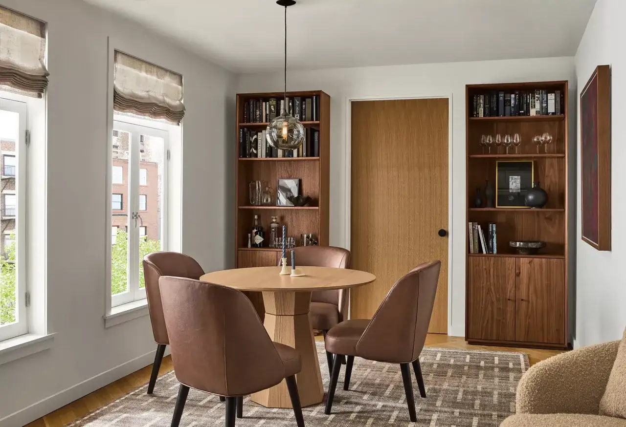
| Medium brown | Balanced, versatile, easiest to layer | Smoked oak, chestnut-like finishes, many solid-wood tables | Most modern homes, especially mixed-material rooms | Can disappear if paired only with beige fabrics |
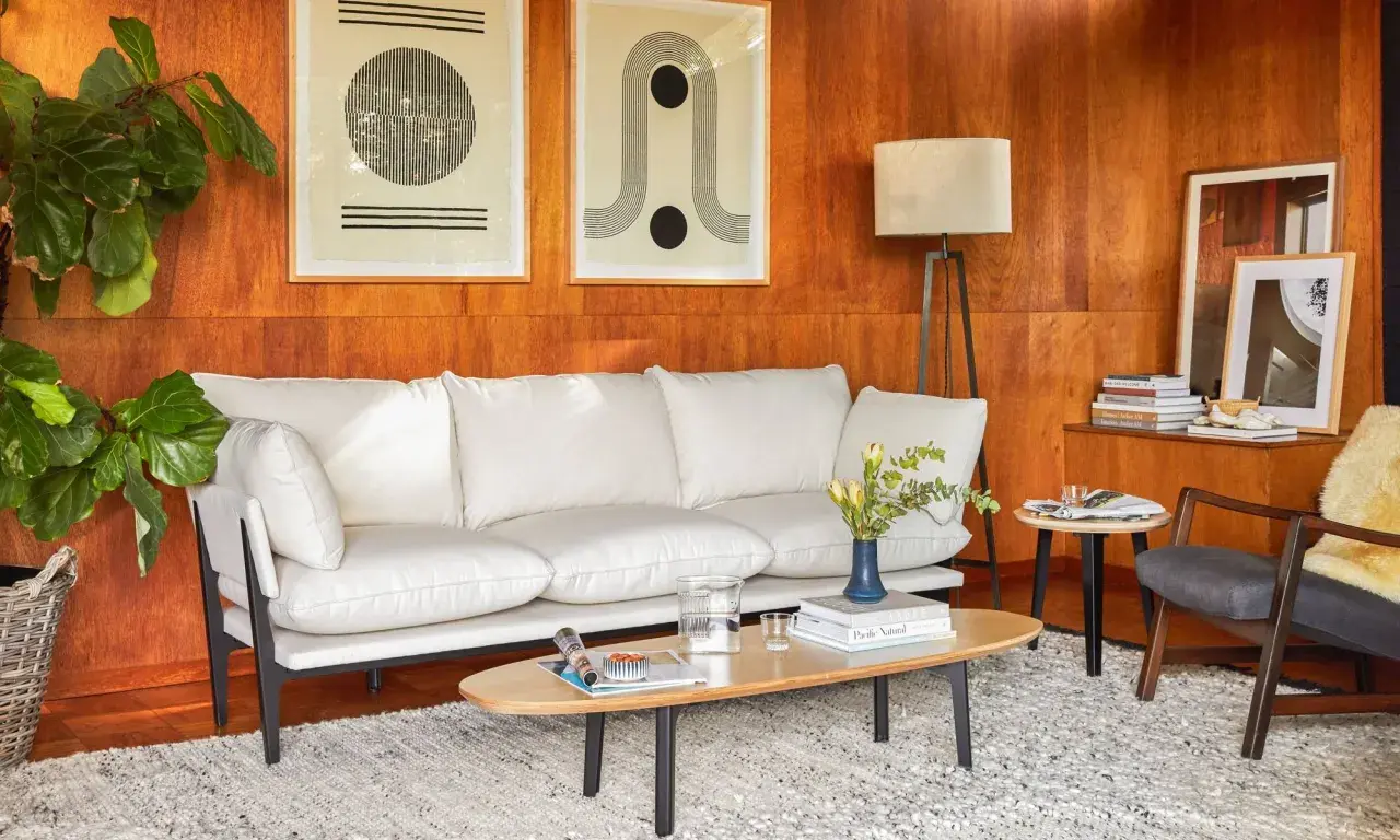
| Dark and smoked | Grounded, dramatic, high-contrast | Walnut, smoked oak, deep-stained veneers | Larger rooms, offices, console tables, accent pieces | Needs enough light and texture to avoid heaviness |
| Greyed and weathered | Softened, aged, relaxed | Reclaimed timber, sun-bleached oak, limed finishes | Coastal, rustic-modern, layered interiors | Can read dull if the grain is too faint |
None of these families is automatically better. In practice, I choose the one that solves the room first, then refine the colour. A compact flat, a family kitchen in a Victorian terrace, and a bright open-plan extension all ask for slightly different choices. That is also why mixing matters more than matching.
How to mix timber shades without visual clutter
My rule is simple: choose one dominant timber, one supporting timber, and one accent at most. More than that, and the room starts to look accidental unless the space is very large or very carefully composed.
- Start with the largest surface. Floors, cabinetry, and the main table usually set the tone.
- Match undertones before exact colour. Warm woods sit better with warm woods; cooler ash-like finishes sit better with similarly cool pieces.
- Repeat each finish at least twice. A single lone chair in one shade often looks like a mistake, but a shelf, frame, or side table can make it feel deliberate.
- Use bridges. Stone, black metal, linen, leather, and painted joinery help different timber colours sit together without fighting.
- Let one texture lead. If the grain is bold, keep the other pieces calmer; if the grain is subtle, you can afford more contrast.
In UK homes, daylight can be thin and changeable, so close timber shades often collapse into a muddy middle. I usually prefer either a clear contrast or a very intentional tonal shift, especially in smaller rooms. That keeps the composition readable, which is what makes it feel designed rather than assembled.
Why finish and grain change everything
A lot of bad decisions happen because people compare unfinished boards in a showroom and assume that is the final result. It is not. Oil, lacquer, wax, stain, smoked treatments, and surface brushing all change how colour lands on the eye.
| Finish | Visual effect | Practical upside | Trade-off |
|---|---|---|---|
| Matt oil | Deepens grain and keeps the surface natural | Easy to refresh, less plastic-looking | Needs more maintenance and shows spills sooner |
| Satin lacquer | Slightly richer and more uniform | Durable and easy to clean | Can soften some of the timber character |
| Gloss lacquer | Sharper reflections and stronger colour depth | Very wipeable | Shows dust and scratches more clearly |
| Stain or dye | Can push wood warmer, cooler, or darker | Offers wide design control | Less honest to the species and can date faster |
| Smoked or fumed | Richer brown with more dimension | Feels premium and stable | Usually costs more and limits the palette |
| Brushed or wire-brushed | The grain stands out and feels more tactile | Helps hide everyday wear | Texture can collect dust if it is overdone |
If you are choosing in the UK, I would check samples under at least two light sources: daylight and evening lamps around 2700K-3000K. A board that looks elegant in a showroom can look orange beside warm bulbs, or grey and tired under cooler light. That is why the final decision belongs in the room, not in the sample rack.
Which shades work best in each room
A family kitchen needs different priorities from a spare room used once a week, so I map the shade to the room before I think about style. The easiest way to see that is in context.
| Room or use | Shades that usually work | Why they work | Better avoided |
|---|---|---|---|
| Kitchen | Mid-tone oak, smoked oak, pale oak with a matte finish | Hides minor marks and keeps warmth without feeling heavy | Very glossy dark finishes in low-light kitchens |
| Living room | Warm medium browns, walnut accents, mixed natural finishes | Adds depth without overpowering upholstery and rugs | All-light schemes if the room already lacks contrast |
| Bedroom | Pale ash, soft oak, calm walnut | Keeps the room quiet and restful | Red-heavy stains in small or very bright rooms |
| Hallway | Medium or slightly darker tones | Masks scuffs and stands up to traffic | Very pale, high-maintenance surfaces near shoes and bags |
| Home office | Medium to dark timber with visible grain | Feels grounded and professional | Reflective surfaces that compete with screens |
This is where I am most cautious about trend-led colour choices. A fashionable finish only matters if it survives the actual use case: pets, children, radiators, sunlight, spilled tea, and the slow accumulation of everyday marks. A good shade is the one you will still like after the novelty has gone.
Sustainable choices that keep the look honest
For me, sustainability is not just about the label on the product page. It is about whether the furniture can be repaired, refinished, and kept in service for years. That usually means asking a few direct questions before you buy.
- Look for certified timber. FSC or PEFC certification gives you a clearer trail on sourcing.
- Do not dismiss veneer too quickly. A well-made veneer over a stable core can use less timber and still give a beautiful surface.
- Prefer refinishable finishes. Oil and some hardwax systems are easier to revive than heavily sealed surfaces.
- Consider reclaimed wood where the character suits the piece. It often brings the richest variation, but it can also demand more patience.
- Choose construction that lasts. Joints, edge detailing, and replaceable parts matter as much as the species itself.
I also think it is worth separating true durability from marketing language. 'Solid wood' sounds reassuring, but a badly built solid piece can still warp, crack, or become impossible to maintain. A smart engineered piece with a real wood surface can be the better long-term choice when the design, finish, and provenance are honest.
The mistakes that make good timber look wrong
Most problems I see are not about taste. They are about proportion, light, and overconfidence.
- Choosing by catalogue alone. Screens flatten the colour range and hide the grain.
- Ignoring undertones. A warm honey finish can clash with a cool grey floor even when both look neutral at first glance.
- Matching everything exactly. Perfectly identical pieces can make a room feel flat and commercial.
- Using too much gloss. High shine makes scratches, dust, and uneven colour more obvious.
- Forgetting grain scale. Big open grain feels casual; tight grain feels more formal. If everything is one note, the room loses rhythm.
- Letting the wall colour dominate. Strong yellow or green paint can shift the furniture's appearance more than the furniture itself.
If you want to avoid those traps, the safest move is to test the piece in context before paying for it. That small delay often saves a lot of disappointment later.
The checklist I use before I approve a finish
When I am reviewing furniture or a material sample, I ask the same set of questions every time. It keeps the decision grounded in use, not just style.
- What species or core material is actually being used?
- Is the colour natural, stained, smoked, or sealed with a topcoat?
- How does it look beside flooring, upholstery, and paint in daylight?
- How does it read under evening lighting?
- Can the surface be repaired, re-oiled, or refinished later?
- Is the timber certified or reclaimed, and does that match the lifespan of the piece?
If a finish still feels right after those checks, it usually belongs in the room. That is the standard I trust: not perfect matching, but a surface that fits the architecture, the light, and the way the furniture will actually be used.