Wood furniture can make a room feel calmer, richer, and more intentional, but only when the style, finish, and scale work together. I usually think of wood furniture styles as a design language rather than a material choice: the same oak table can feel rustic, refined, or almost architectural depending on its silhouette and surface. This guide breaks down the main looks, how to choose the right one for a UK home, and how to buy pieces that still make sense from a sustainability point of view.
The quickest way to choose the right wood-led scheme is to match silhouette, grain, and room light first
- Wood reads differently depending on shape, visible grain, and finish, not just the species.
- Scandinavian, Japandi, mid-century, rustic, industrial, and heritage looks all use timber in distinct ways.
- In smaller or north-facing UK rooms, lighter woods and slimmer proportions usually feel easier to live with.
- Finish matters as much as wood type: matte oil feels softer, satin lacquer looks sharper, and reclaimed timber adds instant character.
- Sustainable choices are not only about solid wood; repairability, certification, and quality construction matter just as much.
What wood furniture styles really mean in practice
I separate this topic into three layers. First is silhouette: the shape and proportion of the piece. Second is surface: how much grain, texture, and patina you can see. Third is tone: the colour family, from pale ash to deep walnut. When those three line up, the room feels deliberate; when they clash, even expensive furniture can look accidental.
That is why one carved oak sideboard can feel traditional while another, in the same material, feels almost contemporary. The wood is only part of the story. The legs, edges, finish, and scale do most of the visual work.
- Silhouette sets the mood first. Low and slim usually reads modern; heavy and ornate usually reads classic.
- Surface changes how formal the furniture feels. Smooth and closed-grain looks more polished; open-grain and visible knots feel more relaxed.
- Tone controls warmth and depth. Pale timbers lighten a room, while darker stains make the furniture feel more anchored.
Once you see wood through that lens, the style categories below become much easier to decode instead of feeling like marketing labels. The next step is to compare the main looks side by side.
The main looks and how they work in real interiors
In 2026, the strongest timber-led rooms are usually less literal than they used to be. Instead of copying one pure style from top to bottom, people are mixing adjacent looks and relying on restraint, texture, and good proportions. I find that approach works especially well in British homes, where period details, modest room sizes, and changing light can make an overly themed interior feel stiff.
| Style | What defines it | Best suited to | Watch out for |
|---|---|---|---|
| Scandinavian | Light oak, ash, birch, clean lines, slim legs, and an airy finish. | Smaller rooms, flats, north-facing spaces, and interiors that need more light. | Too much pale wood and beige can flatten the room if there is no contrast. |
| Japandi | Quiet curves, low profiles, matte surfaces, and a calm mix of Japanese and Nordic restraint. | Bedrooms, serene living rooms, and open-plan homes that need visual order. | If everything is too minimal, the room can start to feel unfinished rather than calm. |
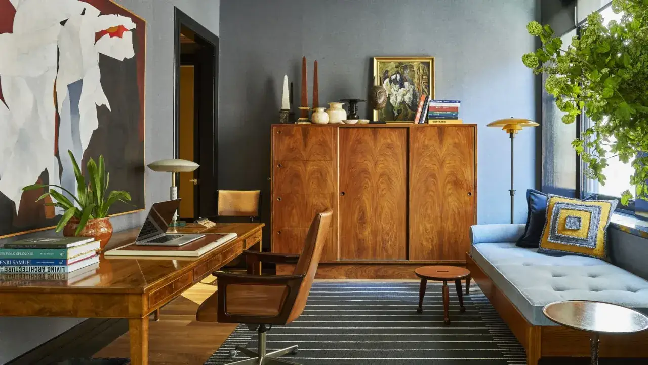
| Mid-century modern | Walnut or teak tones, tapered legs, low silhouettes, and a strong sense of function. | Living rooms, dining rooms, and rooms that need one confident statement piece. | An all-MCM room can feel dated if every item comes from the same era and scale. |
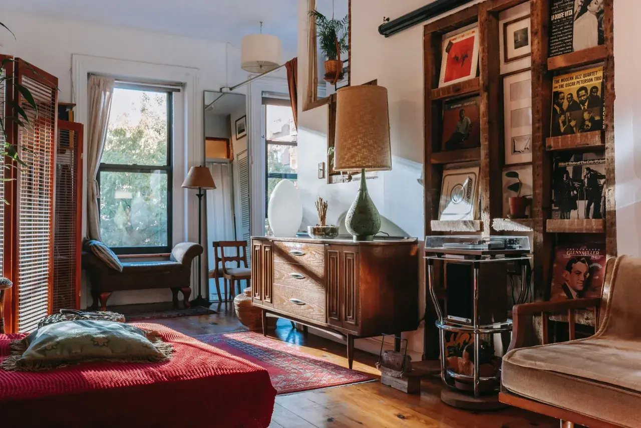
| Rustic or farmhouse | Reclaimed timber, visible knots, chunkier tops, and a more tactile surface. | Kitchen-diners, family rooms, and country settings with relaxed character. | Heavy shapes can overwhelm compact spaces very quickly. |
| Industrial | Raw or distressed wood paired with blackened steel, exposed structure, and a slightly utilitarian feel. | Lofts, urban homes, kitchens, and workspaces. | Cold metal can dominate if the timber element is too small or too dark. |
| Heritage or traditional | Darker stains, carved details, substantial joinery, and a more formal profile. | Period homes, formal dining areas, studies, and rooms with architectural detail. | Without lighter textiles or wall colour, the room can feel weighty. |
My quick read is simple: choose Scandinavian or Japandi when you want quiet space, mid-century when you want shape and rhythm, rustic when you want warmth and texture, industrial when you want contrast, and heritage when the architecture can support a more grounded presence. That leads naturally into the real decision point, which is how to choose the right look for your own room.
How to choose the right look for your room
I usually start with light before I start with species. In a bright south-facing room, a darker walnut sideboard can look intentional and rich. In a compact terrace or a north-facing sitting room, the same piece may feel heavier than you want. The room, not the trend, should set the direction.
- Check the light first. Pale woods and slimmer legs usually help small or dim rooms breathe.
- Read the architecture. High ceilings, mouldings, fireplaces, and older joinery can support more traditional timber pieces.
- Think about use. Family rooms need forgiving finishes; dining rooms need surfaces that clean easily; bedrooms can lean softer and quieter.
- Respect scale. Leave about 75-90 cm around a dining table for comfortable movement, and try to keep a coffee table roughly 40-45 cm from the sofa edge.
- Choose one dominant wood tone. A second tone can add depth, but too many equal voices make the room feel busy.
If I want a room to feel settled rather than staged, I choose one confident timber and repeat it in a second, smaller way. A walnut table with a walnut picture ledge is enough. A pale oak sideboard with oak shelving can do the same job. The point is consistency without monotony, which is where finish and construction become the next layer to get right.
Why grain, finish, and construction change everything
People often compare species first, but finish and construction usually make the bigger visual difference. A pale oak piece with a glossy lacquer can feel more formal than a dark walnut piece finished with a soft matte oil. The timber matters, but the treatment decides how the room reads day to day.
- Matte oil keeps the grain visible and usually feels warmer, softer, and less precious.
- Satin lacquer is easier to wipe down and often suits sharper, more contemporary interiors.
- Brushed or wire-brushed finishes add texture and help disguise wear, which is useful in family spaces.
- Painted timber keeps the structure but reduces the dominance of the grain when you want shape more than colour.
- Solid wood is repairable, while high-quality veneer can be a smart, resource-efficient choice if the core is stable and well made.
Veneer is often misunderstood. It is a thin layer of real wood over a stable core, and when it is well executed, it can be both durable and visually convincing. I would not assume that “more solid” automatically means “better.” In design terms, the best structure is the one that lasts, suits the room, and can be maintained without drama.
The mistakes that make a wood-led room feel heavy or random
The most common errors are not dramatic; they are subtle, and that is why they are so easy to miss. A room can be full of good furniture and still feel unsettled if the wood choices are working against each other.
- Matching everything too closely. Floors, tables, shelving, and cabinets in nearly the same tone can flatten the space.
- Ignoring undertones. Red-brown cherry, yellow pine, and grey-washed oak do not always sit comfortably together.
- Using too many species at once. Three or four woods can work, but only if one clearly dominates.
- Choosing bulky forms for small rooms. Thick tops and heavy bases consume visual space faster than people expect.
- Forgetting texture outside the wood. Linen, wool, metal, glass, and stone help a timber-heavy room feel layered instead of monotonous.
The fix is rarely to remove wood altogether. It is usually to simplify the hierarchy. One main timber, one supporting finish, and enough empty space will do more for the room than a complicated mix of expensive pieces. From there, the question becomes how to buy in a way that still fits a sustainable, modern home.
Sustainable choices that still look refined
This is the part I would not treat as an afterthought. Recent design coverage has leaned toward warmer woods, visible grain, and furniture that looks crafted rather than disposable, which makes sustainability easier to build into the aesthetic rather than bolt on later. That shift matters because a piece that ages well is usually the one you keep.
FSC UK notes that certification helps consumers choose wood products from well-managed forests and recycled sources, which gives you a clearer signal than vague marketing terms like “eco” or “natural.”
- Look for FSC-certified timber when traceability matters.
- Consider reclaimed wood if you want instant character, but expect colour variation, old holes, and uneven grain.
- Do not dismiss high-quality veneer; it can reduce hardwood use and still last for years.
- Check for good joinery, replaceable parts, and finishes you can refresh rather than discard.
- Prefer water-based or low-odour finishes where possible, especially in bedrooms and smaller homes.
For me, the sustainability question is less “Is this piece solid wood?” and more “Can I keep it, repair it, and live with it for a long time?” That is where good design and responsible sourcing start to overlap, and it is the same logic I use when planning room-by-room schemes in actual homes.
How I would use timber in the main rooms of a UK home
Living room
A coffee table or sideboard usually carries more visual weight than several smaller pieces. In a north-facing sitting room, I tend to prefer pale oak, ash, or a warm mid-tone walnut over a very dark stain, because the room usually needs help with light before it needs drama.
Dining room
This is where a table can become the anchor for the entire scheme. Mid-century, rustic, and heritage shapes all make sense here, depending on the architecture. Leave about 75-90 cm around the table if you want chairs to pull out cleanly and circulation to stay comfortable.
Bedroom
Bedrooms work best when the timber feels calm rather than showy. Low-gloss finishes, rounded edges, and softer woods help the room feel restful. Bedside tables that sit roughly level with the mattress usually feel the most natural in use.
Read Also: Rustic Interior Design - Which Style Suits Your Home?
Hallway
Hallways benefit from restraint. A slim console, a mirror, and one timber tone are often enough. If the space is narrow, keeping the console depth around 30-35 cm helps circulation and stops the entrance from feeling blocked.
When I build a timber-led home, I try to let the largest piece stay quiet and let the smaller accents do the talking. That balance is usually what keeps the room from tipping into theme, which is why the final buying rules matter so much.
The rules I would keep before buying the first piece
- Choose the silhouette before the species.
- Repeat one dominant wood tone at least twice in the room.
- Use contrast, not sameness, to connect furniture to flooring.
- Buy for repairability, not just for the showroom moment.
- Leave enough visual breathing room for the wood to read properly.
If I had to reduce the whole topic to one idea, it would be this: the best timber interiors are not the ones with the most expensive wood, but the ones with clear proportions, a sensible finish, and a material palette you can live with for years. That is the version of warmth I would choose for a UK home in 2026.