The essentials before you start
- The strongest calm interiors are built from undertones, texture, and light, not just pale paint.
- Warm whites, taupe, mushroom, sand, and soft stone are more flexible than a flat all-white scheme.
- A 60-30-10 balance still helps, but contrast and texture are what stop the room from looking washed out.
- North-facing rooms in particular usually need warmer neutrals and a slightly deeper anchor colour.
- Sustainable materials such as FSC timber, wool, linen, jute, and low-VOC paint fit this look naturally.
Why neutral interior design still feels current in 2026
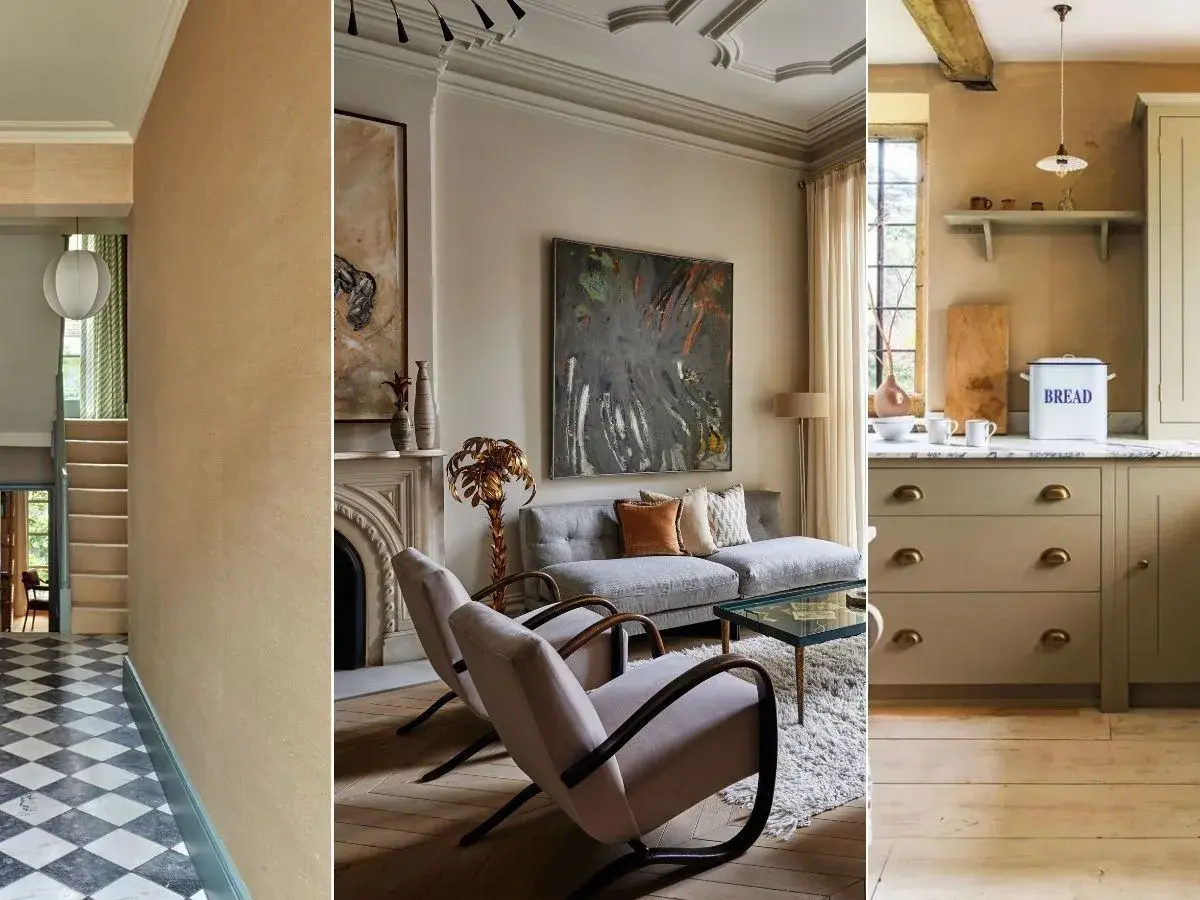
The look has moved on from sterile minimalism and the old habit of painting everything the same pale shade. In 2026, the most convincing neutral rooms feel softer and more lived in: warm whites, mushroom tones, clay-adjacent browns, and stone shades layered with timber, wool, linen, and a few darker anchors. That shift matters because it makes the room easier to live with, not just easier to photograph.
I also think the UK context changes the answer quite a lot. A north-facing terrace, a Victorian hallway, or a modern flat with limited natural light all need a different strategy. The same colour that feels serene in one space can look cold or muddy in another, which is why undertone matters more than the label on the tin.
The practical takeaway is simple: the calmer the palette, the more carefully you need to plan the structure underneath it. Once that is in place, the room can stay quiet without becoming bland.
How to build a palette that feels layered, not flat
I usually start with undertone. A colour may read as beige, stone, greige, or ivory on the swatch card, but in the room it is the undertone that decides whether the space feels creamy, sharp, muddy, or flat. The easiest way to keep control is to choose one dominant base, one supporting tone, and one darker anchor.
A simple 60-30-10 balance still works well: 60% base colour, 30% secondary neutral, and 10% accent or contrast. That accent does not need to be loud. A charcoal lamp base, black picture frame, bronze handle, or deep walnut side table is often enough to give a quiet room some shape.
| Neutral family | What it feels like | Best use | Common risk |
|---|---|---|---|
| Warm white and ivory | Soft, bright, forgiving | North-facing rooms, ceilings, trim | Can turn yellow in low light if the undertone is too creamy |
| Greige and mushroom | Balanced, modern, flexible | Living rooms, hallways, built-in storage | Can look muddy if paired with the wrong wood tone |
| Sand, oat, and taupe | Grounded, warm, welcoming | Bedrooms, upholstery, rugs | Needs contrast to avoid a washed-out effect |
| Stone and mist grey | Cooler, cleaner, more architectural | South-facing rooms, bathrooms, kitchens | Can feel flat under weak winter light |
My rule is simple: if the palette looks complete in daylight but empty at dusk, it is too thin. A good neutral scheme should still have shape when the room loses brightness, and that is exactly where materials come in.
The materials that do the heavy lifting
Colour does less work than people expect; texture does the rest. Wool, linen, bouclé, jute, oak, ash, limewash, plaster, stone, and ceramic all create tiny shifts in surface and reflection that make a restrained room feel considered rather than blank. When I build a calm interior, I try to make sure there is at least one material with visible grain, one soft textile, and one matte finish in the room.
That balance is also where the sustainable side becomes useful rather than decorative. Natural and long-lasting materials usually age better, repair better, and look more convincing in a muted palette than glossy, short-life finishes.
| Material | Why it works here | Best place to use it |
|---|---|---|
| Wood | Adds warmth and stops the room from feeling clinical | Tables, shelving, flooring, cabinet fronts |
| Linen | Softens hard lines and gives a relaxed finish | Curtains, cushions, bedding |
| Wool | Brings depth, comfort, and acoustic softness | Rugs, throws, upholstery |
| Jute or sisal | Grounds the scheme with a natural, slightly rustic texture | Rugs, runners, baskets |
| Limewash or matte plaster | Creates depth without strong pattern | Feature walls, full-room wall finishes |
| Brushed metal | Adds a subtle edge without breaking the calm mood | Handles, lamp bases, taps, frames |
The point is not to fill the room with as many natural textures as possible. It is to use enough variation that the eye keeps moving. Once the material palette is working, the next step is adapting it to each room instead of repeating the same formula everywhere.
How different rooms need different neutral choices
Even the best restrained palette fails when it is copied room to room with no adjustment. I prefer to let each space use a slightly different neutral register so the house feels coherent rather than duplicated. The living room can be warmer and deeper, the bedroom softer, the kitchen cleaner, and the hallway just a touch brighter.
| Room | What to prioritise | What to avoid |
|---|---|---|
| Living room | A mid-tone rug, layered cushions, one darker anchor piece | Too many pale surfaces without contrast |
| Bedroom | Soft wall colour, heavier fabrics, tactile bedding | Hard, shiny finishes that fight the calm mood |
| Kitchen and dining area | Matte cabinetry, oak, stone, and subtle hardware | All-white surfaces with no visual depth |
| Hallway or small space | Warmer off-white, a runner, mirror, and good lighting | Cool white paint that makes the space feel sharper and narrower |
In practice, this means I would not choose the exact same shade for walls, trim, furniture, and textiles. The house reads better when those tones are related, not identical. That small variation is one of the easiest ways to avoid the flat, showroom look, and it leads directly into the other factor that changes everything: light.
Lighting and contrast are what make the room work
Lighting decides whether muted colours look elegant or lifeless. In the UK, winter daylight can be dim and blue, so a room that feels balanced at noon may feel cold by late afternoon. I usually work with three layers of light: ambient, task, and accent. A warm LED in the 2700K to 3000K range normally flatters creams, taupes, and timber; anything much cooler can make them look chalky.
If you are comparing bulbs, a colour rendering index above 90 is worth looking for because it helps fabrics and painted surfaces read more accurately. Dimmers also matter. They let a calm room stay soft at night instead of turning harsh when the sun drops.
- Ambient lighting sets the base level of brightness and keeps the room usable.
- Task lighting supports reading, cooking, or working without forcing the whole room to be overlit.
- Accent lighting brings shape to shelves, art, alcoves, or textured walls.
Contrast matters just as much as brightness. Darker frames, blackened steel, aged brass, and deeper timber tones stop pale rooms from dissolving into one tone. If the palette is soft but every edge is also soft, the result usually feels unfinished rather than refined. That is where the most common mistakes start to show.
The mistakes that make calm rooms feel dull
I see the same errors again and again, and most of them are fixable without starting over.
- Using one beige everywhere creates a flat surface with no visual rhythm. Mix at least two related neutrals and one darker anchor.
- Ignoring undertones leads to clashes that are hard to name but easy to feel. Warm and cool neutrals can work together, but only when the balance is deliberate.
- Choosing too many glossy finishes removes the softness that makes the scheme attractive in the first place.
- Skipping texture leaves the room dependent on colour alone, which is rarely enough in a restrained palette.
- Forgetting about scale makes the furniture look scattered. A large rug, a generous curtain drop, or a substantial lamp usually improves the whole room.
- Decorating too quickly is a quiet killer of good neutral rooms. The best ones are usually built in layers over time.
If I had to boil it down to one test, it would be this: stand in the room at three different times of day and ask whether the space still has structure. If it does not, the answer is usually not “add more colour” but “add better contrast, better texture, or better light.”
Sustainable choices that suit a restrained palette
This is where the style and the values of the home can line up neatly. A quiet palette often encourages slower purchasing, fewer decorative changes, and better-quality pieces that earn their place. That is one reason I think this approach works so well for people trying to furnish more responsibly.
- Choose FSC-certified or reclaimed wood for tables, shelving, and flooring when possible.
- Pick low-VOC or water-based paint so the room is easier to live in after decorating.
- Prefer removable covers on sofas and chairs, especially in linen, wool, or recycled blends.
- Use natural-fibre rugs such as wool, jute, or sisal when the room and traffic level suit them.
- Work with local makers or refinish what you already own before replacing it.
There is a catch, though: some natural materials are durable and some are only durable in the right room. Jute looks beautiful but dislikes heavy moisture, light linen is elegant but can crease, and untreated timber can mark quickly in busy family spaces. I would rather choose a material honestly for its use than force a “green” choice that will need replacing in a year.
The details I would not skip before calling the room finished
When a calm room still feels incomplete, I check the edges first. Lamp shades, curtain lining, the frame colour around art, and the size of the rug often matter more than another decorative object. Those details are small, but they decide whether the room reads as designed or simply assembled.
- Keep one dark note in the room so the palette has an anchor.
- Add one tactile textile that softens the hardest surface in the space.
- Include one natural element, even if it is only a bowl, branch, or woven basket.
- Make sure the lighting changes mood after dark instead of flattening the room.
When those pieces are balanced, the room stops feeling like a theme and starts feeling like a home. That is the real strength of a restrained palette: it gives you a quiet base that can stay useful, adaptable, and easy to live with for years.