A modern heritage look that balances classic structure with relaxed warmth
- Studio McGee’s signature aesthetic is best understood as modern heritage, not one fixed style category.
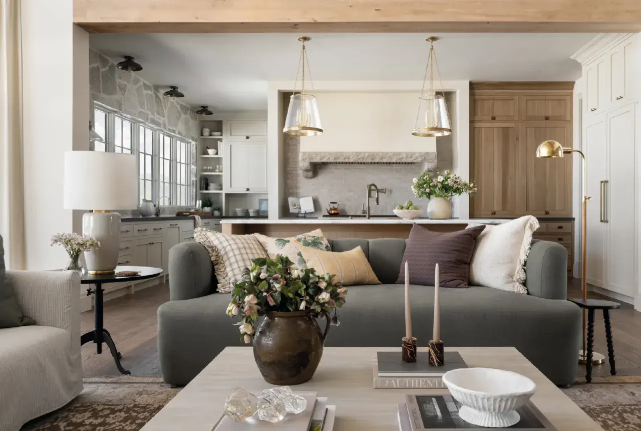
- The look combines classic silhouettes, contemporary restraint, warm neutrals, and layered natural textures.
- It feels polished because the styling is controlled, but it still reads as lived-in and approachable.
- The style translates well to UK homes, especially period terraces, flats, and newer houses that need character.
- It can be made more sustainable by choosing vintage pieces, solid wood, natural fibres, and long-life finishes.
- The biggest mistake is copying the decor too literally instead of using the underlying formula.
The short answer is modern heritage
Studio McGee describes its own signature aesthetic as Modern Heritage, and that label is useful because it avoids the trap of forcing the brand into a single box. It is not pure modern, and it is not full traditional either. The look sits in the middle: classic forms, cleaner lines, thoughtful proportions, and a calm palette that makes the room feel composed without becoming stiff.
That is why the style is often mistaken for modern farmhouse or organic modern, even though it is a little more refined than both. I read it as a layered, timeless approach that borrows from several adjacent styles but never fully belongs to any one of them. Once you know that, the details become much easier to recognise, and that is where the style really reveals itself.| Style | What it usually looks like | How Studio McGee differs |
|---|---|---|
| Modern farmhouse | Rustic materials, country cues, heavier use of distressed finishes | Cleaner, softer, and less themed; it leans more polished than rustic |
| Organic modern | Minimal, earthy, sculptural, often more restrained in ornament | Warmer and more layered, with a stronger use of classic silhouettes |
| Classic traditional | Formal, symmetrical, sometimes ornate | Less formal and more relaxed, with contemporary editing and lighter styling |
| Modern heritage | A blend of old and new, shaped for everyday living | That is the closest match to the McGee look, especially in recent projects |
The useful part of this comparison is practical: if you already know which neighbouring style you tend to overdo, you can keep the McGee formula balanced rather than drifting too rustic, too sparse, or too formal. Next, I want to strip the look down to the ingredients you can actually spot in a room.
The details that make the look easy to spot
When I strip away the styling, I see four recurring moves: a warm neutral palette, natural materials, familiar furniture shapes, and a controlled amount of layering. That combination is what gives the style its softness without making it bland. It also explains why the rooms feel finished even when they are not packed with accessories.Colour comes first
The palette usually starts with warm white, creamy beige, soft taupe, muted brown, and occasionally deeper shades like forest green, navy, or cocoa. What matters is the relationship between the colours, not the colour count. The rooms usually rely on tone-on-tone variation rather than sharp contrast, so the space feels restful rather than flat.
Materials do most of the work
Linen, wool, jute, reclaimed wood, stone, brass, and textured ceramic appear again and again because they create depth without visual noise. That is a big reason the style still feels calm even when there is a lot going on in the room. If a surface looks too new or too shiny, it often undermines the effect; if it has a little grain, patina, or weave, it usually helps.The furniture is classic, but edited
Think rolled-arm sofas, pedestal tables, spindle-back chairs, simple cabinets, and other silhouettes that feel familiar rather than experimental. The difference is in the proportions and the finish: cleaner lines, slightly slimmer profiles, and upholstery that reads tailored instead of fussy. That balance is why the look feels collected, not staged.
The styling is layered, not crowded
McGee-style interiors usually use a few stronger objects instead of many small ones. A vintage bowl, a substantial lamp, a stack of books, and a textured throw can do more than a shelf full of decorative filler. In my view, this is where people often get lost: they copy the accessories, but they miss the restraint that makes the styling feel intentional.
Once you can read those ingredients clearly, the style becomes much easier to apply in real homes, which is especially important when the room has British proportions and you do not want the result to feel imported or overdesigned.
Why it works so well in UK homes
This style suits UK homes because it adds warmth without demanding huge rooms or dramatic architecture. A Victorian terrace, a compact city flat, or a newer family house can all benefit from the same logic: calm background, tactile materials, and a few pieces with presence. That matters in the UK, where many rooms need to feel lighter and more open, but still personal.
- In period homes, it respects original features instead of fighting them. Cornices, sash windows, fireplaces, and timber floors can sit comfortably beside softer contemporary furniture.
- In newer homes, it introduces character without relying on gimmicks. A simple cabinet with oak grain, a vintage mirror, or linen curtains does more than another tray of decorative objects.
- In smaller rooms, the layered neutral palette keeps the space from feeling chopped up. You do not need many colours if the textures are doing the heavy lifting.
- For slower decorating, it is a smart fit because the pieces are meant to last. That makes the look more compatible with sustainable furnishing than a trend-heavy scheme that needs replacing every season.
If I were designing this style with sustainability in mind, I would lean on solid wood rather than disposable veneers, natural fabrics rather than synthetic-heavy blends, and vintage or secondhand pieces wherever the silhouette is right. I would also keep the palette flexible so the room can evolve without a full reset. That is where the real value sits: the style looks good now, but it also avoids the kind of churn that leads to waste. Once the framework is right, the next question is how much you actually need to buy.
How to recreate it without blowing the budget
You do not need a full-room renovation to get the feel right. In most cases, the most effective changes are the ones that affect scale, texture, and light. If I were working on a UK living room, I would spend in layers rather than trying to solve everything at once.
| Budget level | Typical spend in the UK | Best places to put the money |
|---|---|---|
| Quick refresh | £250–£800 | Paint, lampshades, cushions, curtains, framed art |
| Mid-range update | £1,500–£4,000 | Rug, coffee table, one anchor chair, lighting, upholstery work |
| Full-room transformation | £5,000–£12,000+ | Sofa, joinery, window treatments, flooring refinements, bespoke lighting |
- Start with a warm base. Choose one creamy white, beige, or soft taupe and use it consistently on the main walls, trim, or joinery.
- Add one classic anchor piece. A sofa with a tailored shape, a pedestal dining table, or a solid wood console gives the room structure.
- Layer texture before adding colour. A wool rug, linen curtains, woven baskets, and a nubby throw can do more than an extra accent colour.
- Bring in one deeper tone. A dark green cushion, cocoa cabinet, or aged brass lamp keeps the room from drifting into beige monotony.
- Finish with edited styling. Use fewer objects, but choose ones with weight, shape, or patina.
The most important spending rule is simple: buy the pieces that carry the room visually, not the things that merely fill it. A sofa, rug, and lighting trio will usually do more for the final result than a dozen smaller purchases. Even a well-spent budget can miss the mark if you make the usual styling mistakes, and that is where many rooms lose the plot.
The mistakes that flatten the style
The McGee look is easy to oversimplify. People see warm neutrals and assume the entire style is just beige furniture and a few baskets. That is the fastest way to make it look dull, generic, or strangely lifeless.
- Making everything too pale. Without contrast, the room loses depth. Even a quiet palette needs a darker wood tone, a brass accent, or a richer textile.
- Buying faux rustic pieces. Thin distressed finishes and overly themed “farmhouse” accessories usually cheapen the effect rather than adding charm.
- Overstyling surfaces. A packed coffee table or shelf destroys the calm, collected feel. The style works better with negative space.
- Ignoring scale. Small accessories in a large room, or oversized furniture in a tight one, both weaken the composition.
- Chasing the trend instead of the formula. The formula is warm base, layered texture, classic shape, and edited styling. The trend pieces are optional.
I also see people stop too early. They paint the walls a nice neutral, then they leave the rest of the room unresolved. That creates a space that looks unfinished rather than intentional. If you want the mood, you need the structure as well as the colour, which brings me to the version I would actually choose for a British home.
The version I would choose for a British home
For a British interior, I would keep the bones quiet and spend the budget on long-life pieces: a solid wood table, a wool rug, lined curtains, and one vintage object with real patina. I would also let the architecture do some work, whether that means keeping original mouldings in a period house or adding simple joinery in a newer one. Those details make the style feel rooted rather than borrowed.
If you want the most useful takeaway, it is this: Studio McGee is less about copying a specific room and more about using a repeatable design logic. Build a warm base, layer honest materials, mix old and new, and avoid overdecorating the result. That approach gives you the same calm, polished atmosphere while keeping the home more durable, more personal, and much easier to live with over time.