McGee & Co. style works because it feels calm without going bland: classic shapes, warm neutrals, natural textures, and just enough contrast to keep a room alive. In practice, it is less about copying a showroom and more about building a home that feels collected, comfortable, and lived with. Here I break down what defines the look, how to apply it room by room, and how to adapt it for UK homes without wasting money on the wrong pieces.
The essentials in one glance
- The look is best understood as modern heritage: traditional forms, softened with modern restraint.
- Warm neutrals, wood, linen, stone, brass, and layered texture do most of the visual work.
- The style feels polished because it is edited, not because it is packed with matching décor.
- Sustainable choices fit naturally here: vintage furniture, reclaimed timber, low-VOC paint, and durable natural fibres.
- UK homes usually need a more compact, lighter-handed version of the look to suit smaller rooms and older layouts.
What actually defines the look
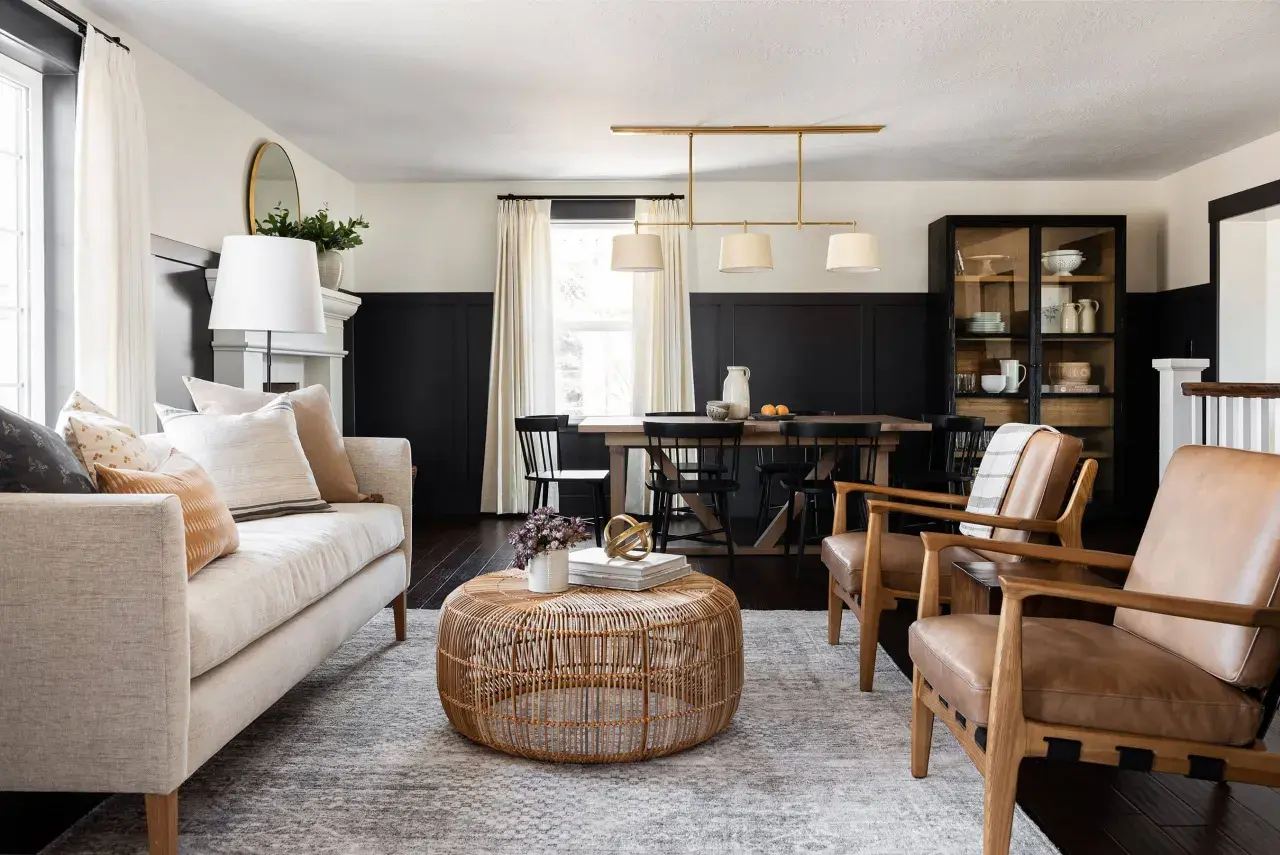
I would describe the style as a careful balance between classic and current. Studio McGee describes its signature direction as New Heritage, and that is a useful label because it points to the real formula: familiar silhouettes, natural materials, and a room that feels composed without looking overly precious.
What gives it its character is not one hero object. It is the relationship between the pieces. A sofa with clean lines, a slightly weathered oak table, a lamp with a simple brass detail, a rug with visible weave, and a few well-chosen objects will usually read more “McGee” than a room full of obvious décor.
| Adjacent style | What it shares | Where this look pulls away |
|---|---|---|
| Farmhouse | Comfortable, practical, natural textures | Less rustic signage and cutesy detail, more refined lines and finishes |
| Scandinavian minimalism | Clean shapes, lightness, restraint | More layering, more warmth, and more heritage character |
| Coastal style | Airiness, ease, relaxed mood | Less beach literalism, more grounded, collected, and architectural |
That distinction matters because many people chase the look with the wrong shopping list. They buy “neutral” items and expect the room to do the rest, but the style depends just as much on proportion, texture, and restraint as it does on colour. Once you see those pieces together, the next question is which finishes do the real work.
The colours and materials that keep it from feeling flat
The palette is warmer than many people expect. I would start with creamy whites, soft taupes, mushroom tones, muted brown, and stone-inspired greys, then add deeper accents carefully: inky navy, olive, forest green, or aged brass. The trick is not to spread colour everywhere. The trick is to let one or two richer notes stop the room from feeling washed out.
Material choice is where the style either becomes believable or collapses into bland beige.
- Wood: Oak, ash, or reclaimed timber adds grain and warmth. Reclaimed pieces are especially useful because they bring instant patina, which is the gentle wear that makes a surface look settled rather than new.
- Textiles: Linen, wool, boucle, and tightly woven cotton soften the architecture. They also keep the room from feeling too hard or glossy.
- Stone and ceramic: These surfaces give a room weight. They work best when they are matte, honed, or lightly textured rather than highly polished.
- Metals: Aged brass, blackened steel, and brushed nickel feel calmer than shiny finishes. Brass is often the sweet spot because it adds warmth without looking flashy.
- Paint finishes: Limewash is a mineral finish that creates a softly mottled surface instead of a flat one, which is useful when you want warmth and depth on the wall.
The sustainable version of this style is actually easier to defend than the fast-furniture version. I would rather see one vintage oak sideboard, one re-covered armchair, and a durable wool rug than three trend-led accessories that will look tired in two years. If you are buying new, look for FSC-certified wood, natural fillings, and low-VOC paint, which releases fewer fumes and is a better fit for a healthy home.
With those surfaces in place, the style becomes much easier to build room by room.
How to translate it room by room without buying a whole new house
I usually start with the rooms that carry the most visual weight, then work outward. If you try to decorate every space at once, the house can feel over-managed. If you build it in layers, it looks like a real home with a point of view.
Living room
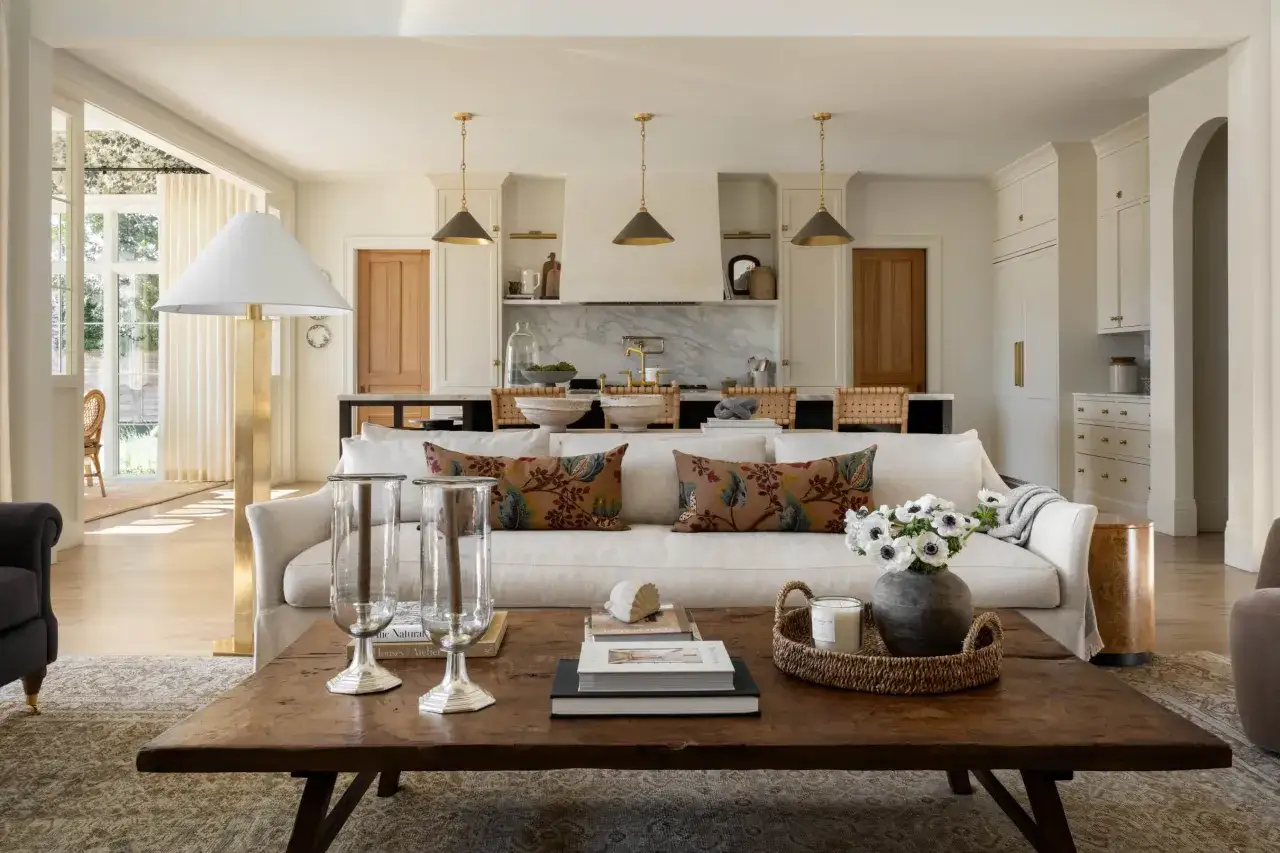
This is the best place to set the tone. Choose a sofa with a clean, gently tailored silhouette rather than an overstuffed one. Anchor it with a rug large enough for the front legs of the main seating to sit on it, then add one or two side tables in mixed materials so the room does not feel too matchy. I would keep the palette quiet, but not monotone. A soft oatmeal sofa, a walnut side table, a brass lamp, and one darker accent cushion is enough to create depth.
Kitchen
The kitchen version of the look is more about proportion and finish than decoration. Shaker cabinetry, stone or stone-look worktops, simple hardware, and pendants with a classic profile usually work better than anything overly decorative. Keep surfaces edited. A single bowl, a wooden board, and one ceramic vessel often look stronger than a row of small objects. If you are renovating, this is where the style’s practicality matters most, because a kitchen has to age well as well as look good.
Bedroom
This room should feel softer than the others. An upholstered headboard, linen bedding, and bedside tables with visible grain create a calm base. Then use layered lighting: a ceiling source, a reading lamp, and a softer accent light so the room works at night without feeling harsh. In smaller bedrooms, I would skip bulky furniture and keep storage quiet and closed. That gives the room the relaxed, gathered mood the style needs.
Read Also: Modern Farmhouse Style - The UK Home Guide
Hallway and bathroom
These rooms are often overlooked, but they matter because they control the first impression. In a hallway, a runner, a mirror, wall hooks, and one sturdy console can do a lot. In a bathroom, look for simple tile, a warm metal finish, and one architectural detail such as panelling or a framed mirror. If the room is small, choose fewer pieces and let the materials do the talking. In a space under about 12 square metres, a pair of chairs or a small sofa usually works better than one oversized sectional, and a clear circulation route of roughly 75-90 cm keeps everything feeling easy.
If I were buying from scratch, I would prioritise in this order: sofa, rug, curtains or blinds, lighting, then accessories. That sequence keeps the investment where the room will feel it most instead of spending too early on decorative extras. Even then, a few recurring mistakes can flatten the result, which is where the next section matters.
Where the style goes wrong in real homes
The most common problem is that people copy the palette but miss the tension. A room can be full of beautiful objects and still feel dead if every surface, shape, and colour sits at the same level. The style needs contrast: old against new, smooth against rough, soft against structured.
| Common mistake | Why it fails | Better move |
|---|---|---|
| Everything is the same warm beige | The room loses depth and starts to look flat | Add one darker tone, one natural wood, and one textured surface |
| Matching furniture sets | The room feels bought in one go rather than collected over time | Mix silhouettes and finishes so the space feels assembled with intention |
| Glossy, synthetic finishes everywhere | The look becomes shiny and temporary instead of calm and durable | Use matte or softly reflective finishes and let natural materials lead |
| Too many decorative objects on every shelf | The eye has nowhere to rest | Edit harder and leave visible negative space |
| Ignoring scale and proportion | Pieces feel cramped, underpowered, or awkwardly oversized | Size the rug, lighting, and seating to the room first, then style second |
| Forcing a farmhouse copy | The result reads themed rather than timeless | Keep the warmth, but simplify the details and sharpen the lines |
The fix is usually less shopping, not more. I often see the room improve most when clients remove one or two loud pieces, swap in a better lamp, and add a material with a bit of age or grain. The same principles become even more important in the UK, where room size, light, and architecture need a lighter touch.
How to adapt it for UK homes and a more sustainable brief
This look translates well to British homes because it respects character, but it needs adjustment. A terraced house, a flat, or a period property in the United Kingdom often has smaller rooms, lower ceilings, and softer daylight than the large open-plan spaces this style is sometimes shown in. That means warmth, scale, and lighting matter even more.
- Use warmer whites: Bright, cool white can look stark in grey light. Creamier shades feel more forgiving and more welcoming.
- Choose 2700K bulbs: That warm light temperature keeps the room soft in the evening without turning it yellow.
- Respect the floor plan: In narrow rooms, slimmer furniture often works better than oversized pieces, even if the larger piece looks more dramatic online.
- Hang curtains high and wide: This creates height and makes windows feel more generous, which helps especially in older homes.
- Keep storage closed: Open shelving can look beautiful, but in small homes it often creates visual noise faster than it creates charm.
- Choose repairable pieces: Reupholsterable chairs, refinishable wood, and modular lighting are smarter than disposable trend buys.
This is also where sustainability and smart design align naturally. A vintage console from a local market, a re-covered armchair, or a reclaimed timber table usually fits the aesthetic better than something shiny and new. I would also look for local upholstery, durable natural fibres, and pieces you can actually maintain. If a fabric stains easily, a finish chips fast, or a chair cannot be repaired, it is not a good long-term fit for this style.
What makes the look work in a British home is not scale alone; it is restraint. Leave enough space to breathe, and the rooms will feel more expensive, more settled, and less forced. The final polish is what keeps the room feeling edited instead of staged.
The final edits that make it feel collected, not copied
If I had to reduce the whole style to a short working rule, it would be this: start calm, then layer. Choose one base palette, add texture before colour, and make sure at least one piece in the room has some age, grain, or patina. That single move often changes the room more than another decorative object ever will.
- Use one calm base colour and repeat it enough to feel coherent.
- Add at least three textures in the same view: for example linen, wood, and brass.
- Mix one older or reclaimed piece with newer pieces so the room feels earned.
- Leave some negative space on shelves, tables, and walls.
- Let lighting do real work, not just decoration.
The best version of this look does not announce itself loudly. It feels edited over time, easy to live with, and durable enough to age well. That is the difference between a room that merely resembles the aesthetic and one that actually has the same calm, collected character.