Mixing dark and light woods in a bedroom works best when the contrast feels deliberate, not random. I usually start by choosing one finish to lead, then I check undertones, grain and proportion before I add anything else. That is what keeps the room layered instead of busy, and it is also the easiest way to make mixed furniture feel calm rather than pieced together.
The simplest way to make mixed woods feel intentional
- Choose one dominant wood tone and repeat each wood tone at least twice somewhere in the room.
- Match undertones first; a warm brown and a cool grey-brown can clash even if both are dark.
- Keep most bedrooms to two or three wood finishes so the space stays restful.
- Use bedding, rugs, curtains and wall colour as the bridge between the woods.
- Refinish, repaint or buy second-hand before replacing good furniture.
Start with one wood tone as the anchor
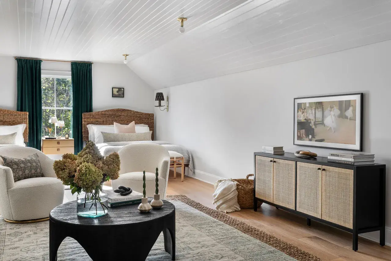
The easiest way to make a mixed-wood bedroom feel composed is to decide which finish leads. I usually let the biggest visual piece do that job, which is often the bed frame, wardrobe or chest of drawers. Once that anchor is clear, the darker or lighter secondary wood has a reference point instead of competing for attention.
This matters because a bedroom is a resting space, not a showroom. If every wood finish is fighting for the spotlight, the room feels restless. If one tone leads and the others support it, the result feels quieter and more intentional. One dominant finish plus one or two supporting finishes is usually enough.
A useful rule is to repeat the lead tone in at least one other place, even if it is only a bench, picture frame or lamp detail. That repetition tells the eye the mix was planned. Once the anchor is clear, the undertones become much easier to read.
Match undertones before you judge the shade
Darkness and lightness are only part of the story. I pay more attention to undertones, because that is what makes one finish feel rich and another feel oddly red, yellow or blue. In practice, value is how light or dark the wood reads; undertone is the colour bias underneath the stain or natural grain.
- Warm woods lean honey, amber, red-brown or golden.
- Cool woods lean ash, grey-brown or slightly blue.
- Neutral woods sit in the middle and are usually easier to mix.
A bold grain can also change the mood. Open grain feels more relaxed and rustic; finer grain usually looks cleaner and more tailored. If two finishes are close in colour but different in undertone, I would rather separate them with a rug, metal detail or upholstered piece than pretend they match. That is where the mix stops looking accidental and starts looking edited.
Once you can read undertones, it becomes much easier to choose pairings that actually work in a real bedroom, not just in a mood board.
Bedroom pairings that usually work
When I am choosing combinations, I look for contrast with enough repetition to keep the room calm. In most bedrooms, two wood finishes are the sweet spot; three can work if one of them is used sparingly.
| Pairing | Why it works | Best for | Watch-out |
|---|---|---|---|
| Light oak and walnut | The contrast is clear, but both read naturally and timelessly. | Rooms that need warmth without feeling heavy. | Avoid adding a third reddish wood unless it is very small. |
| Whitewashed pine and smoked oak | One finish keeps the room airy while the other adds depth. | Smaller bedrooms or spaces with little daylight. | Use enough soft texture so the room does not feel stark. |
| Medium oak and dark-stained bedside tables | The mid-tone acts as a bridge between the two extremes. | Bedrooms with existing oak floors or a vintage bed. | Repeat the medium tone elsewhere so it does not look isolated. |
| Maple or beech and blackened wood | The lighter wood softens the graphic edge of the darker finish. | Modern bedrooms with simple lines. | Keep bedding and curtains soft so the room does not feel severe. |
If you want the safest route, let the larger piece carry the most stable tone and use the other finish in smaller items, such as bedside tables, a bench or a mirror frame. That repetition is what convinces the eye that the contrast was planned. Once the pairings are chosen, the rest of the room has to help them get along.
Use textiles and painted surfaces as the bridge
I rarely rely on wood alone to do all the work. A rug, headboard fabric, curtains or wall colour can cool down a heavy pairing or warm up a combination that feels too flat. In bedrooms, the soft materials matter more than in most rooms because they keep the space restful.
- Choose a rug that sits between the two woods in value, such as oatmeal, stone, taupe or muted charcoal.
- Use bedding with a little visual weight, like washed linen or textured cotton, rather than a shiny white that makes the contrast harsher.
- Repeat the darker wood with black metal, bronze or a deep fabric detail only if you use that accent more than once.
- Painted walls in warm white, soft greige, clay, sage or muted grey usually help mixed woods feel settled.
I would avoid trying to fix a busy wood mix with more wood accessories. A lamp base, tray or picture frame can help, but only if the room is already balanced. Otherwise the bedroom starts to feel crowded before it feels layered. That leads straight into the part most people underestimate: proportion.
Keep the bedroom calm by controlling proportion and placement
The visual weight of each piece matters as much as its colour. A dark wardrobe will always dominate more than a dark stool, and two oversized dark pieces on the same wall can flatten a bedroom fast. I like to think in terms of balance rather than symmetry.
- Keep the heaviest wood finish lower or farther from the main sightline if the room is small.
- Spread similar tones around the room instead of grouping them in one corner.
- Leave enough space around the bed so the mix reads as spacious, not busy.
- Limit the room to two or three finishes unless there is a strong vintage or eclectic reason to go further.
- Use one or two bridge pieces, such as a bench, tray or side table, to connect the light and dark elements.
In a compact UK bedroom, this is the difference between a room that feels tailored and one that feels overloaded. If the furniture is already substantial, I will usually simplify the palette rather than add more contrast. Once the scale is under control, the sustainable choices become much easier to make.
The sustainable way to get the look without buying everything new
For a site focused on smarter furnishing, this is where the topic gets more interesting. The most sustainable version of this look is often not a shopping spree; it is a careful refresh of what you already own. A solid wood bedside table can usually be sanded, stained or repainted far more cheaply than replaced, and a second-hand chest of drawers can become the exact bridge piece the room needs.
If you are buying new, I would look for reclaimed timber, FSC-certified wood or pieces with a finish that can be repaired later instead of discarded. Water-based stains and low-VOC finishes are also worth a look when you are changing the tone of an existing piece, because they suit indoor use and keep the project less harsh to live with. Keeping the structure and changing the finish is usually the cleanest way to get a better result without creating unnecessary waste.
This approach also gives you more control over the final palette, because you can tint one piece to sit exactly between the light and dark finishes already in the room. From there, the only job left is to lock the whole scheme together with a clear finishing check.
The quickest way to make the mix look finished
If I were styling a bedroom from scratch, I would use one dominant wood tone, one contrasting tone and one soft bridge material. The dark finish would usually appear on the bed frame or wardrobe, the lighter tone would show up on bedside tables or a bench, and the bridge would be a rug, curtain or upholstered seat that softens the jump between them.
The final test is simple: step back and ask whether the room feels edited or improvised. If the woods are repeated, the undertones are compatible and the proportions are calm, the mix will read as intentional every time. That is the version I would choose for most bedrooms, especially when the goal is warmth, restraint and a quieter, more sustainable kind of design.